The "Carousel" tile rotates the content of a Sharepoint Picture Library, Blog or Announcements list item as illustrated by the below examples.
Banner Rotator:This example displays the images stored in the Sharepoint Picture Library pointed at via the "URL" setting. It automatically rotates every 9 seconds (default setting) and the images can optionally be linked when adding a column named "URL" to the picture library.Also the carousel automatically displays the image "Title" and "Description" if present. URL: |
 |
News Carousel:This example displays the news items stored in the Sharepoint Announcements List pointed at via the "URL" setting. It automatically rotates every 9 seconds (default setting) and the news items are linked to the List detail view page. The carousel automatically displays the annoucement "Title" and "Body"URL: |
 |
Blog Post:This example displays the most recent blog post of the blog specified by the URL. ALso, the text displayed by the tile is truncated to a maximum of 40 words via the "/more=nn" parameter:Content: |
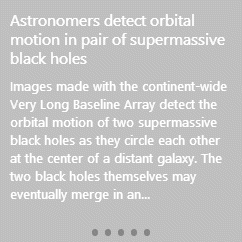 |
Options:you can specify the below options via the web part's "Options" setting or into the Tile's "Content" settingdisplay navigation bullets: |