The "Image" tile displays the image assigned to the tile's "Background" setting.
By default, it reveals the tile "Title" and tile "Content" when hovering over the tile similar to the SharePoint Promoted Links.
The tile can optionally be linked via the tile's "URL" setting.
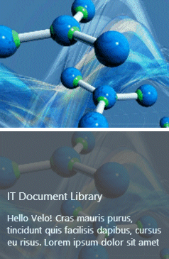
You also can define the image by attaching it to the tile as a file attachment (and leave the "Background" setting empty).
Example 1:The above image tile uses the below settings, displaying an image from the"Pictures" Sharepoint picture library. The tile displays the tile "Title" and "Content" (if present).
Title:Welcome to our Intranet!/box=teal Content:Please have a look.. Background:http://somedomain/Pictures/someBanner.jpgThe "Image" tile can be configured to display the text within a colored box by appending "/box=boxcolor" to the tile's "Title" field where "boxcolor" is either an HTML color name (as eg. "teal") or an RGB #RRGGBB color value.
|
Example 2:The example to the right displays an image from the"Pictures" Sharepoint picture library. The tile displays the tile "Title" and "Content" (if present).
Title:IT Document Library Content:Cras mauris purus,
tincidunt quis facilisis dapibus,
cursus eu risus. Lorem ipsum dolor sit amet Background:http://somedomain/Pictures/somePicture.jpgThe tile supports 3 options on how to render the image within the tile. The option is appended to the tile's "Background" URL.
/cover the image is scaled to fill the tile
/contain the image is scaled to be fully visible
/center the image is not scaled but centered
Example for Background setting:http://somedomain/Pictures/somePicture.jpg/cover |
|
Please enter a comment below if you want to give feedback or have suggestions for improvements: