Dave Williams
4/18/2009 11:33 | Great web part. Is it possible to provide an option to display picture title and description? |
|
Juerg
4/20/2009 13:40 | Dave, the picture titles and descriptions are currently displayed as a tooltip when hovering over the pictures. Would you rather be able to have "real" picture titles and captions ? |
|
Jennifer
4/27/2009 22:58 | If you do not have access to put content into the config file, I assume you are out of look in using this web part or any of the others. Right? |
|
Peter
4/28/2009 06:26 | I know you shouldn't look a gift horse in the mouth, but if you use Lightbox, why not use the Lightbox navigation as well?
This web part is pretty nice, but I miss the 'previous' and 'next' buttons... |
|
Juerg
4/29/2009 09:57 | Jennifer, we will soon support "real " WSP based installation, but you will need Administrator rights in any case when you deploy a web part. |
|
Patricia
4/29/2009 11:51 | Hi!
I am trying this web part in WSS 3.0 and I have a problem:
When I introduce the List Name, the Web PArt show a error message:
"(my list name) Sharepoint List not found! "
Could you give any idea about this problem?
thank you!
Patricia |
|
Sudhir Tiwari
4/30/2009 12:28 | While adding this Web Part to page, I am getting the below error:
"A Web Part or Web Form control on this page canot be displayed or imported. The type is not registered as safe"
Can you please tell me how to resolve this? |
|
Juerg
4/30/2009 14:57 | Sudhir,
you have to add the following line to the "<SAFECONTROLS>" section of your Web.Config file:
<SAFECONTROL Safe="True" TypeName="*" Namespace="LightboxWebpart" Assembly="LightboxWebpart, Version=1.0.0.0, Culture=neutral, PublicKeyToken=6574d83819c8fc89" />
Please make sure that this is on one single line (no line breaks).
Please also make sure that you placed the line into the right web.config file, since you might have multiple Sharepoint applications installed on the same machine. The default application typically is found in
c:/Inetpub/wwwroot/wss/VirtualDirectories/80 |
|
Normann P. Nielsen
5/6/2009 11:02 | Almost a great webpart, but is seems the "popup" box always centers according to the complete monitor/screen, not the browser window? If I dont have maximized the IE, some of the popup is hidden... |
|
RichT
5/7/2009 20:36 | I'm interested in installing this Lightbox Web Part on a large picture library. Does it have the ability to filter? I'd like to filter the pictures to a smaller set based on user input using a URL parameter or web part connection. Thanks |
|
Juerg
5/12/2009 15:25 | Rick,
I assume you don't want the Lightbox web part to sit on the Picture Library page itself and use a filter webpart plus a web part connection.
In this case we would have to add a (persistent?) user input box to be used as a filter criterion. Would you like to filter based on the Title column ? |
|
Sudhir Tiwari
5/14/2009 22:14 | Thanks Juerg !!.
I was missing control entry in the correct web.config.
Its a great webpart. |
|
Dan Rosenberger
5/19/2009 22:48 | Everything seems to be working great except when a thumbnail is clicked on, the "lightbox" or full view of the pic isnt' actually displaying at full resolution (much smaller / distorted)...any suggestions? |
|
Juerg
5/20/2009 10:18 | Dan,
are all images affected ? What is the typical dimension (in pixels) of your images ? |
|
Dan Rosenberger
5/20/2009 14:31 | Yeah it seems to be all pics, i just tried a 2000x1300 pic and the problem is when i launch the picture from the light box, it opens in a larger view, but not the native resolution of the pic. It behaves just like the picture library its stored in, in there, you have to click on the photo once to see the details / description and at a semi-larger view, but still click a 2'nd time to see in full resolution |
|
Dan Rosenberger
5/20/2009 14:50 | Same thing w/ a 1024x768 res pic, still "shrinks" it a bit, not a prob for most things, but for a picutre w/ some details / text in it, the shrinking hurts the pic.
Env is WSS 3.0 w/ Moss2007 |
|
Juerg
5/20/2009 15:37 | Dan,
the web part scales the picture preview to a max. of 800 pixels (width) and 600 pixels (height) while preserving the aspect ratio. This is done to insure that the preview image fits on a typical screen. |
|
tommy
6/13/2009 09:48 | Great piece of Web part, is it possible to include next and previous buttons to the light box so that user can stay in the light box and traverse through different image,. thanks :) |
|
Rabie Belkire
6/15/2009 12:49 | i tried all your steps exactly also i used the same webconfig file that you already minsined, and it gaves me this error "Picture Lightbox:cannot import this webpart". if you have any suggestion just tell me |
|
Juerg
6/15/2009 14:55 | Rabie,
can you check if the trust level in your web.config file is set to �WSS_Minimal� ?
If so, can you try to set it to �medium� as follows:
<trust level="WSS_Medium" originUrl="" /> |
|
Mike
6/19/2009 15:01 | Is it possible to center this web part in its containing zone? Currently this web part aligns to the left most part of the page. And in my case, i want only this web part to show up in the page and centered. Is this possible? |
|
Danny
6/22/2009 15:37 | Great looking component. Only thing I'm missing is the handling (navigating) of (sub-)folders in the picture list. That would make it perfect! |
|
Juerg
6/23/2009 15:02 | Mike,
good suggestion. We have now updated the web part to be centered within the web part zone.
Please re-download the ZIP file, extract and replace the DLL, followed by an IIS Reset. |
|
Derek
6/23/2009 19:28 | Hi
Error
Picture Lightbox:cannot import this webpart
The powerpoint webpart worked for me. Currently my trust setting is medium, Any ideas? |
|
Juerg
6/24/2009 13:47 | Derek,
can you indicate which web part exactly worked for you (we don�t have a �Powerpoint� web part) ?
You might try to move the DLL from your BIN folder to c:\windows\assembly (please make sure to not leave a copy in the BIN directory). This gives the web part elevated privileges. You�ll also have to reset IIS after having moved the DLL. |
|
Antonio Ambrosio
7/1/2009 22:14 | Ciao Juerg, the web part is really fantastic! As also another reader wrote, is it in your plans to add "prevoius" and "next" arrows to navigate images in the lightbox?
Thanks
Antonio |
|
Don McGaw
7/24/2009 17:39 | Love the web part is there any chance you can make it compatible with the code found here to make it expand/collapse by an end user. http://pathtosharepoint.wordpress.com/2008/10/25/expandcollapse-buttons-for-your-web-parts/ |
|
Tricia
8/3/2009 17:41 | This webpart is great. One question though is there a way to have the newer pictures that are put on appear on the first preview pages? I have noticed that as pictures are added they go to the later pages and so it looks as if the pictures are not being updated because the same old pictures remain as the first page preview. |
|
shikarishambu
8/5/2009 00:44 | I think this one is a lot faster than the LyteBox for sharepoint. And, a bit more configurable.
The downsides - no install file, no prev/next, no auto play and need to add safe control. If some of these can be addressed this will be a great addition to any sharepoint site. |
|
Juerg
8/6/2009 10:52 | Tricia,
we now have added a new "View Name" web part parameter to allow to select a list view. If you thus want to display the newest images on top, just create a new View for your Picture Library and sort it descending by the "Created" field. Enter the name of your List View into the "View Name" field.
You have to re-download the new Zip file, extract and replace the DLL (If your DLL is in the GAC, you'll also need to do an IIS Reset). |
|
Karuana
8/10/2009 08:23 | Great webpart... Love being able to select the views. Do you think you'll be adding prev/next buttons? That would be truly perfect! Thank you! |
|
Indika
8/31/2009 08:28 | Please let us know how do we install this on a 64 bit Windows 2008 server. When we try to add the web part to the page we get the error, "Unable to add selected web part(s). AE Picture Lightbox: Cannot import the Lightbox web Part." |
|
Jason Morency
9/2/2009 20:10 | Hi
I can't seem to filter on the Views. I have a couple vies setup, but each time I get an error saying it can't find the specified view. If I take out the view name, it works great...its only when I try to filter. The views themselves work great, its not the view thats an issue. Thanks! |
|
Jason Morency
9/2/2009 20:14 | Just to add to my last comment. If I add my view name, I get this error:
"Sharepoint List not found!"
If I add a junk view name that doesn't exist, I get this error:
"Sharepoint View not found"
So its weird that when I put in the correct view name I get an error that the List cannot be found, and then if I only change the view name and put in jibberish, I get that the view cannot be found. |
|
Anne
9/4/2009 17:40 | Great Web Part (like all web parts on this site!!)
I do have a problem with the title of the webpart that can be entered in edit mode - Appearance - Title. It is showing it fine in the edit view when I save it, but when I go to the "regular" view, it is not shown. |
|
Dave L
9/9/2009 15:30 | Great web parts! My onlt issue with this one is when you have a picture library with hundreds of photo's in it and you select Enable paging, the part showed 92 pages across the top rather than something like " < 1 2 3 4 5 ... > " where the page numbers would keep 5 page numbers displayed in the selection and allow you to use > and < for next or previous page. |
|
Steve Ironside
9/11/2009 13:56 | I'm having the same problem as Jason - created a view to try and sort the photos, but can't get it to work with the webpart; I'm also getting the ": Sharepoint List not found!" error. |
|
Sayitfast
9/22/2009 02:10 | Great web part.... I have one suggestion... on large page with many rows... if you select an image at the bottom the lightbox forces you to scroll up to see the picture.
Thanks
|
|
Mahmoud
9/27/2009 09:11 | I'm having the same problem as Jason and steve - created a view to try and sort the photos, but can't get it to work with the webpart; I'm also getting the ": Sharepoint List not found!" error. |
|
Juerg
9/29/2009 16:12 | Anne, Sharepoint sometimes needs another page refresh to properly reflect the changes. You can of course specify your own custom web part title. |
|
Juerg
9/29/2009 16:17 | Jason and Steve,
this happens if you place a List web part referring to the same picture on the same page. This seems to be a Sharepoint bug and can only be corrected if you remove the List web part from the page. |
|
Joe
10/20/2009 14:40 | hi, i have the same problem like Jason and Steve and i checked my site and didn't find any refference to the same picture. Lightbox is the only webpart i have on that site. This webpart works great when it is used for viewing all images but it is useless to me without filtering. please help. |
|
Juerg
10/23/2009 15:53 | Joe and Jason, please make sure that you select (add) both the "Title" and "Description" column to your List View. If these columns are missing in the View, you will get that misleading "List not found" message (BTW, the most recent version of the web part now emits a more helpful error message in this case). |
|
Shrikant
11/2/2009 12:48 | Web part is great, but I am facing a problem. It doesnt show the Image preview on clicking any photo. Help fast !! Any suggestions people? |
|
Dave
11/11/2009 21:58 | For some reason i can't get this to work with WSS...is it not compatible? my web.config file doesn't have a <SafeControls> section...i tried adding one...but probably didn't do it right |
|
sandhya
11/12/2009 05:34 | hi,
I have installed the web part and trying to configure the properties as per given steps, but when i click on Apply/Ok, no post is done and no changes are applied. Can you please tell me what need to be done. |
|
AliReza
11/16/2009 16:07 | i have a problem by Site name.
my galery is in this address :
http://entekhab/service/forum/DocLib/Forms/AllItems.aspx
and i want put this webpart in in this address :
http://entekhab/service/forum/default.aspx
How can i set "Site Name" in Miscellaneous option?
thanks |
|
M.R.
11/23/2009 15:53 | 'View Name' feature does not work. I am geting the following error message 'List does not exist'.
Why? The list name is correct. If I remove the view name then it works but without filtering by view. |
|
M.R.
11/24/2009 20:47 | Note: "Description" column is present in the List View |
|
Juerg
12/1/2009 14:24 | Shrikant, do you get a �hand� cursor and the tooltip when hovering over an image ?
Which browser are you using ? |
|
Juerg
12/1/2009 14:47 | M.R.
did you also include the "Title" column in your List View ? |
|
Juerg
12/1/2009 14:56 | AliReza,
since your "DocLib" Library is in the same site as your webpart, you can leave the "Site Name" field empty and put "DocLib" into the "List Name" field. |
|
M.R.
12/1/2009 17:17 | Hi Juerg,
Title column was indeed missing from the specific views. I added it and now it works correctly! Thank you for helping me to get it fixed!
Regards,
M.R. |
|
Juerg
12/1/2009 18:13 | Dave, the Lightbox web part works OK with WSS 3.0. Please also make sure that you placed the <SafeControl> line into the right web.config file, since you might have multiple Sharepoint applications installed on the same machine.
The default application typically is found at c:/Inetpub/wwwroot/wss/VirtualDirectories/80 |
|
Aaron Ferguson
12/2/2009 15:38 | I can't get the Description column to appear on the preview (it exists in the list view and is populated) - any ideas? |
|
Juerg
12/3/2009 10:26 | Aaron, did you specify a �View Name� ?
If yes, please make sure to also include the �Description� column in your View (by going to the "Picture Library Settings", then selecting your View at the bottom and then checking the column on the �Edit View� page) |
|
Aaron Ferguson
12/3/2009 13:11 | Hi Juerg. Yes I did specify a view name which did include the Description column. The text appears when you mouse over a thumbnail but not on the preview image. Another problem I had is that when specifying a view name some of the thumbnails are shown as white boxes - but the preview image is OK, so I've gone back to the default view which shows them OK. |
|
Aaron Ferguson
12/4/2009 10:22 | Next thing is that the webpart does not honour the ordering of the items via the view but seems to be showing them in order of upload... |
|
rishi
12/4/2009 11:57 | I keep on getting a runtime error. sorry I am not very technical, but can anyone help. |
|
Juerg
12/7/2009 13:24 | Rishi,
what does the error message say ? |
|
Landon
12/10/2009 19:57 | I like it a lot, but is there anyway we can specify a custom description column that can render rich text? I would love the ability to include hyperlinks and some formatting in the display. |
|
kuttoose
12/16/2009 10:30 | Is list name is "Image folder Name" please give me a sample |
|
Ed
12/28/2009 01:32 | When the webpart is not at the top of the page and the user clicks on a picture, the browser shows a transparent window and you have to scroll to the top of the page to view the image.
Can the image be displayed next to where the webpart is on the webpage?
Thanks. |
|
Bob
1/12/2010 19:01 | I have this web part from awile back. Is the title and description showing up on the actual picture a new feature (the red tulip picture above)? How do I get it to show up? Do I need to download the most recent version? |
|
Bob
1/12/2010 19:16 | Nevermind, My title and description columns weren't checked in the photo library. Works great now! |
|
Jaivy Daam
1/13/2010 11:42 | Everything works fine, but when i try to add the webpart to a zone it says, can't import the webpart. No other errors have been mentioned.
Can someone help me? |
|
Dave Williams
1/29/2010 16:05 | Is is possible to provide an enhancement so that the web part can display images from a folder within the picture library? |
|
Robert
2/5/2010 01:36 | I have an issue that the thumbnails do not showup. If you click on the box the full picture does show. And in IE I have 3 rows with 5 columns, but in firefox I have a 3x3. Any thoughts? |
|
Matt
2/5/2010 11:46 | A great web part. I have it showing 4 columns and 1 row with paging turned on ..... our people love it. |
|
Tony
2/11/2010 20:31 | We are considering this picture light box web part. Can anyone provide a live installation we could see?
www.
|
|
Shaz
2/11/2010 20:41 | My photos are 600x800 in size, but I can't display the thumbnails larger than 100px. When I set the Thumbnail Size to 200 - the picture remains the same size and the remaing space is colored grey. I would have throught the thumbnail size would have increased to 200. How can I increase the size of the thumbnail displayed? Thanks! |
|
Dave Williams
2/22/2010 20:49 | Further to my last post you indicated that folder support may be added to the next release. I could really do with this functionality so could you give some indication when this may be? If it is soon I will put this client requirement on hold until available. |
|
S Saleh
2/27/2010 11:30 | I've downloaded the LightBox webpart and added the .dll to the sps bin folder, I added the text in the relevant web.config file. Uploaded the webpart to the gallery but when i try to add it to a page I get the following error:-
'Unable to add selected webpart' Lightbox 'Request for the permission of type 'Microsoft.Sharepoint.Security.SharepointPermission.Version = 12.0.0.0 Culture = Neutral PublicKeyToken=71e9bce111e9429c failed. Please help, and thank you so much for the great webparts |
|
Juerg
3/11/2010 17:49 | S Saleh,
please check if your Trust level is set to "WSS_Minimal".
If yes, please modify the web.config file in the virtual directory root for your site and change the following tag
<TRUST level="WSS_Minimal" originUrl="" />
to
<TRUST level="WSS_Medium" originUrl="" />
The difference between Minimal and Medium is the addition of SharePoint object-model access.
You can alternatively move the DLL from the application�s BIN folder to c:\windows\assembly where it will get �full� trust. |
|
Bob
3/16/2010 23:17 | Occasionally, one picture will not work, i.e. nothing happens when you click on it. It seems to pick specific pictures and no matter what you do (different file name, resave, reupload) etc. it won't work for that specific image. Any ideas why? |
|
Juerg
3/17/2010 13:48 | Bob,
do you mean that certain pictures consistently do not allow to be viewed or is this an intermittent problem (eg. sometimes it works and sometimes it doesn�t)?
If so, what is the filetype of thee picture(s) ?
|
|
Rosa
3/18/2010 02:38 | We have the same problem. The picture library has 34 pictures, all relatively small in file size and dimension.. only 12 of them 'popup'. I can't work out any consistent cause for this issue. All are JPGS, I have one picture uploaded twice, one works, one doesn't. BUT - with the one that works, as soon as I add text into the description, it doesn't work.
The only other weird thing I can't work out, is that when you right click as save on some pictures, it seems to replace the .jpg with _jpg... is this IE8 or sharepoint? Or a combination of the two?
Very odd! |
|
Bob
3/18/2010 14:59 | Juerg,
I figured it out. It happens when there is an apostrophe in the title or description. |
|
Juerg
3/18/2010 15:08 | Bob and Rosa,
thanks for your feedback! We have now fixed this. Please re-download the Zip file, extract and then replace the DLL (followed by an �iisreset� if you placed the DLL in c:\windows\assembly) |
|
M.R.
3/19/2010 19:01 | I downloaded the zip file but DLL version is still the same as old one, 1.0.0.0.
Is this right? |
|
Juerg
3/22/2010 08:56 | M.R., please check the version number at the top of the web part's configuration pane. The most recent version is 1.1.0 |
|
Nick
4/5/2010 17:43 | Hi, thanks for the free web part. Any luck on including "Prev" and "Next" buttons in the lightbox so that users can navigate through the gallery without having to close and re-open the modal every single time? OR, release the source, and let one of us willing consumers help out with that part of the project!
-Thanks! |
|
Bob H.
4/8/2010 15:52 | Hi Juerg,
The new web part fixes the special character problems EXCEPT for quotes ". When you put quotes in title or description the lightbox action does not work. |
|
Juerg
4/12/2010 16:59 | Bob,
the web part now also takes care of double quotes.
Please re-download the updated Zip file and replace the DLL.
|
|
dheeraj
4/13/2010 11:21 | How can i achieve linking of those pictures with a seperate page.I have created a column in the pictures which are present in the picture library but that doesn't seem to work. when i click on the picture it's preview is show i want to link that picture with another page. Can we achieve this ? |
|
Juerg
4/15/2010 15:39 | dheeray, do I correctly understand that instead of popping up the original full size image you'd rather want to link to another page (associated with the image) when clicking on the image thumbnail ? |
|
Karen
4/20/2010 22:20 | Hello, I am having an issue importing my web part to a page. I followed all installation steps as indicated (placing the dll in the gac). I appear to have the trust level set correctly in the web.config (as I saw in an earlier post), but when I go to add the web part to a page, I get the error "Cannot import the Lightbox Web Part". I would appreciate any suggestions. Thank you! |
|
Juerg
4/22/2010 11:20 | Karen,
we have now added a WSP solution file to the Lightbox Zip package to support automatic deployment and recommend that you use the automatic deployment option (as described in the Lightbox Web Part Installation PDF, see above). |
|
Rosa
5/11/2010 02:52 | Love this web part - Any chance of a disable right click version?? |
|
Juerg
5/11/2010 09:40 | Rosa,
what do you mean by "disable right click version" ? |
|
Rosa
5/17/2010 03:39 | In the popup that shows the picture, I'd love to disable right click to stop people selecting 'Save Picture As'.. I know it's not an absolute way to stop people saving the picture, but it makes it that little bit harder and will satisfy some people here (it's a school thing!)!! |
|
Juerg
5/17/2010 10:55 | Rosa, this is technically not possible, since the browser itself offers this menu option (which cannot get suppressed by code unless you add some registry tweak on a global basis) |
|
Gabriel
5/17/2010 14:34 | does it work in a portuguese language site? for example some webparts simply don't work when they were supposed to work, but in english language they work normally. Thanks |
|
Juerg
5/17/2010 14:50 | Gabriel, the web part should actually work fine in portugese. |
|
Rosa
5/18/2010 09:10 | Damn - you can add a small script webpart to your page to stop people right clicking there, I was hoping the same might be able to be added to that 'popup' for the photo. (When you have it on the background page with the thumbnails - it works fine, but not once you click and get the popup that appears with the full size pic.) |
|
Juerg
5/18/2010 09:15 | Rosa,
can you give the details about the script you mentioned. We'd be glad to integrate it into the web part. |
|
Filipe
6/8/2010 14:06 | Hi. I am trying this web part in WSS 3.0 with ssl. I use a picture libary with the photos. But the internet explorer display a security warning with the message that the pictures are not delivered ussing a secure https connection, this occurred when click in the picture. Could you give any idea about this problem? thank you! |
|
molly
6/18/2010 20:50 | Hi. I just loaded this web part. When I click on my boxes, a slide show pops up and I can advance through my 4 photos. I can't get the links to work as they are supposed to go to web sites...ideas? |
|
Juerg
6/21/2010 16:32 | Molly, if you want to link your thumbnail images to a website, please add an �URL� column to your Sharepoint Picture Library and enter the corresponding URL�s for each picture into this column.
When you then click on the thumbnail image in the Lightbox Web Part, the link will open in a popup window instead of the picture.
The size of the new browser window is actually controlled by the Picture width and height. |
|
molly
6/21/2010 23:38 | I've added a column and web addresses to correspond with each photo. When I click the photo I still just get the photo and it says 1 of 5. Any other ideas? |
|
Juerg
6/23/2010 20:46 | molly, we added this feature by the end of April. Can you check the version number of the web part (by opening the web part's configuration pane and looking it up at the top). The version should be 1.1.2 or higher |
|
Rich.T
7/6/2010 18:07 | Hi Juerg,
Following on from a previous comment, i do not want my thumbnails to be aligned center. Is there any source code i can alter to change this to align them left?
Thanks, Rich |
|
Juerg
7/7/2010 11:47 | Rich,
we have now added a new �Center Thumbnails� web part setting to allow you to left-align the lightbox.
Please re-download the updated Zip file, extract and then replace the DLL (followed by an �iisreset� command if you placed the DLL in c:\windows\assembly) |
|
Jenifer
7/19/2010 15:19 | Hi,can u help for how to display title for each thumbnail
and View name is not working properly in my site.Images are not displaying when i give the new view name.Kindly help me as soon as possible |
|
Juerg
7/19/2010 15:47 | Jenifer,
you need to enable both the Picture Library�s �Title� and �Description� columns (besides the �Picture Height� and �Picture Width� columns which are also needed) for the View you are addressing by the Lightbox Web Part.
Please note that both the Title and the Description are only shown for the thumbnails when hover over the thumbnail images.
Both Title and Description are fully displayed when clicking on the thumbnail to open the original image.
What exactly happens when you specify a view ? Do the thumbnails display (but not the full images) ? |
|
Revathy
7/20/2010 16:01 | This�s Revathy. The New dll which you have reloaded is not working for me ��. What should I do?......It�s showing the same features as before�
|
|
Juerg
7/20/2010 16:06 | Revathy, can you check your web part's version number by opening the web part tool pane and looking it up at the top:
The most recent version is 1.1.12 |
|
Steve Oke
8/5/2010 18:43 | Loved the Slideshow Web Part but can't get the Lightbox Web Part to work. The picture library is located in the same site as the web part but I am still getting this message: "Site not found: " ( I have left the site name field blank)
I have tried the picture library that I used for your slideshow web part and still get the same error. Any ideas? |
|
Juerg
8/5/2010 19:09 | Steve, did you use the WSP solution to install the web part or did you rather add the DLL manually to the application BIN folder ? In this case you might have a permission problem which can be solved by moving the DLL to c:\windows\assembly (followed by an "iisreset" command). |
|
Steve Oke
8/6/2010 17:41 | Fantastic, works perfectly. Thanks for the very quick response! |
|
Jenny
8/11/2010 13:55 | Its giving me error as sharepoint list not found |
|
Juerg
8/11/2010 14:04 | Jenny,
this can have several reasons. Can you place the number "4711" into the web part's "Thumbnail Size" field and report back the information now generated by the web part ? |
|
jenny
8/12/2010 11:18 | hi jurg,i put thumbnail size '4711'.still gives error 'Lightbox:sharepoint list not found.'my site's url is 'http://invkg0069:777/sites/AOIPortal/CallCenter/default.aspx' and Picturelibrary is inside that site content.Please help. |
|
Juerg
8/12/2010 11:32 | Jenny,
did you put the name (not the path) of you Picture Library into the "List Name" field (eg. if you Library is "My Pics", then just put "My Pics" into the "List Name" field) ?
If you put the "4711" into the "Thumbnail Size" field, the web part will output additional information about the problem.
What does it output in your case ? |
|
Jenny
8/12/2010 11:51 | yes.my list name is 'Light'.in that i created 1 item with title is 'Hello' and Description is also 'Hello'.
i get error
Tip of the Day Sharepoint List not found:Light AE Picture Lightbox
Title=Hello
/sites/AOIPortal/CallCenter/Lists/Light/1_.000
Light: Sharepoint List not found!
My site field is empty. |
|
Juerg
8/12/2010 12:14 | Jenny, could it be that your "Light" list is actually defined as a Sharepoint List whereas it actually should be defined as a Sharepoint Picture Library. |
|
Rosa
8/18/2010 03:43 | Hi - taken me a while to post this - but here is the info about making a sharepoint page non-right clickable - Add a content editor web part and add following code in the source editor
<html>
<body oncontextmenu= "return false;">
Right Click not allowed on this page
</body>
</html>
(I got it from : http://social.msdn.microsoft.com/Forums/en/sharepointcustomization/thread/18414dc7-4319-476d-8257-9c498c5092b9 ) |
|
Arup
9/6/2010 08:42 | Can I configure List Name programmatically? |
|
Ratan
9/6/2010 11:33 | Is it possible to configure picture library dynamically? |
|
Juerg
9/6/2010 15:13 | Arup/Ratan,
do you mean via a URL parameter or a web part connection ? |
|
Arup
9/8/2010 07:50 | Actually I have 10 picture libraries. I want to configure LightBox such a way so that based on logged in user the picture library will be changed. I mean "List Name" value will be changed dynamically based on logged in users or URL. Please advice. |
|
Ratan
9/8/2010 08:35 | Yes, it may be by URL or Web Part connection. Could you please let me know how do I achieve that? |
|
Jules Williams
9/8/2010 12:51 | By default how does the web part display the order of the images. (i.e.) is it alphabetical order, or the order they were uploaded in to the library? Is there a way to control what order to display the images in the Lightbox? |
|
Juerg
9/9/2010 17:56 | Jules,
you can define a View for your Picture Library where you can define your desired sort order and then specify the View in the web part's "View Name" setting. Please make sure to include the "Picture Height", "Picture Width", "Title" and "Description" columns in your View. |
|
Juerg
9/13/2010 17:59 | Arup, Ratan,
we now have added the capability to pass the following 3 parameters via the URL to the Lightbox web part:
AELBSitename (Site Name)
AELBListname (List Name)
AELBViewname (View Name)
Just re-download the ZIP file, extract and replace the DLL. You�ll also have to do an IIS Reset if you deployed the DLL to the GAC |
|
Peter DK
10/8/2010 15:04 | Is it possible to have real picture titles and captions. We have pictures of the staff and want to have name and office location shown under the picture. |
|
Tal
12/8/2010 11:04 | I tested the web part, when I set the WP to show a folder in the list ("list1/folder1") and use "enable paging" I have a bug. It shows only one page in the pages list and I cannot navigate to the rest of the pages. |
|
Juerg
12/8/2010 11:44 | Tal,
are you sure that the folder contains more pictures than the number of pictures displayed by the web part ? |
|
Juerg
1/19/2011 11:52 | Tal,
we have now found and fixed the problem.
Please re-download the updated Zip file, extract and then replace the DLL, followed by an �iisreset� command if you placed the DLL in c:\windows\assembly.
|
|
Chris
1/21/2011 15:11 | the web part is in a site and the picture library is in a sub site.
i tried all combination for the site and for the list parameters.
Site Name:
mysite/sub site
/root site/my site/subsite
mysite/sub site/
/root site/my site/subsite/
...
List Name (Picture is the name of the picture library):
Pictures
Pictures/with sub folders
when i place a lightbox web part in the mysite/sub site without Site Name value and with Pictures, it's works fine.
info: the web part is licenced
Please help |
|
Juerg
1/21/2011 16:00 | Chris,
assuming that the web part is in the site �site� and the �Pictures� picture library is in the �subsite� site of the �site�:
Site Name=site/subsite (eg. enter the path starting with the site where the web part has been placed)
List Name=Pictures (eg. always just enter the name of the List without any path information)
Please also make sure that you use the original site name as used when the site was created (in case you later renamed the site) |
|
Benjamin Goldner
2/7/2011 21:34 | is it possible to change the folder on launch (eg from the url?)? |
|
Juerg
2/8/2011 09:23 | Benjamin,
you can pass the following 3 parameters via the URL to the Lightbox web part:
AELBSitename (Site Name)
AELBListname (List Name/Folder)
AELBViewname (View Name)
Example: http://domain.com/someSite/somPage.aspx?AELBListName=someList/someFolder |
|
Darren
2/23/2011 00:05 | I want to display only the images contained in a specific Library folder, however when I append the folder name (separated by a "/") to the Library name ALL pictures in the library are displayed. Any help would be appreciated. |
|
Juerg
2/23/2011 14:16 | Darren,
can you quickly check the web part�s version number by opening the web part�s tool pane and looking it up at the top ? We fixed this problem with version 1.1.24
If you have an older version, please re-download the updated Zip file , extract and then replace the DLL, followed by an �iisreset� command if you placed the DLL in c:\windows\assembly. |
|
Ivar
3/3/2011 12:42 | It should be possible to filter the picture image library used based on a webpart implementing the ITransformableFilterValues interface |
|
Shannon
3/21/2011 17:09 | Are there any plans to include the ability to change width and height of thumnails? |
|
Juerg
3/21/2011 17:31 | Shannon,
you can actually set the picture thumbnail size via the web part's "Thumbnail size" setting (in pixels).
This setting is used to scale the thumbnails to be no wider or taller than the specified value (while preserving the picture aspect ratio). |
|
john
3/23/2011 20:48 | The thumbnail images are tiny no matter what I set the size to within the web part. Is there a reason for that?
I set a 300 width for a 2 X4 col/row settings and the image is centered but very small. Is there any way to have the image fill the entire tile?
When I click on the thumbnail the image opens nicely..
Please see this example page...
http://kargergallery.com/SitePages/test.aspx
|
|
Juerg
3/24/2011 20:24 | john. the web part uses the thumbnail pictures created by Sharepoint which by default are 160 pixels wide. You could actually reconfigure this on a global basis, eg. all Picture Libraries would be affected. See http://hi.baidu.com/seapub/blog/item/21921ee9ead4c938b90e2d04.html |
|
Abbas
4/22/2011 10:15 | Juerg, Is there any way to change TextLayout of the Title? For example
specify the placing of the Text with respect to the Image:
- Right
-LeftWrap
-RightWrap
- Bottom
and is there any way for displaying the discription of the picture near it?
thank you! |
|
Abbas
4/26/2011 21:54 | Hi,
I used your trial and have some problems:
1- If I resize the "Thumbnail size" to make it smaller, it will be croped!
2- I can not resize and grow the picture with chaging "Thumbnail size"!
3- when I want to openning an "URL" with clicking on the picture, it opens on a small frame in th page. may it works like "Circo image player" web part on the codeplex.com? (http://circosoftware.codeplex.com/)
thank you |
|
Michele ODell
4/27/2011 23:58 | I am running SharePoint 2010. Is it possible to include the rating stars in the light box so users can rate the photo right from the lighbox? We are afraid that if users can only rate from the list view on the page that they will open an image in light box view and then click next and prev to scroll the pics and never rate the images. |
|
Bob H
5/10/2011 00:04 | Does anyone have any ideas how one could track the number of times a picture has been viewed using this solution? |
|
Karl Weinrich
5/10/2011 15:52 | We are using version 1.1.19 and there seems to be a maximum limit of 10 Picture Lightbox web parts on a single page. If I add 11 or more web parts on a single page then the wrong photo is displayed when selected. |
|
Juerg
5/10/2011 16:19 | Karl, the web part indeed was limited to 10 instances per page which now has been changed to 30.
Please re-download the updated Zip file, extract and then replace the DLL (followed by an "iisreset" command). |
|
Juerg
5/12/2011 16:42 | Bob H,
since the web part opens the full-size picture using JavaScript on the client, it would be very complex to track this on the server. The only place where you will find this information is in the IIS Log files where each HTTP request is logged (but you then would need to use a Log file analysis tool to automate this)
|
|
Evan
6/10/2011 17:03 | version 1.1.29. I get the following error when specifying a view: "
List item error:Value does not fall within the expected range"
The appropriate fields are enabled on the new (Title, Description, Picture Height, Picture Width). I've also added the default site column named "Link" to the list and it's visible in the view. |
|
Evan
6/10/2011 17:06 | In regards to my previous comment, the "Link" column is causing the problem. I delete it and the error goes away, I add it back and I get the error. I also tried adding a custom column named URL, but I still get the error |
|
Evan
6/10/2011 17:21 | Well, I figured it out. The column "Link" never got added to the view, which generated the error. It would be better if the error actually indicated that a column was missing from the view, instead of just "data out of range".
Now that I have this working, I have a feature request. I am linking to a PDF and have the "show download link" option enabled in the web part configuration. When you click on the "download image" link, it opens another small sized window (based on thumbnail size it appears). Is there any way to have that window open with a larger (or user defined) size when linking to a PDF?
Also, when linking to a PDF, if it could say "download file" or "download PDF" instead of "download image"? |
|
Rekha
6/23/2011 22:13 | Hi team,
We have downloaded your trial version and are trying to analyse if this product meets our requirement.
We have many columns(metadata) attached to our picture library. What i wanted to know is if there is any way to display the pictures based on metadata
thanks in advance! |
|
Juerg
6/24/2011 10:53 | Rekha,
you would have to set up List views to define subsets based on the metadata. Would you like to have the web part dynamically set the set of pictures based on metadata passed to it ? |
|
Priya
6/24/2011 16:20 | Hi Juerg,
I have created a view(by using 'Group By' filter) in a picture library which groups the times based on a column(metadata). I was looking for a way for the web-part to display the picture based on the view that is selected dynamically.
What happens now is the 'Group' filter view does not seem to work well with your web-part.
Please let me know if i am unclear.
Priya |
|
Priya
6/24/2011 19:44 | Also, wanted to check with you if it is possible to print these images?
Thanks in advance! |
|
Priya
6/24/2011 20:42 | Also wanted to check if i hide the default description field and add an 'Abstract' field which does not have word limit(referring to your last comment on 'Image Carouse Webpart'), i do not see the value of the column 'Abstract' being dispalyed with the image.Is this feature not available in this web-part?
Also while i tried to configure another custom 'Print' webpart which we have developed to this, i get an error message'Unable to cast object of type 'LightboxWebpart.Lightbox' to type 'Microsoft.SharePoint.WebPartPages.WebPart'. |
|
Raj
7/12/2011 17:51 | is there a way to randomize the image thumbnails rather than display static ones? This could be awesome to keep it interesting and encourage users to sample different pics that exist in a library |
|
Dave R
8/2/2011 15:54 | Hi Jeurg
I can't get the folder element to work, only the pic lib itself. I'm entering KS3 Images/Healthy Living as a format in the List Name, but it comes back with 'not set to an instance of an object'. Any advice? Thanks, Dave Rawsterne |
|
Juerg
8/3/2011 16:01 | Dave,
the web part throws the error when it tries to read out the titles of the folders. Did you create these folders manually via the web interface or via the �Explorer� View ? We noticed that folders created that way do not have a �Title� fields. We thus now changed the web part to use the folder �Names� instead which should fix your problem.
Please re-download the updated Zip, extract and then replace the DLL, followed by an �iisreset� command if you placed the DLL in c:\windows\assembly. |
|
Terra
8/12/2011 22:07 | We are getting the following security error when using this webpart on a secure site in IE7. The error doesn't appear in IE9. It occurs when browsing from the first to second photo. "This page contains both secure and nonsecure items. Do you want to display the nonsecure items." Do you have a fix for this? |
|
Juerg
8/15/2011 17:27 | Terra,
the �Prev� and �Next� image buttons embedded in the assembly are causing the problem. Although they are accessed via a relative URL pointing to /WebResource.axd, this doesn�t seem to work (it�s actually a reported bug with the recommendation to �add the WebResource.axd to the list of secure pages�).
You can place the 3 buttons (they are containe in the downloadable Zip file) into the following directory:
SP 2007: c:\Program Files\Common Files\Microsoft Shared\web server extensions\12\TEMPLATE
SP 2010: c:\Program Files\Common Files\Microsoft Shared\web server extensions\14\TEMPLATE
The web part will now fetch the images from the LAYOUTS directory if you also add the following appSettings line to the appSettings section your Sharepoint application�s web.config file:
<appSettings>
.
.
<add key="AELB_ButtonPath" value="2" />
</appSettings> |
|
Rick Petrecca
9/9/2011 20:43 | We are looking for a solution to display a slide show and your web part looks like it might be a good fint I have three questions for you:
1 - We have multiple web servers and app servers in our SharePoint farm. Do we need to buy a license for each front end web server or do we need to include the app servers as well?
2 - We have a separate test farm. Do we need to buy separate licenses for the test farm as well?
3 - We are a municipal government in the US. Do you accept Purchase Orders or is PayPal the only payment method available?
Thanks, Rick |
|
Juerg
9/12/2011 11:08 | Rick,
1. you will need to purchase a license for each �production� web front end server.
2. You will not need to buy extra licenses for your test farm (you will be able to use the production keys also in your test farm)
3. Yes, we also do accept purchase orders. |
|
Murdock
9/15/2011 13:15 | There should be an and/or search option. I would like to have 1 page for find this and that and another page for find this or that. |
|
Juerg
9/15/2011 16:01 | Murdock,
to which web part are you referring to (since the Lightbox web part has no search options) ? |
|
Mike
9/22/2011 22:46 | Can you support SharePoint variations? We have one site collection with two sites (one site in English and one site in French).
1) How can we translate Next, Previous, Images of...?
2) The approach with Carousel and appsettings key - for images|of will only enable a new translation (ex: French translation) but then I will loose the English one. I need to have text in French when web part is used on French site and in English when used on English site.
When do you expect this to become available? |
|
Juerg
9/29/2011 14:20 | Mike,
we have now added support for variations.
- create a text file name "Locale-xx-yy.txt" for each non-English language to be supported. Replace "xx-yy" by the Locale (as eg. fr-fr for French or fr-ca for French - Canada). You can look up the Locale codes on this page: http://msdn.microsoft.com/en-us/library/0h88fahh(v=vs.85).aspx
- Add the following 5 localized strings to the file (each word on a separate line and translated to your target language):
next
previous
Page
Image
of
- make sure to choose UTF-8 when saving the file (to allow for accents and umlauts) and place the file(s) in the following location:
c:\Program Files\Common Files\Microsoft Shared\web server extensions\14\TEMPLATE\FEATURES\LightboxWebpart
on each of your web front end servers. |
|
Nancy
10/25/2011 17:33 | Hi,
I'm trying to configure the Lightbox webpart on Sharepoint 2010, but I get a javascript error on my page, which results in the webpart not working properly (images not clickable, no popup).
The error reported is:
Message: Unterminated string constant
Line: 910
Char: 37
Code: 0
At that particular line, I only find coordinates definition:
y[12] = 600
Nothing weird...
Any ideas?
Kind regards,
Nancy
|
|
Webpart lightbox pop problem
11/16/2011 10:22 | i installed webpart successfuuly,but it will show the picture in lightbox,
i don't understand why the picture is only show part ,the popup is not show in center.i can't close . |
|
Juerg
11/17/2011 20:57 | can you send us a screen shot of the problem ?
The Lightbox popup window has a maximum size of 800 by 600 pixels, so it actually should fit on the screen.
Also which browser and operating system are you using
|
|
Juerg
11/17/2011 20:59 | Nancy,
can you send us the HTML source code of that page for inspection ?
|
|
David
12/7/2011 03:41 | I noticed that thumbnails for pictures containing a period in their filename do not get displayed (e.g. "photo_09.23.11.jpg" ). Is this a known issue? |
|
kim
12/12/2011 12:41 | Hi. I installed webpart successfully & deploy in 'Central Administraion site'. but I can't find 'lightbox' in my SharePoint site's 'Site collection features' list. there's only MS Team Foundation's webparts. What did I do? |
|
Michael
12/12/2011 23:54 | I have installed it and it looks good, but I have two questions before we purchase... 1) Is it possible to have the number of columns vary depending on the width of zone? (Making it better for mobile devices) and 2) The subsites containing the webpart will be programmatically created, is it possible to programmatically set the library name (or other parameters)? Thanks and great work |
|
Juerg
12/13/2011 17:52 | Hi Michael,
- The number of columns cannot be varied dynamically by the web part
- Yes, you can pass the following 3 parameters via the URL:
AELBSitename
AELBListname
AELBViewname |
|
Nancy
12/14/2011 19:05 | Hi,
we use the lightbox webpart on a Sharepoint 2010 publishing site. When I configure the listname to point to a folder within the 'Images' library, I do not obtain the images from that folder, but from the 'Images' library itself, returning those pictures that are NOT part of that folder.
Am I doing something wrong?
Kind regards,
Nancy
|
|
elmira
12/20/2011 20:17 | Hi,thanks for the very usefull web part,i use the lightbox webpart on a Sharepoint 2010 publishing site. When I configure a view and write its name in ViewName field ,nothing show in the page !
my view has title,description,height and width coloumn,what's the problem? |
|
Juerg
12/21/2011 15:01 | Elmira,
when you configure the web part to use a List View, but all your pictures are contained in folders, please open your View for editing and then select "show all items without folders" option in the "Folders" section.
This will make the images contained in the folders available in the web part.
|
|
Andrew
12/27/2011 19:15 | I have a Wiki site in Sharepoint and it would be great to have the lightbox appear in the actual body of the text, as opposed to in a Web Part zone on the side. Is there a way to do this? Can I insert the lightbox using a tag of some sort?
Thank you,
Andrew |
|
Juerg
1/4/2012 17:26 | Andrew,
are you using Sharepoint 2010 ?
If yes, you can embed any web part in the text area of a wiki page via the �Edit Page� button in the ribbon menu.
|
|
Karl Weinrich
1/5/2012 16:18 | This is a great web part. I do have one request. I need a way to filter photos by "Created By". I would like to connect a filter web part to the Light Box or use a url parameter and the QueryString Filter web part.
Thanks for your help. |
|
Juerg
1/5/2012 18:42 | Karl,
if you don�t have too many authors, you might consider to create a separate List View for each author where you filter the library by the �Created By� column.
You can then use the �AELBViewname� URL parameter (in combination with the QueryString Filter web part) to interactively select the List View. |
|
Matt Snow
1/5/2012 20:27 | Hello, We have purchased and installed your light box web part into our production environment and have a bit of feedback/feature request.Users with lower resolution displays are having issues seeing the title and description as it drops below view.
Could you please add the light box image size as options in the Miscellaneous tab per web part?
Also, can you make the background of each image thumbnail inherit the color chosen as the background in the Miscellaneous tab? Right now we've chosen a #FFF background color, however we get a grey background on each thumbnail that isn't square.
Site: http://transportation.ky.gov/Centennial/Pages/Photo-Gallery.aspx
Other than these two suggestions the web part works perfectly. Thanks and feel free to email me a reply!
Matt |
|
Juerg
1/6/2012 17:56 | Matt,
to avoid the gray background, enter the following 3 color values (separated by semicolons) into the web part�s �Background Color� setting:
#FFF;#000;#FFF
where the first color is the container background, the second color is the text color and the third color is the tile background (see also the detailed description of this setting at the top of this page)
We also have now fixed the problem when using low resolution screens. The web part now automatically scales down the popup image to take care of the actual available screen resolution.
Please re-download the updated Zip file, extract and then replace the DLL, followed by an �iisreset� command if you placed the DLL in c:\windows\assembly. |
|
Wilson
3/5/2012 15:04 | Tested with version 1.1.38 but the problem with not able to see part of the description and the close button still exist.
Possible to enable vertical scroll bar? It was available in SharePoint 2007 but not in SharePoint 2010. |
|
Juerg
3/5/2012 15:41 | Wilson,
we recently added the new �AELB_PictureSize� appSetting (with V1.1.37)to allow to override the default maximum 800x600 pixel picture size preset.Please add the following new line to the appSettings section of your Sharepoint application�s web.config file
<appSettings>
.
.
<add key="AELB_PictureSize" value="800x480" />
</appSettings>
Enter your desired maximum picture width and height as illustrated above. |
|
Wilson
3/6/2012 12:41 | Hi Juerg,
The solution of setting the picture size is not working totally. There are many PCs with different screen resolutions and some user will even increase the DPI as their eye sight is not good.
Is it possible to
1) enable the scroll bar just like how it is done when used in SharePoint 2007 or
2) have an appSetting that take in a percentage which will then be multiplied with the actual screen size. i.e. 0.3 then
a) screen resolution of 800x600 will have a picture size of 240x180
b) screen resolution of 1680x1050 will have a picture size of 504x315
Thanks. |
|
Yara Lima
3/7/2012 23:26 | Hi, I would like to display other fields from the picture library like description or date created. as well as being able to download the file when i click the download link as opposed to opening the web version in another page. is that possible? |
|
Dorinda
3/12/2012 04:41 | I am having an issues with the hover over showing the actual image size. I do not want that to show and I am not able to remove it from the view it always comes back. I dont mind the title and the description showing but i do not want the image size to be displayes. Also all of my images are 136x60 i need to be able to display them at that size not at the thumbnail size of 100 px. How can i make them display at that size.
This will be the third webpart I will purchase but i need those issues resolved.
Thanks in advance :)
Dorinda |
|
Juerg
3/12/2012 13:27 | Wilson,
we have now added the new �AELB_PictureScale� appSetting which allows you to override the default maximum 800x600 pixel picture size preset depending on the actual screen size as you suggested.
Please add the following new line to the appSettings section of your Sharepoint application�s web.config file
<appSettings>
.
.
<add key="AELB_PictureScale" value="0.7" />
</appSettings>
Enter your desired scale factor (make it less than 1.0) as illustrated above. |
|
Juerg
3/12/2012 13:32 | Dorinda,
we have now removed the display of the picture dimensions in the tooltip.
You now also can customize the thumbnail height via the new �AELB_ThumbnailHeight� appSetting.
Please also set the web part's "Thumbnail Size" to 136 in your case.
Please add the following new line to the appSettings section of your Sharepoint application�s web.config file
<appSettings>
.
.
<add key="AELB_ThumbnailHeight" value="60" />
</appSettings>
Please re-download the updated Zip file, extract and then replace the DLL, followed by an �iisreset�. |
|
Juerg
3/12/2012 13:36 | Yara,
we have now added the new "Show Date Created" web part setting which displays the picture's "created" date in the popup window.
Please note tht the picture's "Title" and "Description" are already shown in the popup window.
Please re-download the updated Zip file, extract and then replace the DLL, followed by an �iisreset�. |
|
Wilson
3/15/2012 02:23 | Juerg
The latest version will popup a messagebox showing the dimension of the picture lightbox when I click on the thumbnail.
Can that be removed? Thanks. |
|
Juerg
3/15/2012 11:19 | Wilson,
sorry for the oversight! The message box related to the "AELB_PictureScale" setting has now been removed. |
|
WDC Leanne
7/12/2012 00:25 | Can I add ALT text for an image in the photo gallery? This is for web accessibility. I am wanting to display the image name when users have images turned off. This also helps when users of the website are using screen reader software. The software will read out the ALT text. |
|
Juerg
7/12/2012 12:42 | Leanne,
we have now added the ALT text to the thumbnail images. You can define the text foe each image by entering it into the image's "Description" column.
Please re-download the updated Zip file, extract and then replace the DLL, followed by an �iisreset� command. |
|
Rich Kolensky
7/15/2012 17:18 | I am getting a "mixed content" warning when using the "next picture" control on the control itself. We recently mplemented SSL, and I do not see any property that I can change that will affect this behavior. All of my url references are relative. Any ideas? Thanks! I am using version 1.1.24 |
|
Juerg
7/16/2012 12:34 | Rich,
the �Prev� and �Next� image buttons embedded in the assembly are causing the problem. Although they are accessed via a relative URL pointing to /WebResource.axd, this doesn�t seem to work (it�s actually a reported bug with the recommendation to �add the WebResource.axd to the list of secure pages�).
You can place the 3 buttons (AELBNext.gif, AELBPrev.gif and AELBNull.gif contained in the downloadable Zip file) into the following directory:
SP 2007: c:\Program Files\Common Files\Microsoft Shared\web server extensions\12\TEMPLATE
SP 2010: c:\Program Files\Common Files\Microsoft Shared\web server extensions\14\TEMPLATE
The web part will now fetch these images from the LAYOUTS directory if you also add the following appSettings line to the appSettings section your Sharepoint application�s web.config file:
<appSettings>
.
.
<add key="AELB_ButtonPath" value="2" />
</appSettings> |
|
Great Part
8/14/2012 04:47 | Can we display the pictures in random order from Picture Library..? |
|
Juerg
8/14/2012 10:32 | Great Part,
this is currently not supported. Would this be an important feature for you ? |
|
Dave V
8/16/2012 15:23 | Hi,
do you have any plans to make a version of this webpart which could work with 2010 image libaries, instead of picture libaries? |
|
Juerg
8/16/2012 15:58 | Dave,
what do you mean by "image libraries", ie. which template would you use to create such a library (as eg. the "Asset Library")? |
|
Dave V
8/17/2012 09:45 | Hi Juerg,
thanks for the quick reply, and my appologies for being so brief earlier.
I was refering to the images libary which is created by default for a publishing portal, and is indeed an assets library.
I'm currently evaluating your webpart for a customer and after the first demonstration, they are very pleased with the functionality. However they are" new" to SharePoint and are used to dealing with this Images libary, which, in contrary to a pictures library, will allow them to use the ribbon and also to modify metadata easily for a batch of uploaded images, using the edit in datasheet mode functionality.
So we were wondering if you have any plans into allowing a different library as a store of the pictures for this webpart. |
|
Juerg
8/17/2012 12:31 | Dave,
to address the "Images" asset library, please enter "Images" in the web part's "List Name" setting. |
|
Dave
9/12/2012 11:54 | Hi Juerg,
putting "images" indeed worked, I was using the URL name (publishingimages) instead, which was why I thought it didn't work with asset libraries.
However now I've hit another problem: i don't seem to be able to limit the selected pictures anymore to a specific folder. Can you confirm you see this behavior as well? |
|
Juerg
9/12/2012 13:37 | Dave,
there was indeed a problem with the "Images" asset library (because it is internally named "PublishingImages") and specifying a folder.
This has now been fixed and you can re-download the updated Zip file, extract and then replace the DLL, followed by an �iisreset� command. |
|
Yrr Geirs
10/17/2012 17:10 | Hi, great web part! I have downloaded the trial and my company is thinking of buying it :)
One thing that bothers me though..... is there any way of getting rid of the postback when going through the images (hitting next button...) ?? It�s driving me crazy :) |
|
Juerg
10/17/2012 17:49 | Yrr,
stepping through the images in the Lightbox popup does not cause any postbacks and should be fast. However, there is an annyoing flicker when using Internet Explorer 8. The observed flickering should only occur in this browser (ie. IE7, IE9, Chrome and Firefox are doing OK). |
|
kishor
10/30/2012 12:14 | How to prevent user to download image?? |
|
Juerg
10/30/2012 16:13 | kishor,
there is unfortunately technically no way to stop users from downloading an image displayed in their browser since the image already has been downloaded to the browser�s cache. |
|
kishor
10/31/2012 05:31 | Thanks Juerg |
|
Michael
11/7/2012 22:23 | We originally installed from the install2010.bat installer... how do we upgrade? Re-run the installer from the newer version? Also, we are having a problem where intermittently we will just get a red 'X' when clicking next/previous instead of showing the image. Will the newer version correct that or do we need to change something? Thanks |
|
Juerg
11/8/2012 11:22 | Michael,
please extract the AELightboxWebpart.wsp solution file from the Zip file and then run the following Sharepoint 2010 Powershell command on your web front end server:
Update-SPSolution �Identity AELightboxWebpart.wsp �LiteralPath c:\AELightboxWebpart.wsp �GACDeployment
(assuming that you stored the WSP file in the root folder of the C:drive on the server).
The �Prev� and �Next� image buttons embedded in the assembly are causing the problem. Although they are accessed via a relative URL pointing to /WebResource.axd, this sometimes doesn�t seem to work (it�s actually a reported bug with the recommendation to �add the WebResource.axd to the list of secure pages�).
You can place the 3 buttons (the 3 images are contained in the Zip file) into the following directory on each web front end server:
c:\Program Files\Common Files\Microsoft Shared\web server extensions\14\TEMPLATE\LAYOUTS
The web part will now fetch the images from the LAYOUTS directory if you also add the following appSettings line to the appSettings section your Sharepoint application�s web.config file:
<appSettings>
.
.
<add key="AELB_ButtonPath" value="1" />
</appSettings> |
|
p4patricia
12/20/2012 12:00 | Hi, I have just started using this wonderful webpart. This works perfectly until I add the URL....just adding the column returns an error message: List item error: Value does not fall within the expected range. When I add a document URL into the column I get the same message.... I have checked the 'Open link in Lightbox Popup'. Any ideas? |
|
p4patricia
12/20/2012 12:04 | Hi,
My apologies I had added my URL column to the default view but hadn't added it to the view I was filtering on... works perfectly now.... |
|
Simone
1/23/2013 11:04 | Great webpart! is it possible to add a search function? If i e.g. want to search for pictures in a specific category? |
|
Juerg
1/23/2013 17:14 | Simone,
you might consider to place your pictures into folders in your picture library and then use the web part's "Show Folder Menus" to let the users interactively choose a specific folder. |
|
Guilherme
2/1/2013 20:04 | Hi,
It is possible to read the pictures from the filesystem?
We have a large collection of images that is beeing sync to the filesystem. We would need a solution fo rthe slideshow from the filesystem?
What you would suggest? It is possible to adapt the present webpart?
(we already use the lightbox for ppicture libraries in moss 2007)
Thank you very much in advance,
Guilherme
|
|
Juerg
2/4/2013 14:11 | Guilherme,
this is unfortunately not possible. The Lightbox web part is designed to get the images (and the corresponding metadata) from a Sharepoint library. |
|
WDC Leanne
2/19/2013 03:16 | My photos are differing sizes but most have been set with 960px for height (portrait) or 960px width. I have set the Thumbnail Size to 250 but the picture remains at 160 and the remaing space is colored grey. I would have throught the thumbnail size would have increased to 250.
How can I increase the size of the thumbnail displayed? The same question was asked by Shaz back in 2/11/2010 20:41 but it wasn't answered. Thanks :) |
|
WDC Leanne
2/19/2013 03:27 | Can you please list somewhere on this page, what the current version number of this web part is? We are unsure if we have the latest version or not. |
|
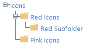
WDC Leanne
2/19/2013 03:40 | I cannot get the Folders view to work. I have added images to a picture library and then added two folders which contain other images - they are called 'Test' and 'Test2'. I have added "Photo-Gallery/Test" to the "List Name" area. I then ticked "Show Folders Menu".
The webpart is displaying all images within the "Photo Gallery" picture library and the folders menu but when I click each of the folder names, the images don't change. It continues to display every image. |
|
Juerg
2/19/2013 17:41 | Leanne,
Version:
the current web part version is 1.1.51 (it is now listed on this page).
Thumbnail size:
The web part actually displays the 160x120px thumbnail images created by Sharepoint. Since the medium-size (640x480px) preview images created by Sharepoint are too large, the web part currently makes no attempt to use the medium-size preview images (scaled down to the desired thumbnail size).
Folders:
which version of the web part are you using ? |
|
WDC Leanne
2/20/2013 02:54 | We are using Version 1.1.43. |
|
Juerg
2/20/2013 13:09 | WDC Leanne,
do you point the web part to a regular Sharepoint Picture Library (as opposed to a document libary like "Site Assets") ? |
|
Martina
2/20/2013 18:05 | Hi Juerg,
On our intranet page, I have a List called "Photo Gallery" which contains a folder with pictures for each of our internal events. The thing is that this list already is a webpart, so I do not see a possibility to use the lightbox in this, as we are not a big fan of the "screen show" function provided by the system.
Can you think of any way I could use your tool in our list? We would like to separate the photos by events, but we cannot use multiple Lightbox-WPs one on top of the other because we cannot minimize the WP as our users do not have (and will not receive) sufficient rights to be able to open the WP (also, they probably wouldn't know where to click). If it makes any difference, we are using SP Foundation.
Thanks for your input & support! Martina |
|
WDC Leanne
2/20/2013 23:40 | Juerg
We point to a SharePoint Picture Library called "Photo-Gallery". |
|
WDC Leanne
4/2/2013 03:41 | We are using this webpart on external websites which have anonymous access. The issue we are having is when a photo is edited in the Picture Library and the content deployment pushes that photo to the live website, all other thumbnails don't display in the webpart. The SharePoint login box appears wanting anonymous users to login.. ??
We have to check out ALL photos in the Picture Library, check them back in then run a full content deployment EVERYTIME the description of the photo is changed.
Is this "expected" behaviour of this webpart or is it something we are doing wrong with the webpart (i.e. the way the webpart 'views' the thumbnails folder while in anonymous mode)? |
|
Juerg
4/2/2013 14:34 | WDC Leanne,
do you specify a View in the web part's "View Name" setting ?
If not, can you specify the "All Pictures" default view name. This ensures that the web part uses a relative URL to the thumbnail images (as opposed to the List's "EncodedAbsThumbnailUrl" field when no view is specified). |
|
Priyanka
4/2/2013 17:15 | Hi! i was able to add the webpart to a page in sharepoint 2010 site but when i click a thumbnail image the background overlay does not extend to the end of the page. this is mainly happening in IE7 where the overlay only extends to the center of the page. Any suggestions??? |
|
Juerg
4/8/2013 15:58 | Priyanka,
can you send us a screen shot to [email protected] to illustrate tohe problem ? |
|
Mario
4/27/2013 17:08 | On the same page as the light box we have a Silverlight web part.
The popup light box always appears behind the Silverlight web part.
Is it possible to set the Z-order of the light box in order to get it in front?
Kind regards, Mario |
|
Andre
4/28/2013 13:50 | Hi Juerg
We are migrating from 2010 to 2013 sharepoint. Thirst i want to make the complete site running in 2010 mode before upgrading the site to 2013.
I,m using lightbox in 2010, but you have made a 2013 lighbox version. fter running the batfile i see the webpart in the central maintenace tool of 2013, i have implemented the solution but on the top level site i cannot activate the webpart because it is not shown. Should i migrate all to 2013 first and is then the webpart shown?
Best regards |
|
Mario
5/13/2013 16:06 | The Lightbox does not seem to follow the filter "Created by [Me]" (set in the default view)
Please advise
Kind regards, Mario |
|
Juerg
5/14/2013 13:13 | Mario,
if you have any non-default settings applied to your default library view (sorting and/or filtering), you will need to enter the name of the default view (as eg. �All Pictures�) into the web part�s �View Name� setting. |
|
Juerg
5/14/2013 13:16 | Mario,
The Lightbox web part uses a z-index of 31000 to ensure that the popup is always on top of all other page elements. This works fine with regular XAP files and when Silverlight to play back videos.
We thus recommend that you contact www.Virtosoftware.com since the XAP file belongs to the Virto �Gantt Task View� web part and ask them to check their z-order. |
|
Alex
5/14/2013 13:31 | Andre,
make sure to enable the 2013 version of the web part unter 'Site Collection Features'.
|
|
Angela
6/11/2013 19:00 | I am trying the Lightbox Web Part for SP2013 - 30 day evaluation version. There is an option "Enable Detail View Link". This only seems to work if "Show Thumbnail title" is selected. Is this correct? I was expecting it to work like the Download link (displays on the lightbox pop up). |
|
Juerg
6/14/2013 20:16 | Angela,
we have adapted the web part so that it now shows the �view details..� link (if not �Title� is given) both for the thumbnail and in the lightbox popup.
Please re-download the updated Zip, extract the WSP file and then update the web part solution.
|
|
Kathy
10/8/2013 18:19 | Hi Juerg,
I installed the free trial version. It all looks great except that the "Show Folder Menu" option is not doing anything. This is what will make or break it because we need to be able to put folders of different events into the Picture library and have them viewable by folder. Do you know why it wouldn't be working? Thank you! |
|
Juerg
10/8/2013 20:58 | Kathy,
please make sure to also enter the name of the folder to be displayed when opening the page by adding the folder name to the web part�s �List Name�.
Example:
Office Locations/Atlanta
(where �Office Locations� in the above example would be the Picture Library name and �Atlanta� would be the pre-selected folder). |
|
Belinda
10/28/2013 11:21 | I've used this web part successfully on SP2010 and we recently upgraded to SP2013. Now I can only see a black box with a white cross, where the yellow folder images normally displays on the right of the page. How can I get the yellow folders back? Thank you |
|
Juerg
10/28/2013 16:42 | Belinda,
can you check if the below folder exists on your Sharepoint web front end server:
c:\Program Files\Common Files\Microsoft Shared\Web Server Extensions\14\TEMPLATE\IMAGES\LightboxWebpart
If yes, can you check if the below images are present in that folder:
- Folder.gif
- Folderactive.gif
- Next.gif
- Null.gif
- Prev.gif
If not, please copy these images to the above folder (you can find the images in the Zip file. |
|
Rob
11/8/2013 14:58 | Hi! We installed the webpart succesfully. First in our Test environment, en later in our production environment (SP2013). I can see the images when I use the highest folder (images), but when I want to select one folder deeper (images/example) it doesn't show anything. What can I do? Thanks. |
|
WDC Leanne
11/17/2013 23:49 | Regarding my issue: "We are using this webpart on external websites which have anonymous access. The issue we are having is when a photo is edited in the Picture Library and the content deployment pushes that photo to the live website, all other thumbnails don't display in the webpart. The SharePoint login box appears wanting anonymous users to login.. ??
We have to check out ALL photos in the Picture Library, check them back in then run a full content deployment EVERYTIME the description of the photo is changed.
Is this "expected" behaviour of this webpart or is it something we are doing wrong with the webpart (i.e. the way the webpart 'views' the thumbnails folder while in anonymous mode)?
and your reply : "WDC Leanne,
do you specify a View in the web part's "View Name" setting ?
If not, can you specify the "All Pictures" default view name. This ensures that the web part uses a releative URL to the thumbnail images (as opposed to the List's "EncodedAbsThumbnailUrl" field when no view is specified)."
Yes we do use View Name settings and we still have the issue were the thumbnails do not display and users are prompted with a SharePoint login box....
Do you have any instructions on setting up the Picture Library so the thumbnails and images can be viewed in anonymous mode?????
We are still having this issue. |
|
Juerg
11/18/2013 17:50 | WDC Leanne,
would it be possible to schedule a remote session to analyze the problem ? |
|
WDC Leanne
11/20/2013 02:49 | Yes we can schedule a remote session. I think you are 12 hours behind New Zealand. I will send an email to [email protected] with my contact details. Thanks Juerg. |
|
WDC Leanne
11/20/2013 23:11 | I am now getting an error when specifying a view: "List item error: Value does not fall within the expected range".
The appropriate fields are enabled on the default view and the new view (i.e. Title, Descriptioin, Picture Height and Picture Width). I've also added a new column called "ViewName" which is enabled in both views.
The web part will display the default view (i.e. All Pictures) but won't display the new view called "Walks".
The new view is based on the "All Pictures" with a filter added, which filters the images with a "ViewName = Walks".
This works on another picture library but does not work on the new one. I cannot see anything obvious and the error message doesn't tell me much.
We are using version 1.1.43. |
|
WDC Leanne
11/21/2013 00:58 | Please disregard the above. I have found the missing column (after turning on every single column within the picture library view and turning off each one individually!). Took over an hour to find the issue!! |
|
DanS
11/25/2013 16:36 | We have never used any picture libraries on our site, even the OOTB capability. But having just installed the AE Web Part, I find that the page with the Web Part now asks for authentication when viewing anonymously. I believe it has something to do with the thumbnails permissions.
Does anyone have a thought on how to allow anonymous viewing of the thumbnail list? |
|
Juerg
11/25/2013 17:38 | DanS,
did you configure the Picture Library for anonymous access ? |
|
DanS
11/26/2013 21:19 | Hi Juerg. There doesn't seem to be a setting to grant anonymous access for the library itself. Of course, the entire site is a public site and all pages and images just inherit those permissions. The full size images in the picture library don't throw an authentication request. Only the thumbnails.
If I cancel the authentication dialog, then I can click on the lightbox thumbs (which are just grey) and the full size image does pop open. |
|
Jason
12/2/2013 21:37 | We have a library is hundreds of photos. We are placing this web part in a vertical 25% web part zone. If I turn on paging, it takes up most of the page with all the page numbers. Is there a way to wrap paging after so many or simply have something like 1 2 3 ... 18 19 20?
This is for O365 by the way. |
|
Juerg
12/5/2013 17:29 | Jason,
we have now added the new �PagerColumns=xx� option which allows you to group the pager by the number of pages specified.
Please enter the �PagerColumns=xx� option into the web part�s �Options� setting.
Example:
PagerColumns=5
Please re-download the updated Zip file, extract the WSP file and then update the web part. |
|
Juerg
12/16/2013 14:05 | DanS,
it looks like for some reason the thumbnail images generated by Sharepoint (and saved in the hidden �_t� picture library folder) are not properly checked in.
We thus could add a new option that uses the original image as the thumbnail (since the original image does not force a login).
However, the image would need to be scaled down via the CSS3 �background-size� attribute which is only available for CSS3 compatible browsers (thus IE8 or older would ignore this setting). |
|
elevy
12/17/2013 18:38 | We are having trouble getting the thumbnail sizes to be larger than 100px wide. Even if we set them to larger in the properties, the image itself is still super small and pixelated. Is there a way for the default thumbnail size to be larger? |
|
Jeff
12/20/2013 03:48 | I'm having the same issue as the previous comment - the thumbnail pictures are always the same size no matter what value I use. The background just gets bigger, but not the actual thumbnail pic. I'm on Sharepoint Online 2013. Also, what does the "Options" text box do? What options can I set? |
|
Juerg
12/30/2013 14:50 | elevy and Jeff,
You can override the �thumbnail� image by specifying another Picture Library column as follows:
Append the column name to the web part�s �List Name� setting (separated by a �|� character).
Example:
Site Assets|Web Image URL
The �Web Image URL� column corresponds to the Sharpeoint �web preview� image which is scaled to a max. of 640 by 640 pixels. You thus will need to then reduce the background size of the web part�s <td> cells since the web preview image now is too big. |
|
Jim DUnn
1/24/2014 16:08 | I need a bread crumb. do you have one?
Also need a left nav menu
All in 2013 for a deadline! |
|
Justin Yeh
1/24/2014 20:44 | The default "description" field limit when creating the picture library is 255 characters. It's too short for me. So I create another multi-line text and lifted the limit, changed the original "description" to "description2", and name the new one "description". The web part gave me the error saying it won't fit. Could you add this to the future release so that we can specify which field we want to use for the description? |
|
Juerg
1/25/2014 15:10 | Justin,
you can specify an alternate �Description� column by adding the following new line to the appSettings section of your Sharepoint application's web.config file
<appSettings>
.
.
<add key="AELB_Description" value="NameOfColumn" />
</appSettings>
where �NameOfColumn� is the name of your multiline picture library column.
The web part also checks if a column named �LongDescription� is defined in your picture library and if so, it then will use this column for the description. |
|
Steve R
1/31/2014 16:50 | We are required to meet accessibility standards on our webpages - curious if this webpart can be modified so that users can "tab" from thumbnail to thumbnail. Right now there is no keyboard access to these images. |
|
Juerg
2/3/2014 14:04 | Steve,
we have now added the new �tabbing=1� web part option (to be added to the web part�s �Options� setting) to enable tabbing through the thumbnail images.
Please re-download the updated Zip file, extract the WSP file and then update the web part. |
|
Christine
4/8/2014 16:59 | Is there a way to change the color of the folder menu, to something other than blue? |
|
Juerg
4/8/2014 17:55 | Christine,
the web part has an option to specify your own folder icons (a blue and a white set are already included).
Please either replace the two folder icons:
- folder.gif
- folderActive.gif
in the below folder on your Sharepoint web front end server:
c:\Program Files\Common Files\Microsoft Shared\Web Server Extensions\14\TEMPLATE\IMAGES\LightboxWebpart
or specify the colors via the web part�s �Background Color� setting as follows:
WebPartBackgroundColor;FontColor;ThumbnailBackgroundColor;FolderIconColor
Example:
seagreen;yellow;lime;white |
|
Hassab
4/30/2014 16:51 | Hi Juerg,
This web part is great! I'm wondering if you can help me with something...I'm using this as a picture menu for a project site template that will have tiles at the top that in various ways describe the project. Some of the files will be PDFs, some pictures and some video. What I have done is manually create a stillshot from the video, upload it to the library and then use a URL column to point the site that hosts the video. It works sort of but there are controls on the site that you can't access in the lightbox, and even though I have paging disabled it seems to want to use paging controls for this list item only, so that if you click the lightbox when this item is open it goes to the next item. Would would be really fantastic (for all these items really) is if clicking the picture would open the item in full view in a new tab, based on the URL column. Another solution might be to have an "open in browser" button or link somewhere on the popup. I'd rather it defaulted to popup and from that point gave the user the option of opening in a different tab.
Thanks
Hassab |
|
Juerg
4/30/2014 19:44 | Hassab,
we have now added two new options (to be added to the web part�s �Options� setting.
1. �prevnext=0� allows you to suppress the �Prev� and �Next� lightbox buttons.
2. �pdf=PDF parameters� allows you to specify the desired Adobe PDF viewer parameters.
Example:
pdf=#toolbar=1&navpanes;=1&scrollbar;=1
You thus might enter the below into the �Options� setting:
prevnext=0|pdf=#toolbar=1&navpanes;=1&scrollbar;=1
Please re-download the updated Zip file, extract the WSP file and then update the web part. |
|
Dan
5/7/2014 16:38 | Will the "WSP Solution Deployment" license activation (add license.txt) create an app pool recycle in the SP farm? |
|
Juerg
5/7/2014 16:51 | Dan,
no, the web part will dynamically pick up the information. |
|
Mario
6/3/2014 22:57 | Regarding the �tabbing=1� web part option (to be added to the web part�s �Options� setting):
"to enable tabbing through the thumbnail images"
Hum. What does "tabbing" mean in this case. What should I experience?
Kind regards,
Mario |
|
Juerg
6/4/2014 11:22 | Mario,
the �tabbing=1� web part option (to be added to the web part�s �Options� setting) enables tabbing through the thumbnail images (adds an HTML �anchor� to each thumbnail image using the �tabindex� attribute to allow for tabbing through the images). This is a requirement for accessibility standards to allow using both the keyboard and the mouse. |
|
Alexander
6/25/2014 16:06 | Hi!
1. Any way to view popup windows on iphone and ipad normaly?
2. Can we change design of window? Like "X"-sign in corner or change info texts (ex: "download image") to another language.
|
|
Catharine
7/7/2014 13:33 | Hi Juerg,
Love this one.... but we always want more ;)
Is it possible to have the Lightbox show random images ? i.e. if we have a picture library with 100 images in it and a 9*9 light box - for it to order the images randomly and show the first 9 ? |
|
Juerg
7/9/2014 12:59 | Catharine,
this is currently not possible but we�ll consider this option for the web part�s next major update. |
|
Jeff
7/29/2014 02:31 | Hi, just wondering if it's possible to change the folder menu to sort by name, rather than by ID. The folders look a bit messy as they appear as though they're out of order (since they aren't shown alphabetically). |
|
Juerg
7/29/2014 10:56 | Jeff,
you can use the �AELB_FolderSort� appSetting to specify the sort column for sorting the folder menu.
Please add the following new line to the appSettings section of your Sharepoint application�s web.config file
<appSettings>
.
.
<add key="AELB_FolderSort" value="Created desc" />
</appSettings>
The above example sorts the folders descending by creation date (ie. the most recently added folder is at the top).
We also recently added the option (with version 1.1.82) to set the sort order via the �foldersort� option (to be entered into the web part�s �Options� setting).
Example:
foldersort=Name |
|
Minesh
10/29/2014 14:44 | Hi Juerg,
You did great work for light box webpart. I need your support for lightbox webpart office 365.
http://www.amrein.com/apps/page.asp?Q=5740
Regarding your light box web part, I have few questions.
Following is the scenario.
I have a Picture library with A,B,C,D,E,F folders. In each folder I have 4 images.
I want to show only 1 image on lightbox webpart from each folder. Is that possible ?
I want to show 2 column x 3 rows. On Each cell 1 pic should be display from the each folder with Folder title.
|
|
Juerg
11/4/2014 13:30 | Minesh,
if it would be OK to display a specific image from each folder (as opposed to a random image), you could add an additional column to your Picture Library and flag the 6 images to be displayed.
You then could create a List view that only selects the 6 flagged images and enter the view name into the web part�s �View Name� setting, so that it displays these 6 images.
Howver, clicking on one of the displayed images (to open the lightbox popup) would then not automatically give you access to the other 3 images contained in the same folder. |
|
@d Vos
1/2/2015 14:55 | Hi, is it possible make a logical order in de folder menu, i.e. alphabatical. Now the folders are in a random order. I donot like that. |
|
Juerg
1/2/2015 17:10 | @d Vos,
you can use the �foldersort� option (to be added to the web part�s �Options� setting) to specify the sort column for sorting the folder menu.
Example:
foldersort=Title
The above example sorts the folders ascending by the folder name. |
|
Thirty North
3/12/2015 21:26 | Downloaded the Office 365/SharePoint online version. It uploaded to the solution gallery OK, but when I try to insert it into a page, SharePoint says if "failed validation". Any ideas? Thanks. |
|
Alex
3/13/2015 11:22 | Thirty North,
Please check the Server Resource Quota of your Site Collection (SharePoint admin center). |
|
Thirty North
3/13/2015 16:58 | Alex, the usage says 14.79 GB available of 18.70 GB, 1000 resources available. Not sure what that means. Then it lists four URLs, none of which is higher than 14.90% used. |
|
Rujal Jariwala
3/16/2015 08:46 | I have three server for SharePoint. One is application server and other one is front-end server and one is database server. Do i need to buy three different lisance for this ? |
|
Juerg
3/16/2015 10:18 | Rujal,
the web part is licensed per Sharepoint web front end server, so you will need just one license. |
|
Alex
3/18/2015 08:41 | Thirty North,
Next to the 'PERCENT USED' column is the 'SERVER RESOURCE QUOTA'. This value needs to be >0 for your site collection if you like to run sandboxed solutions. |
|
Raymond
3/20/2015 11:25 | 1. We group the pictures using document set instead of folders so that some attributes in pictures can be inherited from document set and all pictures could be displayed properly in default view. However, if we add filtered view in "View Name" option then only pictures not stored under document set could be displayed. Is there anything that we have set incorrectly?
2. Is there any documentation on the "options" that we can set?
We are using SharePoint 2013. Thanks. |
|
Raymond
3/25/2015 10:50 | I got a work-around solution for the first problem. The filtered view is duplicated and in the "Modify View" page for this duplicated view, re-select "Show all items without folders" under the Folders option. The Lightbox View setting is pointing to this duplicated view instead and pictures under documents sets can be retrieved and displayed properly.
|
|
Juerg
3/25/2015 14:53 | Raymond,
the web part currently supports the following options:
- prevnext=1 always show �Previous� and �Next� arrows in Lightbox
prevnext=0 suppress the �Previous� and �Next� arrows in Lightbox
- pagercolumns=nn arranges the pager numbers in nn columns
- likeit=ColumnName enables the �Like It� option
- tabbing=1 enables keyboard tabbing among thumbnails
- thumbnailsize=medium uses medium size Sharepint thumbnail pictures
thumbnailsize=full uses full size Sharepint thumbnail pictures
- folderstyle=CSS allows to style the folder menu
- linktitle=1 links the web part title to the underlying Sharpeoint picture library
- foldersort=Column allows to specify the column used to sort the folder menu
- css=CSS style allows to inject CSS styles
- thumbnailheight=nn allows to specify the height of the thumbnails
|
|
Eddie Norman
4/30/2015 21:00 | I�m looking at the Picture Lightbox Sharepoint Web Part as a solution for picture viewing. The OOTB picture slide show in Sharepoint 2013 doesn�t work as expected and needed. I have a Sharepoint 2013 picture library with several folders each containing pictures. I�d like to have a viewer that will show all pictures in all folders and/or the ability for the viewing user to select the folder and view from that point. How can your solution address my need? Do you have something that may perform better?
|
|
Juerg
5/1/2015 18:40 | Eddie,
the Lightbox web part both allows to display all pictures in all folders (you would need to create a "flat" list view in this case and then enter the view name into the web part's "View Name" setting) or to display the available folders and have the users interactively choose a folder:
|
|
Collin
7/24/2015 20:00 | Hi! Is it possible to set the thumbnail size for height only, and not width?
Basically, I would like the height of the thumbnails to match up, and I'm not worried about width differences. |
|
Collin
7/24/2015 20:52 | Also, I am not able to set the thumbnail size to "medium" in order to show the medium size image preview.
I get this error message when I enter "medium" into the thumbnail size box:
Thumbnail size (px): This property requires a numeric value that is represented by single-byte characters (for example, '1'). |
|
Juerg
7/27/2015 15:26 | Collin,
you cannot configure the web part to show the thumbnails with a fixed height and a variable width (according toe the picture's aspect ratio). Since the thumbnails are arranged in a grid, pictures with varying aspect ratios might severly distort the grid layout (eg. each grid column's width would now be determined by the widest picture that is part of that column).
To choose the "medium" Sharepoint thumbnail size, please enter the below into the web part's "Options" setting (as opposed to into the "Thumbnail size" setting):
thumbnailsize=medium |
|
Mario
9/2/2015 15:17 | Hello Juerg,
Can we set a $("html").css("overflow","hidden");
when opening the lightbox?
Now we get ugly scrollbars behind the lightbox.
Kind regards,
Mario |
|
Juerg
9/3/2015 15:17 | Mario,
although we are not able to replicate the issue, we suspect that the dark background layer is adding the scroll bars.
Can you thus add the below to the web part�s �Options� setting:
css=#AEdimlayer {width:100% !important;height:100% !important} |
|
hannad
12/10/2015 22:53 | Can this web part be used with the "Filter Web Part"? I am attempting to do so but it doesn't seem to be taking effect |
|
Juerg
12/12/2015 19:48 | hannad,
you can actually use a web part connection (as for example by adding a Filter web part) to filter the pictures by the value selected by the filter web part.
To enable this, please add the �filter� option (to be entered into the web part�s �Options� setting) as shown in the below example:
filter=Project
The above example assigns the value received via the web part connection to the �Project� list column in order to filter the picture library by this column. |
|
Dez
12/14/2015 18:07 | How would you add multiple options?? I tried just adding tabbing but it didnt work.
here is what I have in options box but nothing is working.
tabbing=1;prevnext=1
Thanks N Advance |
|
Juerg
12/14/2015 18:11 | Dez,
please use the �|� pipe character as the separator:
tabbing=1|prevnext=1 |
|
hannad
12/30/2015 22:20 | We were wondering if there any way to display the "Created By" name on the picture (either the thumbnail view or full image). We would like this to highlight who contributed the photo. |
|
Juerg
1/2/2016 14:17 | hannad,
yes, you can specify a custom template via the �template� option (to be entered into the web part�s �Options� setting) to display the list columns as needed in the full image lightbox popup as shown in the below example:
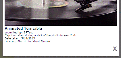
template=submitted by: {Created By}<br>Caption: {Description}<br>Date taken: {Created}<br>Location: {Location}
(enter the column names enclosed in curly braces) |
|
collin krizmanich
1/6/2016 21:09 | Is it possible to have different size thumbnails for each image? |
|
kevint
1/6/2016 22:29 | Is there any way to add additional columns to the grid display? The end user would like Title, Created By, and the Like option on the grid view. We are currently using the template to display these values after an item is clicked. any help appreciated, thanks! |
|
Juerg
1/7/2016 17:35 | collin,
do you want to use different thumbnail sizes for each picture displayed in the thumbnail grid ? Can you illustrate with a sketch (please send it to [email protected] ) ? |
|
Juerg
1/7/2016 17:37 | kevint,
we have now added the new "showauthor" option (to be entered into the web part's "Options" setting) which allows you to display the "Created By" in the thumbnail grid below each picture title.
The "showauthor" option allows you to define the label for this field as shown below:
showauthor=Created by:
Please re-download the updated Zip file, extract the WSP file and then update the web part. |
|
Jen
2/4/2016 20:00 | Hi Juerg,
This is the second or third Amrein part we're using, and we really like them, thanks. We've been using the lightbox part for a few months already, but I just noticed that in Chrome and Firefox, our images are straddling the edge of the lightbox background, so that the top half of the image is against the background, but the bottom half shows up against the regular web page. There's tons of 'unused' background above the image. Have you seen this before; can we correct it? Everything looks fine in IE.
Here's a link to see for yourself: http://annualconference.nais.org/program/stories/pages/default.aspx
Thanks!
Jen |
|
Luqman
2/23/2016 08:25 | Hye Juerg.
I am currently using the free evaluation version for SP2013.
I have successfully deployed this webpart.
Only that the issue Im facing now is on the folder navigation.
As of today, I only manage to make it work on the first folder level. When in the first folder level, the folder navigation did not change to the second level.
So here I am, stuck only to view the root images and the first folder level.
My setting is as below;
List Name: PictureLibrary/
Show Thumbnail Title: Yes
Show Download Link: Yes
Show Folder Menu: Yes
Close Popup On Link: Yes
Open Link in Lightbox Popup: Yes
Really looking forward for your reply.
This folder navigation for the picture library is really crucial for my team to move forward.
Thanks a lot! |
|
Juerg
2/23/2016 14:55 | Luqman,
the Lightbox web part does not allow to interactively drill down the folder tree (eg. it just displays the predefined folder node).
However, you might consider to connect the web part to the �Tree View� filter web part to allow the interactive selection of folders:
|
|
kevint
2/23/2016 21:23 | Is there any way to allow a user to "Like" a photo from the popup window? Have this request from a user, not sure how to proceed. Thanks! |
|
kevint
2/23/2016 21:24 | I noticed that if a user "likes" a picture from the actual sharepoint library, all likes (created by users using the grid) are reset to "1". I'm concerned that users will inadvertently access to the list and reset likes, any insight on this behavior? |
|
Juerg
2/24/2016 11:53 | Kevin,
you can enable the �Like� to also display in the lightbox popup window by adding the below option to the web part�s �Options� setting:
likeposition=2
We are aware of the issue that the Likes count is reset to 1 when a user "likes" a picture directly in the Sharepoint picture library user interface and will correct this in the web part�s next release. |
|
David Stoddard
3/16/2016 16:36 | Are There any plans to make the web part responsive? Currently when viewed on a smaller viewport the thumbnails shrink horizontally which kinda works for some of the larger tablets but when it gets down to phone size and you have like 6 thumbnails across they run off the screen. Is there a way it could be made to wrap to additional rows on smaller view ports? |
|
Juerg
3/16/2016 18:02 | David,
the Lightbox web part currently uses an HTML table for the thumbnail grid layout.
We will change this in the next major version to make the web part responsive. |
|
Juerg
3/21/2016 17:58 | Jen,
we have found the reason for this behavior (your web site allows to vertically scroll the full page) and have now added the new �scrollheight� option (to be added to the web part�s �Options� setting) to specify the vertical size of the dim background for Chrome and Firefox. We recommend to just set it to a large value (in pixels) as for example:
scrollheight=5000
Please re-download the Lightbox web part, extract the WSP file and then update the web part solution. |
|
KBT
3/22/2016 00:02 | Download link is optional (with "show download link" checkbox), would it be possible to get a setting that will set the text of the download link? |
|
Juerg
3/22/2016 11:22 | Kevin,
you can specify the text for the download link via the �download� option (to be added to the web part�s �Options� setting) as shown n the below example:
download=download this picture |
|
KBT
3/30/2016 17:15 | Is it possible to transform the href of the download link or point to another library of images for downloads?
We find ourselves in an odd usecase where we want thumbnails, medium resolution light box image and a full resolution download. |
|
Juerg
3/30/2016 17:21 | Kevin,
the download link displayed in the lightbox popup by default points to the full resolution image. |
|
KBT
3/30/2016 17:28 | Apologies, I did not explain myself very well.
We have three sizes of images: Thumbnails, Medium size, and very high resolution. We are hoping to have the lightbox display the medium size image and only deliver the large, full size if the use clicks on the "download" link.
Is such a situation possible with this web part? |
|
Juerg
3/30/2016 19:32 | Kevin,
this is currently not possible (eg. the web part always shows the full-size image in the lightbox popup). |
|
Nathan
4/1/2016 19:41 | Hi Juerg,
Is Alt Text also enabled in the Light Box webpart feature as well? i tried the solution you had for the Picture Slideshow and updated the Lightbox to the lastest version, but it looks like it isn't working. |
|
Juerg
4/3/2016 14:29 | Nathan,
although the Lightbox web part already adds the �ALT� attribute to the thumbnail images (by using either the �Title� or �Description � column), we have now also added support for also adding the �alt� attribute to the lightbox popup image and the option to specify a separate column to be used for the �ALT� text.
The web part now by default looks for a library column named �Alt� and if present, adds the text in this column. If the column is missing, it uses the text found in the �Title� column.
If you do not want to use �Alt� as the column name, you can configure the web part to use a different name via the �Options� web part setting as shown in the below example:
alt=Alternate Text
Please re-download the updated Zip file, extract the WSP file and then update the web part solution. |
|
protmaks
4/4/2016 10:48 | We also recently added the option (with version 1.1.82) to set the sort order via the �foldersort� option (to be entered into the web part�s �Options� setting).
Example:
foldersort=Name
sorts ascending folders, how to sort in descending order? |
|
Juerg
4/4/2016 11:34 | protmaks,
to sort the folders indescending order, please enter:
foldersort=Columnname desc
(eg. append �desc� to the option). |
|
Janine
4/11/2016 07:57 | First, it is a very good Webpart.
But we have one problem since we changed to SharePoint 2013. We have four web frontends and four license keys in four license.txt files. Sometimes when I open a page that contains the lightbox webpart I get a message "Invalide License Key". If I press F5 the message disappears or appears. Could you give any idea about this problem? Thank you! |
|
Juerg
4/12/2016 18:15 | Janine,
please make sure to place the License.txt file into the below folder on all 4 WFE servers:
c:\Program Files\Common Files\Microsoft Shared\Web Server Extensions\15\TEMPLATE\FEATURES\LightboxWebpart |
|
Chris
4/18/2016 16:33 | Is it possible to make the web part show the most recently added images at the top/beginning, rather than the images being displayed in the order in which they were added? |
|
Juerg
4/18/2016 17:47 | Chris,
please create a list view which sorts the pictures descending by "Created" and then enter the list view name into the web part's "View Name" setting. |
|
LJD
5/2/2016 23:49 | This is a really great solution. However, I am having a hard time getting the web part connection working. I've added the Filter='columnname' to Options and added a filter web part to the page and adding a connection is still unavailable. Can you help me with what I may be missing? |
|
Juerg
5/3/2016 12:15 | LJD,
can you quickly check the web part�s version number by opening the web part�s tool pane and looking it up at the top ? It should read 1.1.85 or higher (eg. the version where the web part connection interface was added). If your version is older, please re-download and then update the web part solution. |
|
LJD
5/6/2016 01:35 | Juerg,
Thank you for the response. We were able to get the web part connection working and are using the filter= option. Only issue i'm having now is paging is not working when i filter. The unfiltered view shows 10 pages of thumbnails (and paging is working great) but when you pass a filter value to the same web part it returns only the 1st page when it should be 5 pages. |
|
Juerg
5/9/2016 12:11 | LJD,
we have now fixed the issue when both using paging and web part filter connection.
Please re-download the updated Zip file, extract the WSP file and then update the web part solution. |
|
Ian Hawkins
8/8/2016 09:43 | We currently use the 365 Sandbox version of this webpart. Microsoft have informed us though:
"I need to bring your urgent attention to the following URL https://dev.office.com/blogs/removing-code-based-sandbox-solutions-in-sharepoint-online. This message is also listed in the message centre, but customers are being given notice that support for code-based sandbox solutions is being deprecated from SharePoint Online at the end of August. All customers are being given 30 days� notice before their solutions stop working. This message has been made public since 2014, but has been issued again in the last few days."
So it sounds like this webpart will stop working at the end of August.
What is being done so we can continue to use this webpart?
Thanks, Ian |
|
Juerg
8/8/2016 17:54 | Hi Ian,
as you noticed, Microsoft just announced (without any previous announcement) to stop supporting �sandboxed� web parts for Office365 by the end of this month (which will render our �Office365� web parts useless). The �Activation� process has already been disabled.
We are in the process of re-creating our Office365 web parts (including the Picture Lightbox web part) using the new �client web part� model. However, this process will take some time, so the web parts will become available one by one over the course of the coming months. |
|
Alex W
9/26/2016 02:12 | Hi Juerg
Could you please get the 'like it' button to integrate with the existing social features built into SharePoint so that you can see which users liked it. This will also prevent multiple likes from one user.
Thanks |
|
Juerg
9/30/2016 18:23 | Alex,
we�ll integrate the Sharepoint 2013/2016 Like functionality into the web part�s next release (scheduled for November 2016). |
|
Natalie
12/12/2016 11:35 | Hello Juerg. We are really hoping that it will be possible to use the Office365 sandboxed version. Your brilliant lightbox tool has been one that I have used for years in earlier version of SharePoint and really hope to keep using it now that we have moved to SharePoint online. Do you have any news on when that might become available? Thank you so much. Natalie |
|
Juerg
12/12/2016 20:03 | Natalie,
the new version of the Lightbox web part for Office365 is scheduled for early January 2017. |
|
Christina
12/20/2016 13:10 | Hi Juerg,
do you have integrate the Like functionality into the Webpart? And have you solve the issue that the Likes count is reset to 1 when a user "likes" a picture directly in the Sharepoint picture library user interface?
We've also noticed that after "like" with the browser refresh the likes continue to be counted.
|
|
Juerg
12/22/2016 19:33 | Natalie,
we have now released the new version of the Picture Lightbox web part for Office365 and you can download and install it (see top of this page)
Please also note the downloadable installations instructions. |
|
Yannis
1/11/2017 10:37 | Hi Juerg, I installed and activated the webpart solution (AELightboxWebpart365) in Office365 SharePoint Online. When adding the webpart to a page, I don't have the option to configure it. No ellipses in content. Just an 'Edit Snippet' link with embedded javascript code. Can you help me please? |
|
Sirus
1/18/2017 21:25 | Hi- I'm having trouble with some of the first 8-10 photos not displaying in the popup. In IE the popup just displays white, in Chrome the popup loads up the same page within the frame. There isn't a correlation with photo size, they're all .jpg, and the problem happens inconsistently for the first 8-10 photos. |
|
Sirus
1/18/2017 21:42 | Hi again- I figured out the issue, but still need your help. This same gallery is used with the banner rotator web part, and we use the URL field to link the banner to the gallery page with the light box web part. Is there any way to set this up so the light box web part ignores the URL field (which we still need for the banner rotator)? |
|
Juerg
1/19/2017 12:39 | Sirus,
we have now added the new �ignoreurl� option (to be added to the web part�s �Options� setting) to have the web part ignore the �URL� column as illustrate below
ignoreurl=1
To make use of the new option, please re-download the Zip file, extract the WSP file and then update the web part solution. |
|
Sirus
1/27/2017 18:47 | Juerg- The updated fixed my issue. Really impressed with the support here. Thanks! |
|
mariya
1/31/2017 06:38 | Is it possible to hide the "Name" underneath the each image pop-up window? |
|
Juerg
1/31/2017 11:14 | Mariya,
the lightbox popup by default displays the picture's "Title".
If no title is assigned to the picture, it will display the pictuire's filename. which can be suppressed by adding the below to the web part's "Options" setting:
showfilename=0 |
|
mariya
1/31/2017 11:28 | Hi Juerg,
Sorry to say this, Still the name is present at the bottom of the picture pop-up.
The"Title" field id empty and in the picture library VIEW only "title" and "description" enabled.
I added the showfilename=0 to the Options setting.
can you please please advice me? Thanks in advance. |
|
Juerg
1/31/2017 11:31 | Mariya,
can you quickly check the web part�s version number by opening the web part�s tool pane and looking it up at the top ? |
|
mariya
1/31/2017 11:32 | Hi Juerg
Its 1.1.87 |
|
Juerg
1/31/2017 11:36 | Mariya,
the "showfilename" option was added with version 1.1.92 in July 2015, so please re-download the web part and then update the web part solution. |
|
Mariya
1/31/2017 11:38 | Juerg,
Thanks for your help. Have a great day. |
|
Christina
2/8/2017 16:02 | Hi Juerg,
I had posted my question alreadey, but unfortunately still no answer seen. Perhaps that has gone down, so I would like to ask again.
Do you have integrate the Like functionality into the Webpart? And have you solve the issue that the Likes count is reset to 1 when a user "likes" a picture directly in the Sharepoint picture library user interface?
We've also noticed that after "like" with the browser refresh the likes continue to be counted.
Thanks, Christina |
|
Juerg
3/4/2017 17:20 | Christina and Alex,
we have now released the new version of the Picture Lightbox web part which supports the Sharepoint 2013/2016 �Like� button.
To enable the �Like� feature, please add the below �showlike� option to the web part�s �Options� setting:
showlikes=1
(you also will need to remove the �likeit� option if present)
Please re-download the Zip file, extract the WSP file and then update the web part solution. |
|
Alex W
3/5/2017 23:26 | Hi Juerg
Thanks for the update. Unfortunately, after downloading the new version and installing on SharePoint 2013 (on premise) it still doesn't work? I added the new option (and even removed all other I had) but no luck.
Regards
Alex |
|
Juerg
3/8/2017 10:00 | Alex,
we have now fixed the issue when using the �metro� option (where indeed the �Likes� feature was not enabled).
However, when taking away the �metro=1� option, the �Likes� button should display.
Please also make sure to enable the �Ratings� feature in your picture library and have set it to �Likes� (as opposed to �Star Ratings"). |
|
Jaime Soto
5/22/2017 21:55 | FYI I'm evaluating this web part. It is working with Chrome and Firefox but not with IE or EDGE. Can you tell me what can be done for this? I'm running windows 10 using SharePoint online O365, IE version 11. I've emailed support as well. |
|
Janine
9/28/2017 07:09 | Hi! Is there any planning of converting the solution in a SharePoint hosted add-in for on premise? We are trying to get rid of solutions. |
|
khurram
9/28/2017 07:46 | i am adding AE Picture Lightbox Web Part this web part but after installation its going setting but their is no working save button please give me update .. |
|
Juerg
9/28/2017 10:48 | Janine,
to avoid a farm deplyement, please download the "sandboxed Solution" and upload the WSP file to the site collection's "Solutions" gallery. |
|
Juerg
9/28/2017 10:50 | khurram;
can you send a screen shot to illustrate the issue ? |
|
Fabian
10/25/2017 14:27 | Is it possible to hide the Message"there are no items to show" on the end of the folderview? |
|
Juerg
10/25/2017 16:28 | Fabian,
you can specify a custom text by adding the below to the web part's "Options" setting:
emptymessage=your custom text |
|
Wendy
5/1/2018 15:28 | I am using this Web Part for the first time which so far is meeting my needs. However there is one file type that is not being displayed and that is the eps file format. Please advise if this is possible. Thank you! |
|
Juerg
5/1/2018 16:47 | Wendy,
Sharepoint unfortunately does not render EPS files as images.
Are you using a third-party file viewer to manage EPS files ? |
|
Wendy
5/1/2018 16:55 | I believe they are being generated by Adobe Creative Cloud. Thanks, I will figure out another way. |
|
Wendy
5/1/2018 16:57 | An issue - we are running version 1.1.97, the Options attribute doesn't seem to be working. I am specifically trying to sort the folders by entering foldersort=Name as the only option. Please advise. |
|
Juerg
5/1/2018 17:07 | Wendy,
your version does not yet support the �foldersort=Name� option.
However, you just can enter the below into the �Options� setting to refer to the �Name� column:
foldersort=FileRef |
|
Wendy
5/1/2018 17:11 | That did it, thank you! |
|
Ivan
11/12/2018 12:55 | I am trying to show content of a Picture library in LightBox, but it seems that none of Options I use are considered in LightBox...
Example,
pagercolumns=2|template=submitted by: {Created By}<br>Caption: {Description}|likeposition=2|showfilename=1|scrollheight=5000
Lightbox doesn't show pager column, template is not considered, nor likeit...
can you help?
Thxs,
Ivan
|
|
Juerg
11/12/2018 16:30 | Ivan,
please note that these options are only supported by the on-pemise version of the web part, but not by the Office 365 version. |
|
Juerg
2/20/2019 12:41 | Paul,
to filter a column by a value passed in via an URL parameter, please add the below to the web part's "Options" setting:
for exact matches:
urlfilter=ColumnName
for matches where the column value begins with the passed in value::
urlfilter=ColumnName%
for matches where the column value starts with the passed in value::
urlfilter=%ColumnName
Please note that the name of the URL parameter needs to be the column name.
Example:
urlfilter=%Title |
|
Terri
6/4/2019 20:56 | Hi! I'm using version 2.0.21. Is there a way to not show the tooltip when hovering over a picture? I use html in the title (bold, line break, etc) and the code shows up in the tooltip.
Thank you! |
|
Juerg
6/5/2019 10:52 | Terri,
we have now added the new �tooltip� option (to be added to the web part�s �Options� setting) which allows you to suppress the tooltips by adding:
tooltip=0
Please update the web part by re-downloading the Zip file, extracting the WSP file and then updating the web part solution. |
|
WDC
11/1/2019 03:05 | I have just downloaded the latest release of the Lightbox webpart for SharePoint 2010 and installed / deployed it by following your "deployment instructions" and "web part installation" instructions. I have also uploaded the "Lightbox.webpart" to web app (or site collection) and added it to a page.
However, the webpart still says it is version 1.1.44 (old version that I already had from 2013).
Should I be seeing a later version number? Am I doing something wrong with the deployment and installation?
|
|
WDC
11/1/2019 03:55 | Please ignore previous comment. You must remove solution fully from the server (via Central Admin) before deploying and installing. |
|
Esther
5/4/2022 12:57 | Hello,
since we changed to TLS we have a license error:
Trial License has expired
For over many years we had none problems with the license.
The license file exist on all front end servers.
The solution was re-deployed, same error persist.
We use the webpart since 10 years on the same Sharepoint 2013 farm without problems.
|
|
Juerg
5/9/2022 13:31 | Esther,
can you send us your current web part license key to [email protected] ?
We'll then send you a new license key (the current one seems to have expired 10 years after its purchase). |
|
Abbas
7/11/2022 10:45 | Hello Juerg
please tell me that what does the control "Thumbnail Scaling" do?
regards,
Abbas |
|
Juerg
7/11/2022 13:33 | Abbas,
this defines how the image will be displayed within the thumbnail square area:
- Thumbnail (automatically select the most suitable of the below two options)
- Cover (cover the thumbnail area which might induce some horizontal or vertical cropping)
- Contain (fit the image within the thumbnail area which might induce some horizontal or vertical borders) |
|
Abbas
7/13/2022 10:02 | Hello Juerg
My settings are as below:
List Name: Pics/
Show Thumbnail Title: Yes
Show Download Link: No
Show Folder Menu: Yes
Close Popup On Link: Yes
Open Link in Lightbox Popup: Yes
And I have the following problem:
1- It does not show the root images.
2- It only shows the pictures in the first folder level.
3- The folder navigation did not change to the second level.
Is it possible to solve these problems?
regards,
Abbas |
|
Juerg
7/13/2022 14:05 | Abbas,
this behavior actually is by design, eg. the �Show Folder Menu� setting was created to switch between first-level folders in a library.
We currently have no plans to enhance this setting since no other customer ever requested these enhancements.
|


 Great products and excellent support!


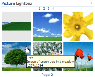


 Web Part Installation Instructions

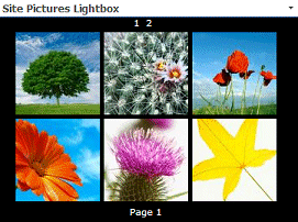
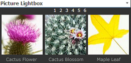
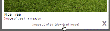
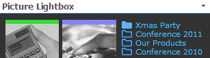
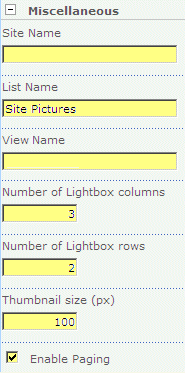
 Post a Comment