NickP
3/16/2013 21:00 | Cannot activate the solution in SP2010 on line (o365). Message :
Error
This solution contains invalid markup or elements that cannot be deployed as part of a sandboxed solution. Solution manifest for solution '656333264-0677-43ca-9132-48303d64dbfb' failed validation, file manifest.xml, line 2, character 61: The 'ResetWebServer' attribute is not declared.
|
|
Juerg
3/18/2013 11:57 | Nick,
we have now added the Office365 "sandbox" version. Please download it from this page, extract the WSP file and then upload it to the Sharepoint solutions gallery. |
|
NickP
3/24/2013 00:24 | Juerg
Excellent. Many thanks. |
|
AdrianL
4/8/2013 06:24 | Great work. 2 problems I found: (1) Adding an image (via attachment or Icon column) results in the font size for that item being ignored. (I changed the sample Menu Item CSS to 16pt). All other items had the larger text; the item with the icon had the smaller, default font size.
(2) When an icon is added it can appear outside the top left of the shaded grid. Can these icons be auto-centred by having the grid height expand accordingly? |
|
Doris
4/23/2013 01:13 | Hi Juerg. For now we are using this web part for a simple dropdown navigator (alternative to the SP 2007 "I need to..." web part).
1) It seems to not work if you re-select the entry already appearing in the window, for example, the first one in the list or if you open the dropdown then decide to pick the one already displayed. A Go button of some sort like the SP web part has may be helpful.
2) Also, it would be nice if the display shows some text such as "Choose task" instead of the first item in the list.
3) It seems the design settings are for the other menu layouts. For dropdown, are there other styles?
Thanks! |
|
Juerg
4/23/2013 13:42 | Doris,
we have now improved the web part�s �Dropdown� option:
- The dropdown box is now automatically reset after a user has made a choice
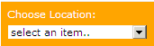
- The first entry is now blank (instead of displaying the first list item) You now also can specify a static text to be displayed via the web part�s �Header� setting (please prefix the text with a �|� pipe character).
Examples:
|select an item..
Choose Location:<br>|select an item..
- You can now use the �Menu CSS Style� setting to style the surrounding box
Example:
color:white;padding:7px;background-color:orange
and the �Menu Item CSS Style� to style the dropdown box.
Example:
border:1px solid orange;margin-top:5px Please re-download the updated Zip file, extract the WSP file and then update the web part solution. |
|
Tony Robins
5/3/2013 17:44 | Just tested the web part. I like it. Just 1 or 2 problems. I'd like to just display the URL Icon and not the title. I'd like to use a dropdown view.
cant seem to get it to do this |
|
Tony Robins
5/3/2013 18:17 | Sorted the First problem above. Found the Picture menu Web Part. Would Still Like A dropdown display though |
|
Mike H
5/6/2013 17:52 | Another great webpart. thanks! This is incredibly useful, particularly for users like me who does have access to audiences in SharePoint Foundation. |
|
DRADE
5/22/2013 19:01 | Hola muy buenas
La web part esta de maravilla pero el problema que tengo es que todos los link se abrien en una nueva pesta�a y yo quiero que se actualize la misma pesta�a en que estava, me podran ayudar porfavor?�
otro problema que tengo es que no me aparece la casilla de mostar iconos, que podre hacer para tener los iconos junto al menu�?
Saludos
DRADE |
|
Juerg
5/22/2013 19:40 | Drade,
please uncheck the "Open Links in new Window" web part setting to open the links in the same browser window.
Regarding the icons:
please either add the icons to the list via attachments or add a new List column named "Icon" to the List. |
|
DRADE
5/30/2013 09:47 | Hola muy buenas
Los textos de los menus al no tener imagen puedo editar el css para que sean mas grande o peque�o, pero cuando tengo los icono de menu, los textos se me hacen peque�os y al editar el css no se aplica, osea la fuente no cambia nada
Saludos
DRADE |
|
Charlie
5/30/2013 16:56 | Hi,
I am experiencing the same problem as Adrian. When adding an icon the font size is ignored, and by default too small.
Any fix for this?
Thanks. |
|
Juerg
5/31/2013 17:49 | Drade and Charlie,
we have now fixed the problem with the CSS style not being applied to the text when icons are enabled.
Please re-download the updated Zip file, extract the WSP file and then update the web part solution. |
|
Nate
6/18/2013 22:30 | I'm attempting to apply the CSS settings while using the flyout menu option and I am unable to do so. Something is preventing me from changing the colors of the default settings. Also, will you be posting anything about how to best program a flyout menu? |
|
Nate
6/18/2013 22:44 | Also, using the flyout menu, I want to use one folder as my top level hierarchy that would then reveal another folder that would reveal the link (Ex.: Departments > Administrative > Communications). I've tried to set it up that way, but the part appears to bring any and all folders I've created to the top level instead of leaving the subfolders I've created as subfolders. |
|
Nate
6/18/2013 22:55 | Also, using the flyout menu option and folders as the hierarchy view, the links contained within the folders are also being displayed twice: when you select the folder and below the folder. |
|
Juerg
6/24/2013 19:21 | Nate,
please note that the CSS style for both the �FlyoutMenu� and the �DropdownMenu� options are made via the �FlyoutMenu.css� and the �DropdownMenu.css� files.
Both files are located in the following folder on the Sharepoint server:
c:\Program Files\Common Files\Microsoft Shared\Web Server Extensions\14\TEMPLATE\IMAGES\AELinksWebpart
We will add a new option in the web part�s next release to alternatively keep these files in a Sharepoint Assets library.
Please also note that currently the web part only supports a single level of hierarchy. The next version will add support for multiple levels of hierarchy.
to fix the problem with the menu entries both being displayed in the submenus and also in the main menu, please specify a list view in the web part�s �View Name� setting. If you don�t want to apply a specific view, just enter the default view name of your list (as eg. �All Items� or �All Links�).
|
|
RadcliffeGB
7/3/2013 12:10 | I'm using sharepoint 2013 & server 2012 and I'm trialing the AEnavigatiorwebpart & the AEMenuWebpart .I've follwed the instruction for a Manual and Automatic Installation neither without success..I'm sure I'm doing something wrong but I don't quite know what.. |
|
Juerg
7/3/2013 12:53 | RadcliffeGB,
we recommend that you use the automatic installation (by deploying the WSP solution). Do you get a specific error message when running the install2013.bat file ? Please make sure to run the bat file from within a CMD prompt to be able to see the completion code. |
|
RadcliffeGB
7/3/2013 15:43 | I've done that several times and therether is not message just nothing happens when i look in the central admin farm solution |
|
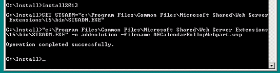
Juerg
7/3/2013 16:19 | RadcliffeGB,
did you get the "Operation completed successfully" message when running the install2013.bat file:
|
|
Matteo
7/8/2013 15:24 | Hello Amrein,
I like the grid layout option on this gadget however it would be nice if there were a variation on how the grid was built.
The "Nbr. of Columns" option is good however the gadget just tries to place the same number of items in each column kind-of.
What I would like is an option to provide you a column name on the list that has various "Categories". Then the number of columns would be determined by the number of unique values in this column, and the number of items in the column would be determined by their category value. This way you might have a different number of items in each column.
Would also be nice to optionally include the Category value as a column header.
Can the gadget do this? if not can this feature be added?
Matteo
|
|
Dave
7/8/2013 15:26 | Suggestion for improvement. Allow for a 'target' field in the list. This would allow selective use of the 'open link in new window' option.
At the moment it's only possible to open all menu items in a new window/or not. I have a requirement for only selective links to open in a new window. This improvement would prevent me from having to create 2 separate menus. |
|
Juerg
7/8/2013 20:00 | Dave,
the web part is checking if the List contains a �yes/no� column named
Open link in new window
If found, then this setting overrides the web part�s global "Open links in new window" setting and you can individually set the behavior for each list item. |
|
7/10/2013 22:04 | |
|
Paul Bedford
7/10/2013 22:11 | I am having issues with the DropDownMenu view and folders.
I have a list based of the OOB Links list to which I have added a column for icon (links to images in a Picture Library) and a Sort Order column (numeric).
I have created five folders and in each folder have varying numbers of list items.
The issues are:
1. On the main navigation I not only have the folders listed but all the list items from each folder. How do I only display folders.
2. The main navigation background is gray and the text white in a standard size and font and I cannot find a way to set CSS to make changes.
3. The items in each folder display under the correct heading but display on a red bacjground and again I cannot set CSS to make changes.
4. I want to display an icon images against each of the main navigation entries (folders) - is this possible? If so how?
5. I want to optionally make the text in the main navigation entries (folders) a URL - is this possible? If so how?
|
|
Paul Bedford
7/11/2013 21:24 | Further to my last post. Also the drop menus are displaying BEHIND page content such as web parts etc. |
|
Juerg
7/15/2013 18:49 | Paul,
- to fix the problem with the menu entries both being displayed in the submenus and also in the main menu, please specify a list view in the web part�s �View Name� setting. If you don�t want to apply a specific view, just enter the default view name of your list (as eg. �All Items� or �All Links�).
- please note that the CSS style for both the �FlyoutMenu� and the �DropdownMenu� options are made via the �FlyoutMenu.css� and the �DropdownMenu.css� files.
Both files are located in the following folder on the Sharepoint server:
c:\Program Files\Common Files\Microsoft Shared\Web Server Extensions\14\TEMPLATE\IMAGES\AELinksWebpart
Background color of main menu:
#AEDropdown {background:green}
Main Menu Text:
#AEDropdown > li > a {color:white; font:12pt Segoe UI}
- Submenu background color:
#AEDropdown > li.sub ul {background:orange}
- Icons in the main menu are currently not supported (will be added in the next release)
- Main menu entries currently cannot be linked (since they are defined using the Sharepoint �Folder� content type� which only has a �Name� field . We hope to support this in the next release.
- Please add the following line to the CSS file:
#AEDropdown > li.sub ul
{
width: 15em;
margin: 0;
padding: 0.5em 0;
list-style: none;
background: orange;
position: absolute;
top: -1000em;
z-index: 32000;
}
|
|
Brian Lukanic
7/16/2013 03:07 | Juerg,
For the Office365 version of this web part, where am I supposed to place FlyoutMenu.css and DropdownMenu.css? With the .wsp solution activated, my settings of the web part to use the dropdown or flyout simply shows the simple bulleted links, as if the .css is unable to be located. What do I need to do with these .css files to get the flyouts to work? |
|
Juerg
7/16/2013 11:39 | Brian,
please upload the �FlyoutMenu.css� and the �DropdownMenu.css� files (both files are contained in the Zip download) to the �Site Assets� library in your top site and then enter the following into the web part�s �Menu CSS Style� setting:
SiteAssets/FlyoutMenu.css
or
SiteAssets/DropdownMenu.css
(depending on which menu layout you are using). |
|
George
7/16/2013 14:50 | I am using SharePoint 2013 Enterprise. I tried to upload and activate Navigator Menu Web Part (SharePoint 2013 Version), it did not activate.
Then, I tried to upload and activate Navigator Menu Web Part (Office365 Version), it activated successfully.
But, when I try to use it on a SharePoint page, it comes up with an error : Unhandled exception was thrown by the sandboxed code wrapper's Execute method in the partial trust app domain: Cannot import the AE Navigator Web Part
Please help me to solve this issue.
Thanks. |
|
Juerg
7/16/2013 15:18 | George,
please delete the farm version you uploaded from the solution gallery. |
|
George
7/16/2013 15:22 | So, how can I install it on the site ?
Many Thanks. |
|
George
7/16/2013 16:13 | Juerg,
For SharePoint 2013, can you please explain to me, how can I activate and use Navigation Web Part ?
I tried all the possible options, but cant get to work.
Thanks. |
|
Juerg
7/16/2013 16:27 | George,
the problem occurs since you first uploaded the farm version to the solution gallery. Please thus deactivate and then delete both files in the solution gallery and then re-upload the Office365 version of the web part. |
|
George
7/16/2013 16:31 | Juerg,
Thanks for reply.
I tried the solution you gave, but it still did not work.
Can you please guide me ?
Thanks. |
|
Juerg
7/16/2013 16:36 | George,
are you using a hosted Sharepoint 2013 environment (as for example Office365) ?
If not, we recommend that you deactivate and delete the sandbox solution in the solution gallery, download the farm version from this page (first option) and then install it as described in the "Web Part Installation Instructions" PDF file. |
|
George
7/17/2013 08:06 | Juerg,
Thanks for reply.
I am using SharePoint 2013 Enterprise.
I tried to upload and activate the first webpart on this page, but it did not activate successfully.
Then, I tried office 365 version, it installed successfully, but cant use it because of the errors I mentioned. |
|
jim
8/2/2013 19:16 | Can the corners be round at the top let and right?
Also can this be put in the place where the normal menu would appear in SharePoint? |
|
Juerg
8/12/2013 16:14 | Jim,
you actually can use the following CSS styles in the web part�s �Menu Item CSS Style� setting to create top-left and top-right rounded corners (albeit this only works for modern browsers supporting CSS 3, so it will not work in IE7 and IE8):
Example:
padding:2px;background-color:orange;color:white;font:10pt Segoe UI;width:140px;text-align:center;border-top-left-radius:7px;border-top-right-radius: 7px
 |
|
Brian
8/20/2013 19:57 | Juerg,
Is there an ability to have a description along with the title?
Also, is there any way to modify the <a tag the URL gets placed into? I'd like to apply different classes or attributes to the URL (ie. using Colorbox)
Thanks |
|
Cindy Zhang
8/24/2013 00:51 | Defined Highlight Color, looks like not working (still red when hovering on). Any solution? |
|
Juerg
8/26/2013 14:47 | Cindy,
what exactly did you enter into the web part's "Highlight Color" setting ? |
|
Cindy Zhang
8/26/2013 18:32 | Hi Juery, I tried both #rrggbb and HTML color name for "Highlight Color". Still default Red color is applied when hovering over the text link. Anything I missed? |
|
Juerg
8/27/2013 17:25 | Cindy,
do you have more than one Navigator web part placed on the same page ?
If yes, then the second web part's "Highlight Color" setting is also applied to the first web part. |
|
Cindy Zhnag
8/28/2013 08:07 | Hi Juery:
I do have more than Navigator web part in the same page. Then the second web part's "Highlight Color" setting is also applied to the first web part, this is interesting! Is this By Design?
Anyway, now I can change the Highlight color. Thanks!
Cindy |
|
Shan
8/30/2013 16:39 | Can't figure out how to get the tiles to be different colors like i nthe example under Icon Layout in the Installation Instructions section above. My Icons are part of my list item. I made them all the same color as the background color. Thanks for any help. |
|
Juerg
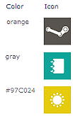
8/31/2013 11:54 | Shan,
to assign indivudual colors to each menu item, please add a new column named "Color" to your list and then enter either the HTML color names or the #RRGGBB color values.
|
|
Juerg
9/3/2013 14:31 | Brian,
if your List contains a list column named �Notes�, then the content of the �Notes� field is displayed as a tooltip when hovering over the menu item.
Also, the web part actually assigns the �AELinkUrl� CSS class to the �a href� tag. |
|
Christine
9/10/2013 09:05 | Is there a way to align the menu items to the top as apposed to the middle? I've tried using valign:top in the various CSS Styles with no effect. |
|
Christine
9/10/2013 09:23 | vertical-align:text-top worked |
|
Nate
9/10/2013 15:57 | Juerg:
I am using the flyout menu and I want the menu items to be displayed in a specific order. I created a new view and put the name of that view in the "Display View" field. However, the webpart is not displaying the items as they are in the view. The webpart appears to be displaying the items by ID. Do you know how I can resolve this?
Thanks,
Nate |
|
KirstenW
9/10/2013 16:18 | We are using this successfully, but there is one odd glitch: Sort Order. Even though the view we have listed in the Web Part is sorted by URL, the order of the items in the list seems to stick sorted by ID. This is a problem when making changes to the menu as things don't stay in alphabetical order. What are we missing? |
|
Juerg
9/10/2013 19:54 | Nate and Kirsten,
we noticed that the items contained in the folders were not sorted according to the view in version 1.1.11, but this was fixed with version 1.1.14
Please thus re-download the current version, extract the WSP file and then update the web part solution. |
|
Neil
9/11/2013 11:37 | I cant get this web part to inherit the sort order from the view. Is there a solution for this ? I want to sort folders, items by a column, I have specified sort order in the default view, but it doesn't work in the web part. |
|
Neil
9/13/2013 08:17 | Can anyone help me ?
Thanks in advance. |
|
Juerg
9/13/2013 10:38 | Neil,
can you quickly check the web part�s version number by opening the web part�s tool pane and looking it up at the top ? If your version is older than 1.1.14, please download the current version and then update the web part.
Please note that the folders are not sortable if you use the "Links" list template, so we recommend to use a list based on the "Custom" list template. |
|
Neil
9/13/2013 12:12 | Hi Juerg,
I am using the latest version of Web part. I am integrated document library with this web part. will it inherit sort order from document library view ?
Thanks for your help. |
|
Juerg
9/13/2013 14:34 | Neil,
it currently does not (the folder are always sorted by ID, eg. in the order they were created). Would you like to have the folders sorted by name or as defined in the List View ? |
|
Neil
9/14/2013 10:21 | Hi Juerg,
Thanks for reply.
I have defined sort order in document library by a column.
I would like the same sort order in the web part display.
|
|
Neil
9/16/2013 10:38 | Hi Juerg,
Is this possible to achieve - sort order same as in a document library view ?
Thanks. |
|
Juerg
9/16/2013 11:29 | Neil,
did you create a new Folder content type to add a sort column to your library folders ? |
|
Neil
9/16/2013 11:55 | Yes, I created folder content type and added sort order column to sort by that column. it works in library view, but not in web part.
Can you please help me on this ? |
|
Juerg
9/16/2013 15:28 | Neil,
we have now adapated the web part to reflect the folder sort order when specifying a List View.
Please re-download the current version, extract the WSP file and then update the web part solution. |
|
Neil
9/16/2013 15:43 | Thank you Juerg,
I will update the web part to the latest version and test it. |
|
Kirsten W
9/17/2013 21:59 | Hi Juerg,
We were having the same problem (more or less) as Neil, and so I updated our webpart to get the fix as described.
It does appear to work, but we were distressed to see that the existing flyout menus we built no longer work. We are not Live yet with our new site, so it wasn't the end of the world, but just wanted you to know so you could give that caution to others that they might want to have their lists already rebuilt as Custom Lists to make the post-update downtime shorter. |
|
Blake
9/17/2013 23:01 | What type of list should this pull from, and how should it be setup for use with the FlyoutMenu?
I've tried various lists/columns/folder structures but the FlyoutMenu always ends up looking like a bulletted list with no flyout, i.e.:
Menu1
-Submenu1
Menu2
-Submenu2
-Sub-Submenu2 |
|
Kirsten W
9/18/2013 00:28 | Well, FWIW, this is how we did it.
1. Use Custom List (not Links list if you are going to use folders for a multilevel flyout)
2. IMPORTANT - DO NOT CHANGE THE NAME OF THE LIST IN Title Description and Icon, or it will not display on the webpart (this seems to be new in v16)
3. Adv Settings - Make New Folder = YES
4. Add also a Hyperlink column called �URL�
5. Make the view you want to use sorted by Title (doesn't matter what columns you put in it)
6. Create each item with the same value in Title and URL (descr)
7. Add to the AE Navigator webpart and it will work now
(Top Level Hierarchy = Folders) |
|
Blake
9/18/2013 16:58 | @KirstenW
I've followed the steps you outlined, but I get the same results. After creating the custom list (named Testing), and checking YES to 'Make New Folder' I created a hyperlink column named URL, and a single text line column named Description and sorted the list by Title.
Then I started adding new items:
1st Item: Title - Business Forms; URL Web Address points to a folder (Folder1) in a document library on same site; URL Description - Business Forms; Description - Business Forms
2nd Item: Title - HR Forms; URL Web Address points to a folder (Folder2) in same document library; URL Description - HR Forms; Description - HR Forms
3rd Item: Title - HR Forms; URL Web Address points to a folder (SubFolderA in Folder2) in same document library; URL Description - HR Forms; Description - Misc
4th Item: Title - HR Forms; URL Web Address points to a folder (SubFolderB in Folder2) in same document library; URL Description - HR Forms; Description - Payroll
When adding the Navigator webpart, I use the following settings:
Site Name: leave blank, since it's a page on the same site
List Name: Testing
View Name: All Items
Link Title Field Name: Title
Link URL Field Name: URL
Menu Layout: FlyoutMenu
Top Level Hierarchy: Folders
The rest I leave default.
This is what the webpart looks like:
Business Forms
HR Forms
HR Forms
HR Forms |
|
Blake
9/18/2013 18:20 | @KristenW
Been working with Juerg, and it looks to be an Internet Explorer issue not a webpart issue. Thanks for the help! |
|
John
9/29/2013 05:53 | The background menu hover color can be specified with "Highlight Color". Can the text foreground hover color be set? I want it to be different from the normal text color. |
|
Juerg
9/30/2013 13:21 | John,
we have now added the option toa also specify a foreground hover color by enter both the background and the foreground hover color into the web part's "Highlight Color" setting, separated by a semicolon.
Example:
red;green
Please re-download the current version, extract the WSP file and then update the web part solution. |
|
Stacy
10/11/2013 16:57 | If I want to security trim the list and I add the group column as stated above, will it automatically detect the permission? I have a list of team sites and I only want my users to see where they have access to. |
|
Juerg
10/11/2013 19:37 | Stacy,
yes, if you enter a Sharepoint group or an AD group into the "Group" field, the menu item will only be displayed for users belonging to this group. |
|
Quyen
11/6/2013 08:48 | Hi J�rg,
in IE I get this error: the submenu disappears when I move mouse away from the main menu down to the submenu.
The error does not occur in Chrome, but since the company is using IE, I have to get it work for IE.
Any idea how to fix it?
Thanks, Quyen |
|
Juerg
11/6/2013 10:49 | Quyen,
we tested with IE8, IE9 and IE10 on SP2010 and SP2013 and it seems to work fine.
Could it be that your main menu is too long and wraps to a second line ? |
|
Raffi
11/7/2013 20:28 | Hi Juerg,
I was wondering if there was a way to add an option to have a "GO" button to launch links, either text or an arrow to the right of the drop down list when Menu Layout = DropDownBox. The issue is that iPad's do not respect the drop down selection and will not launch the destination page/file when you select it. This iPad issue is not specific to your web part, just drop down menus in general. We are using version 1.1.11 of your web part.
Thanks. |
|
Juerg
11/13/2013 11:34 | Raffi,
we checked on an iPad 3 and when you select an item from the Navigator dropdown box, the link is opened as expected.
Which version if iOS are you using ?
|
|
Kong
12/4/2013 17:30 | I'm using the flyout menu and for some reason I cannot change the default colors. I have copied the flyoutmenu.css file Site Assets and referenced it in the Menu CSS Style section as described in the instructions. When doing so, the menu turns to the list layout and looses the css. I'm not sure what's going on. Help? |
|
Juerg
12/5/2013 16:41 | Kong,
are you using the Office365 version or the farm version of the web part ? |
|
Kong
12/5/2013 17:41 | Juerg,
I'm using it as the farm version deployed on a SP2013 environment. |
|
Natasha
12/5/2013 20:42 | Has anyone experienced the following?
I am testing out this web part. I incorrectly installed the sandbox solution on my SharePoint Server 2010 environment. I then deactivated and removed the sandboxed solution. I then downloaded the farm solution, ran the install on my WFE, and deployed in CA. When I go to site collection features to activate I don't see 'AE Links webpart', I see an 'AE Navigator' web part. I activate this but when I select the AE NAvigator web part to add on my page get error message that it does not exist.
I have deactivated, retracted, removed and reinstalled the solution several times but I don't see a feature or webpart for AE Links and this AE Navigator feature and web part remains.
Can you help?
Thanks.
Natasha. |
|
Alex
12/6/2013 12:26 | Natasha,
apart from deactivating/deleting the sandboxed solution (and in your case also the farm solution) you would also need to delete the AELinks.webpart file (Web parts under Web Designer Galleries) before installing the farm solution. |
|
SonicVader
12/10/2013 06:37 | Would be nice if you would update the description to explain how to do a multilevel vertical menu. I had to read the user comments to find out you need to fill in the view parameter otherwise items in folders will display on the top level as will as their own level. Ah well, at least there is a user comment that saves the day.... |
|
Kishanth
12/13/2013 15:58 | Hello, does this WebPart support Multilingual Navigation on SPO365 for a PublicFacing Website? |
|
Juerg
12/16/2013 13:17 | Kishant,
would you like to be able to have the web part display text (as displayed via the "LInk Title Field Name") dependent on the user's current language (Sharepooint MUI setting) ? |
|
AldoJam
12/27/2013 19:22 | Hi, we're testing this out and it works very well! Only question is how can I change the color of a grid item if I'm on the page it's supposed to be at...the Active Item Color property seems to be the solution but the description says something about "if used as a filter"...any examples or suggestions would be greatly appreciated!
Thanks. |
|
Juerg
12/27/2013 20:03 | AldoJam,
did you configure the menu as a FlyoutMenu/DropdownMenu or "vertical" or "horizontal" ?
If you use the web part as a menu to navigate to other pages, then the "Highlight Color" setting has no effect since you are navigating away from the current page whereas if you use the web part as a filter, then you stay on the same page and the web part uses the "Highlight Color" to indicate the active selection. |
|
marina
1/9/2014 08:38 | Hello,
Is it cross-SC and cross-WA solution?
What is the max number of items per menu? How many sub-menu levels dows it support? |
|
Juerg
1/9/2014 17:49 | marina,
you can actually enter an http:// URL into the web part's "Site Name" setting to reach across site collections. You also can reach across web applications if the proper permissions are set up.
The web part current supports two levels of sub menus:
|
|
Cindy
2/4/2014 10:45 | I have the same question as Matteo. Any progress on that option? Thank you. |
|
Juerg
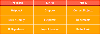
2/5/2014 20:10 | Cindy,
we have now added the new option to manually specify column headers via the web part�s �Options� setting.
The below example was created by entering the following into the �Options� setting:
columnheaders=Projects;Links;Misc.|columnheaderstyle=background-color:tomato;color:white;padding:4px;border-bottom:3px solid brown
If the new option seems to be useful for you, then please re-download the new version, extract the WSP file and then update the web part solution. |
|
David
2/17/2014 01:35 | Hi
I am testing the web part as a fly out "drop down menu" but cannot chage the default colurs. I have tried to use a color column alter the menu item, menu section ections of the webpart with no success. |
|
David
2/17/2014 02:03 | Hi I am also struggling to control where the links sit. I have created a "title" column and entered titles for various itmes to sit under. However they are all being displayed at the top level. I have entered "title" into the "Link Title Field Name" area. |
|
David
2/17/2014 02:48 | Hi I've been able to resolve my issue "struggling to control where the links sit. I have created a "title" column and entered titles for various itmes to sit under. However they are all being displayed at the top level. I have entered "title" into the "Link Title Field Name" area."
However I would like the option to have an image included with the top menu item. How can I do this? |
|
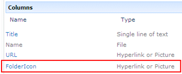
Juerg
2/17/2014 18:27 | David,
we have now added the new option to also assign images to the folders.
You will need to first create a new folder content type based on the �Folder� parent content type and then add a new column named �FolderIcon� (of type �Hyperlink or Picture�) to the new content type:
You also might add an �URL� column if you intend to add links to the folder.
Please then �allow management of content types� in your Sharepoint list and add the newly created folder content type to your list.
You then will need to create your folders based on this content type.
To modify the background color of the Flyout or dropdown menu, please make a copy of the corresponding CSS file as found in the downloadable Zip file, edit the CSS file to assign different background colors:
- Top menu bar: #AEDropdown { background..}
- Submenu: #AEDropdown ul { background..}
and then upload the CSS file to a suitable Sharepoint library as foe example the �Site Assets� library.
Please then enter the relative URL of the uploaded CSS file into the web part�s �Menu CSS Style� setting.
Example:
/sites/SiteAssets/DropdownMenu.css
Please re-download the updated web part and then update the web part solution. |
|
David
2/21/2014 06:13 | how may I make the drop down menu spread evenly out across the 'zone' it is in? I would like to have an icon and text left alighed or centred in each top menu with the top memus spread evenly across the zone the layout would include sub menus. |
|
Juerg
2/21/2014 19:15 | Dave,
there is no single way to use CSS to style the menu your way for all browsers, but modern browser support the below option (by adding the below styles to the corresponding selectors in the DropdownMenu.css file):
#AEDropdown ul
{
display:table;
width:100%;
}
#AEDropdown li
{
display:table-cell;
text-align:center;
} |
|
David
3/4/2014 03:11 | Hi Juerg
My tech team have installed the new version as you kindly provided on the 2/17/2014. I have set up a new folder type called "IconFolder", added the extra columns and turned on allow management of content types on the list however I cannot see the option to create an "IconFolder" so that I may attach pictures to the menu. I appreciate this may be outside of the scope of the assistance provided for this webpart but would appreciate some help / guidance. |
|
BenJ
4/3/2014 23:23 | Will your filter web part work with this navigator webpart? I am using the vertical menu layout and would like to filter the items based upon a column in the underlying list. The web part connection doesn't appear to be giving me this option. |
|
Juerg
4/4/2014 17:13 | BenJ,
you actually can use a Filter web part (as for example our Filter web part) to either select the underlying list or the underying list view used by the Navigator web part. In this case please enter
[filter]
instead of the llist name or the view name into the corresponding web part property. |
|
MichaelS
5/12/2014 10:00 | Hello
We cannot seem to get the navigational links to work with Firefox or Safari. It works fine in all the versions of IE we have tried.
In Firefox and Safari, instead of the link from the list, all links appear to be the url of the page on which the webpart resides.
Is there a resolution for this, please? |
|
Juerg
5/13/2014 18:18 | Michael,
your version is quite old (the current version is 1.1.32)
We thus recommend that you re-download the web part, extract the WSP solution file and then update the web part solution. |
|
MikeZz
5/22/2014 20:41 | I noticed back on July 16, 2013 post, you mention you can call a css file from the site's Asset library to apply standardized css across many parts on the Menu CSS Style setting.
Is there a way to call a simple CSS file to apply to just the Menu Item CSS Style? Or is there a template css file that has all the web part property options for the "Horizontal" option?
I tried just creating a test.css file with this in it but it didn't work:
Menu Item CSS Style property is: SiteAssets/test.css
CSS File Content:
{
text-align:left;padding:10px;padding:2px;background-color:#1260AA;color:#023FCD;font:10pt segoe ui;width:150px;border-spacing:3px
}
One thing to note: I still have these other properties set on the webpart... maybe there is a conflict:
Highlight Color: #303030
Active Item Colur: #303030
Thanks! |
|
MikeZz
5/22/2014 20:50 | Actually it would be kind of nice to have a single CSS file to call for all the menu settings of the part. I'm currently trying to use the Horizontal menu but have also considered the Grid one as well.
I'm not sure what takes precedance but I'm also using the "Color" Column on my list just to try it out on some items. It seems to work when I just use the hard-coded properties but goes bad when I try to call the CSS file.
Thanks again! |
|
Calin
5/23/2014 12:46 | Hello, i tried to aply a CSS on the Menu Flyout, and my buttons became a list.
I checked the page source and the problem is that istead of going to the site assets for the file it goes to "/_layouts/images/AELinksWebpart/SiteAssets/Forms/FlyoutMenu1.css
"
I tried to modify the path in "Menu CSS Style" in all posible ways, but i cannot make it point to the site assets library.
Note: we are using the version 1.1.24 - in this version we cannot apply the CSS?
|
|
Juerg
5/23/2014 17:48 | Calin,
please update the web part solution since we've added support for the CSS file being stored in a Sharpeoint library after version 1.1.24 (the current version is 1.1.32). |
|
Juerg
5/26/2014 16:36 | Mike,
we have now added the option to also specify a CSS file (replacing the web part�s �Menu CSS Style�, �Menu Item CSS Style�, �Menu Section CSS Style� and �Highlight Color� settings) in the web part�s �Menu CSS Style� setting for the "Horizontal", "Vertical", "Grid" and "List" menu layout options.
Example:
SiteAssets/Horizontal.css
Horizontal.css
The second example (no path given) expects the CSS file at the below location on the Sharepoint server:
c:\Program Files\Common Files\Microsoft Shared\Web Server Extensions\14\TEMPLATE\IMAGES\AELinksWebpart
Please see below an example of a CSS file:
.AELinkContainer {border-spacing:2px;border-collapse:separate}
.AELinkCell {text-align:left;padding:4px;background-color:red;color:white;font-size:10pt !important;font-family:Segoe UI !important;width:100px;height:35px}
.AELinkUrl {color:white !important}
td.aehilite:hover {background-color:black !important}
Please re-download the updated web part, extract the WSP solution file and then update the web part solution. |
|
MikeZz
5/28/2014 15:12 | Hi Juerg,
Do the "Folders" for the Dropdown Menu have to be Out of the Box Folders (Created with the "New Folder" button)? Or can they be custom content types based on the Item>Folder content type?
We're trying to use a column to filter the folders and items so that we can have a single master list of menu items for the collection.... then just call filtered views depending on the location of the menu.
When trying this approach, we don't see the folders when calling the views from a subsite and were just wondering if this is why. (yes were still running v1.24 but be updating in the next couple weeks to the latest version).
Thanks, Mike |
|
Juerg
5/30/2014 16:01 | MikeZz,
you can actually use custom content type based folders instead fo the regular folders to create the menu hierarchy (as this allows you to add custom columns to the folders like the "Icon" or "Color" column etc.).
Please make sure to use a recent version of the Navigator web part. |
|
RobinD
6/12/2014 17:22 | I am using the Grid layout, but what I really want is to group the icons in my Grid layout by a Location field. So for example, show 3 icons for Location A, 4 icons for Location B, etc. Is this possible? Thanks! |
|
Juerg
6/12/2014 17:54 | RobinD,
would you want to display the grouped items horizontally or vertically (eg. a row or a column for each group) ? |
|
RobinD
6/12/2014 23:34 | Ideally I'd like to have one row per Location. |
|
Juerg
6/17/2014 19:48 | RobinD,
would the below layout be correct (one row per group containing a varying number of items) ?
If yes, would you also need to display a label for each group ?
|
|
RobinD
6/17/2014 20:41 | Yes, that's it exactly. Variable number of items, and a label (in this case the specific Location name) above each row of items. |
|
Juerg
6/19/2014 16:34 | RobinD,
we have now added the new "groupby" option (to be entered into the web part's "Options" setting) which allows you to specify the name of the column to group the menu items.
Example:
groupby=Location
Please also make sure to sort your list view by this column (and also enter the list view name into the web part's "View Name" setting).
|
|
Catharine White
6/27/2014 16:49 | I would like to have a Navigation which could be connected to a filter web part.
Eg. Options displayed on the navigation would change dependent on the selection from a filter. I have a list which contains a large number of documents/links which I can use for navigation. I have a column in the list which determines what �type� of document it is. I need to have a web page which shows type A items and another which shows type B items. I can achieve this with multiple web pages (i.e. one per type) But as all other items on the page are the same, it would be much more efficient to have a filter which the user can select from, and that value passed to the navigation
Is that feasible ?
|
|
Juerg
6/27/2014 19:22 | Catharine,
the Navigator web part can be connected to a Filter web part (as for example our free �Filter� we part). The filter value can be used to either select a specific Sharepoint List or a specific Sharepoint List View.
You thus would have to create a separate List View for each type of document and then enter
[filter]
into the web part�s �View Name� setting.
This forces the web part to use the view transmitted by the connected Filter web part. |
|
Catharine
6/30/2014 11:12 | Hi Juerg,
Thank you for the information about [filter]. That works fine - but doesn't quite fill my requirement, I simplified it for this forum.
In my library there are(multiple) documents which are for role X of type A,B orC
and for role Y of type A,B or C
I need the user to select the role, and then navigation items of type A be displayed together under a heading and type B displayed together etc.
I have just downloaded the latest version with the group by and this with the filter (almost) does what I need with one view. My screen real estate is narrow and deep - so I would like to be able to control the number of columns with the group by. Is that feasible ?
If not I have to have 3 different navigators on each page - each controlled by a different view - and I don't know how 1 filter could do that |
|
Juerg
6/30/2014 21:26 | Catharine,
we have now added the new �groupybycolumns� option to specify the max. number of columns (to be added to the �Options� web part setting).
Example:
groupby=Location|groupbycolumns=2
Please re-download the updated web part, extract the WSP solution file and then update the web part solution. |
|
David
7/3/2014 02:40 | Hi Juerg
I am hoping you may be able to assist with a couple of things. We have noticed that the web part appears to not screen reader compliant, when used as a drop down menu and accessed through the keyboard. Is it possible to have the web part keyboard accessible?
We have also noticed the sub menu items cannot be accessed if the drop down menus extends across zones. For example the submenu items appear to be chopped off where the top zone ends and the below three column zones being. Is it possible to have the menus hover across all zones used on a template?
We are using the web part version from February 2014.
Warm regards
Dave |
|
MikeZz
7/3/2014 15:43 | Can you please provide a copy of the CSS file your using for your grid option? The only way I can seem to impact the grid part is by specifically adding a color column to the list and putting colors in it.
Other than that, I always get a red box with blue text even if I put something in the CSS properties of the webpart or if I just call my CSS file for the DropdownMenu part.
Thanks |
|
Juerg
7/9/2014 19:19 | MikeZz,
the �Grid� layout does not use a default CSS style sheet (unless you add the URL of a CSS file to the web part�s �Menu CSS Style� setting).
You can style the grid boxes via the web part�s �Menu Item CSS Style� setting.
Example:
text-align:center;padding:2px;background-color:orange;width:130px;height:30px;color:white |
|
Juerg
7/11/2014 19:27 | David,
we will check if we can add keyboard support for the dropdown menu in the next major version.
We also now found a solution to the problem with the dropdown menus being clipped by the surrounding web part zone.
To fix this issue, please enter the below into the web part�s �Options� setting:
css=.ms-rte-layoutszone-inner {overflow:visible !important} |
|
Matteo
7/21/2014 05:54 | Hello Juerg
a couple of items
1) Groupby
- This is a great feature and almost answers my question from 7/8/2013 15:24
- You have shown examples of the group by display operation in an a horizontal row like fashion
- Is it also possible to do it in a column or vertical fashion? If so how do you do this
2) "Grid" Menu layout with Metrics
- I saw that you have one example called "Grid" Menu layout with Metrics in the documentation
- However i did not see how you use this or identify what data points are the "Metrics".
- Can you provide a sample config of the web part properties to demonstrate this?
- Can this gadget, or do you have another gadget, that can operation like a "live Tile" as i have seen in many a Metro interface Demo?
Thanks
Matteo |
|
Juerg
7/21/2014 13:45 | Matteo,
- yes, you can group the links in a vertical layout. Please see my post dating from June 30
- �Metrics�:
The web part allows to define a list (and an optional list view) which is then used to display the count of items in the specified list view.
To use this feature, please add a new column named �Metrics� (of type �Hyperlink or Picture�) to the list used by the Navigator web part and then add the full URL of the list or list view into this column.
Examples:
http://domain/Shared%20Documents/Forms/New%20Documents.aspx
http://domain/Somesite/Lists/Tasks/AllItems.aspx
- Would you like to have a new option that slides in the link description from the bottom of the tile similar to the Sharepoint 2013 tiles ?
|
|
Keith Phillips
7/22/2014 16:47 | We are trying to use this web part to replace the tabs that you get on a new search page and we're having a couple of issues:
1. when I put in the name of the Tabs folder "Tabs in Search Results" in the web part the web part doesn't find it on some of the search result pages.
2. when I search the page changes to a search results page, with the std search page if I have the tabs configured I could click on a tab and it would show me the search results for the content source that was configured with the tab without having to type in the search criteria again.
I.E. I do a All Site search for the word DEED and I get 100000 hits, I then click on the tab DADE and I get the search reduced to only show DADE DEEDs
Let me know if we are trying to get to much out of the web part or if there is a configuration setting we are missing.
Thx |
|
MikeZz
7/23/2014 23:11 | I'd like to have some Title Text on the same line as the Navigator Webpart but it always forces a new line.
Is there a way through standard CSS in the webpart CSS file or a seperate one in a content editor that we can force the web part to align like you can with photos? I can't recall the CSS property but maybe float , align or block. |
|
MikeZz
7/23/2014 23:14 | I just noticed a setting that I had not tried before but like:
"To security trim the links, please add a column named "Group" (of type "Person or Group")"
I tried successfully (even with multi-groups in the column -Thanks!).
Is there a way to also have this work on folders? During my testing, I was only able to hide items in folders but not the folders themselves.
Thanks again because this feature will prevent a lot of issues with people asking for permissions to places they don't need.
Best Regards! |
|
Catharine
7/24/2014 11:41 | Hi Juerg,
I have been asked if it is possible to have a line of text appear when you hover over a navigation option - something that gives a bit more information about the option. e.g.We have a navigation which has job roles as the menu options... the users would like to see a brief description of each job role as they hover over the option.
Is there an option for that ? |
|
Juerg
7/24/2014 11:55 | Catharina,
if you place text into the �Notes" column (assuming that you are using a List based on the �Links� list template, otherwise please add a new column named �Notes� to your List), then the text will appear as a menu tooltip when hovering over the menu item. |
|
Juerg
7/24/2014 15:44 | MikeZz,
- We have now added the option to display the header text (as entered into the web part�s �Header� setting also when using the dropdown or flyout menu layout option:
To position the header left to the menu bar, enter (or add) the below into the web part�s �Options� setting as shown in the below example:
css=.AELinkHeader {float:left;padding:5px;background-color:tomato;height:50px;color:white}
- The new release now also applies security trimming to the folders (albeit only when specifying a Sharepoint group).
Please re-download the updated Zip file, extract the WSP file and then update the web part solution. |
|
Juerg
7/25/2014 15:45 | Keith,
can you illustrate the problem with a screen shot ?
Also, are you on Sharepoint 2010 or 2013 ? |
|
Bill Dewey
8/12/2014 18:04 | Problem with Open Link in New Window for DropDown Box. I have tried this also with a column named "Open link in new window" as noted above, set to "Yes", but I cannot get the Open Link in New Window to open either using the option in the Webpart or the column. It works as expected with the other menu types. I did not see any reference to this, but may have missed it, is there a reason this will not work with DropDown Box? Thanks. |
|
Juerg
8/13/2014 14:14 | Bill,
we have now fixed this issue (DropdownBox in combination with the �Open link in new window� list column).
Please re-download the updated Zip file, extract the WSP file and then update the web part solution. |
|
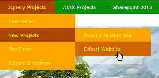
Thomas
8/25/2014 12:11 | We want to use the FlyOut Menu in a SP2013 Foundation. The Navigation list itself is based on custom Folders with a URL column. We have 3 Levels. The first Level should be displayed always, the second and third only when there are subfolders there. But it seems that Level 3 is always displayed if a Level 2 is displayed. For example:
If i mouseover on Level 1, then Level 2 should be displayed. if i then mouseover on this Level 2, then Level 3 should be displayed. But right now, if i mouseover Level 1, i see the Level 2 AND Level 3 of this.
- Level 1
- Level 2
- Level 3
I already use a specific list view "Alle Elemente". What should i change ?
|
|
Juerg
8/27/2014 11:40 | Thomas,
we fixed the problem by updating the "FlyoutMenu.css" file.
Please re-download the Zip file, extract the FlyoutMen.css file and then place it in the below folder on the Sharepoint web front end server(s):
c:\Program Files\Common Files\Microsoft Shared\Web Server Extensions\14\TEMPLATE\IMAGES\AELinksWebpart |
|
Bill Dewey
9/5/2014 17:40 | Security Trimming - might it be possible in the future to add a feature whereby this could be controlled by a list, rather than a SharePoint or AD Group? The situation is that I have a list of doctors with a column which designates their home site. We have navigation items that are specific to each home site, which should only be visible to the doctors of that home site. At present I have to create a security group for each site adding the doctors to the group. It would be really convenient if I could just point to the appropriate view from the list we already currently maintain. I realize this may not be possible, but I figure it can't hurt to ask! Every time I use this part I find some new use, thanks again for doing such a great job. |
|
Juerg
9/8/2014 13:31 | Bill,
this indeed would be a very specific addition to the Navigator web part.
An alternate approach would be to populate the �Web site� Sharepoint User profile property (assuming that you have provisioned the Use Profile Service) with the user�s home site URL.
The Navigator web part could then compare the current site URL with the URL placed in the current user�s �Web site� URL to security trim the menu. |
|
Catharine
10/30/2014 12:46 | Hi Juerg,
I am using the grid style of navigator, with groupby. Works really well. I would like to apply some style to the Groupby headings but cannot work out where I would add that.
Also I love the Tile look you show in your examples - how do I make the menu options deeper to achieve that ? (Sorry my CSS is basic - though growing !) |
|
Monica
12/17/2014 10:42 | I have created a new Content Type based on Folder but I get an error message in the web part when selecting Flyout or Dropdown. The other layouts work fine and I get no error message.
I tried to create a Content Type with only the standard columns and if I leave it like that the web part works but if I create a new column in the new Content Type and create folders in the list based on the content type I I will get this error message in the webpart: Folder error: Value does not fall within the expected range.
Any ideas on what I might have done wrong. |
|
Carolyn
2/6/2015 02:00 | I love this webpart. I use the horizontal layout often. The menu always appears on the left. In some cases with a lot of menu items the is ok. In other cases we would like to center the whole menu. How can I do that? |
|
Juerg
2/6/2015 14:54 | Carolyn,
to center the Navigator web part , please place the below into the web part�s �Options� setting:
css=.AELinkContainer {margin-left:auto;margin-right:auto} |
|
Darryl
3/3/2015 22:28 | Juerg, is it possible to have multiple links for a single icon? For example, we'd like to use this to list our applications. The icon could link to the application, and then we would want a link for each to show more information in a modal window and another to show support details in a modal window. Would that be feasible, or is there another web part we should be using to get a grid kind of layout (like we've built manually at https://portal.cbe.ab.ca/dashboard/Pages/default.aspx)? Thanks! |
|
Duncan
3/16/2015 22:03 | Hi Juerg
I have created a sorted list using the Links template (SP2013), all displays correctly in the list; when using the list with the web part the items are not in same alphabetic sort order; is there a setting we are missing somewhere? We have version 1.1.53 of the web part |
|
Bill Dewey
3/17/2015 18:49 | We are trying to implement a My Links against a list which only contains personal links. The web part displays links already in the list, but the "Add Item" does not go to an Add Item page, it errors. The URL appears to just point to the current page with a # appended. Did I perhaps miss an option along the way? I have entered the site/list/view/Title/URL parameters specifically. Thanks, |
|
Juerg
3/18/2015 15:45 | Bill,
are you using the web part on a Publishing page ?
If yes, please download the most recent version (1.1.54, on premise) which fixes this Problem. |
|
Juerg
3/22/2015 17:57 | Darryl,
you now can define your own menu item template using HTML to create a custom layout via the new "template=" option (to be entered into the web part's "Options" setting). |
|
Chan Shealy
3/26/2015 17:06 | Can these flyout menus/dropdowns be used to upgrade the quick launch sidebar on SP 2010? |
|
Juerg
3/27/2015 14:35 | Chan,
no, since the Quick Launch menu uses the Sharepoint �SiteMap� data provider (an XML file maintained by Sharepoint) and the Navigator Web part uses a Sharepoint List that contains the links. |
|
Pete
4/9/2015 17:26 | Can you give an example of the Links list to work with flyout menus pleas. |
|
Sharon
4/9/2015 18:46 | Hi Juerg,
In a previous post you mention...
you now can define your own menu item template using HTML to create a custom layout via the new "template=" option (to be entered into the web part's "Options" setting).
Could you give an example of how one would go about doing this? |
|
Alex
4/10/2015 08:55 | Pete,
after creating your links list add folders to it (ITEMS > New Folder). Inside the folders you can now add links. |
|
Jody
4/14/2015 16:44 | Juerg, this webpart was setup and installed in our DEV 2007 environment and works beautifully. It was then setup in the PRD 2007 environment and while the CSS/config is the same, the hover over color will not seem to work in PRD.
I do not have multiple menus on one page. Any ideas? |
|
Juerg
4/22/2015 16:22 | Jody,
SP 2007 by default places the Internet Explorer into �Quirks� mode which disables the �hover� (eg. using Chrome or Firefox displays the hover as expected).
The �Quirks� mode basically reverts back to Internet Explorer 5.
You might have a look at
http://www.heathersolomon.com/blog/archive/2007/02/21/6213.aspx
to see how to change the master page�s document mode. |
|
Melissa
5/5/2015 16:15 | Hi Juerg, is there a way to specify the size of the icons? Or do I just need to resize the icons prior to adding them? Thanks |
|
Juerg
5/5/2015 17:21 | Melissa,
you can specify the desired icon size (in pixels) via the web part�s �Options� setting as shown in the below example:
iconsize=125 |
|
Sharon
5/7/2015 18:32 | Would someone be able to answer my previous question? |
|
Juerg
5/7/2015 19:03 | Sharon,
you can add the "template=.." option to the web part's "Options" setting to define an HTML based menu item template with embedded column placeholders (put in curly braces an in all lowercase) as shown in the below example:
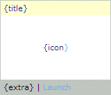
template=<table style="border:1px solid silver"><tr><td style="width:150px;color:white;padding:4px;background-color:{color}">{title}</td></tr><tr><td style="background-color:white;height:90px;text-align:center"><a href="#" {url} >{icon}</a></td></tr><tr><td style="padding:4px;background-color:silver">{extra} | <a href="#" {url} >Launch</a></td></tr></table>
which will produce the below result:
|
|
Sharon
5/7/2015 20:36 | Hi Juerg,
Thank you for the quick reply. When I set the template with the table style it breaks the page. What menu layout should I be setting? I tried the grid -it breaks the page- it sets a table within a table within table and so on.
I have created a view that has the columns set up with all the matching criteria as laid out in your example. |
|
Juerg
5/8/2015 15:39 | Sharon,
can you quickly check the web part�s version number by opening the web part�s tool pane and looking it up at the top ?
Can you also send us your the content of your web part's "Options" setting to [email protected] for inspection ? |
|
Sharon
5/8/2015 19:46 | Hi Juerg,
We are using version 1.1.54. and I will send along that other info. |
|
Juerg
5/11/2015 13:23 | Sharon,
there is a bug in the web part which causes this nesting of tables problem when you are using a template in combination with the �Icon Layout� setting set to �Above�.
Please thus just set the �Icon Layout� say to �Top� to avoid the problem.
We have fixed this issue in the most recent version of the web part. |
|
Juerg
5/12/2015 12:35 | Duncan,
we actually fixed the problem with the sorting order of the submenus in version 1.1.55
Please re-download the current version of the �Navigator� web part, extract the WSP solution file and then update the web part solution. |
|
Catharine
5/19/2015 11:27 | Hi Juerg,
My links are in 3 different folders, each of the folders has different permissions.
I have created a view which does not show the folder hierarchy but does show the appropriate links.
I have used that view name in the navigator - but no links are displaying. Are there any other settings I need to change ?
Catharine |
|
Juerg
5/22/2015 10:16 | Catharine,
there is a bug in Sharepoint which causes this issue (using a list based on the �Links� list template in combination with a �flat� list view).
However, we have now found a workaround and released a new version.
Please re-download the current version of the �Navigator� web part, extract the WSP solution file and then update the web part solution. |
|
Thomas
6/8/2015 10:28 | is it possible to Show / hide the arrow in the FlyOut Menu based on the fact if there are real submenu entries ? i found no way, because it doesnt seem there are different CSS classes used. |
|
ammar
6/9/2015 10:19 | Hi
pleas how can i create a sub menu item
Thanks ... |
|
Juerg
6/9/2015 18:57 | ammar,
the easiest way is to create folders in your Sharepoint List. Each folder will represent a submenu (you can select the hierarchy to be either defined by folders or list views as set in the web part's "Top Level Hierarchy" setting). |
|
Juerg
6/9/2015 19:01 | Thomas,
the web part actually displays the arrow only if the main entry points to a folder.
However, the arrow is then displayed even if the folder is empty, but this situation would not useful since such a main menu entry would not serve any purpose. |
|
ammar
6/10/2015 09:56 | Thanks Broo i have an issue that when i crate a menu an sub menu by folder set the sub menu will appear withe menu location and sub menu location and its must me appear in sub menu only ? |
|
Frank
6/10/2015 15:39 | Hello,
My goal is to have an arrow beside navigation items (with subitems) and no arrows beside other navigation items (which do not have subitems), while being able to completely define the sorting.
I use one folder content type to display navigation links that inherit sub items. These folders are displayed with an arrow in the webpart.
Furthermore, I use an item content type for navigation links that do not have subitems. These are not displayed with arrows.
My problem is that the sorting does not seem to work in the webpart with these two content types. The webpart always displays all the folder content type navigation links on top and all other item content type navigation links below them. However, I would like to define their order completely.
When I am doing the sorting in my list (with a sorting column), everything is displayed in the correct way. Only the webpart puts the folder content type items always to the top.
My version is: 1.1.44
|
|
Juerg
6/10/2015 16:12 | ammar,
can you send a screen shot to [email protected] to illustrate the problem ? |
|
Juli
7/8/2015 16:24 | I am evaluating this webpart. I have looked at all the comments and see where you can add the color column to the new Folder Content type. What I need to know know is how to reference that column in the css for the dropdown menu. |
|
Juerg
7/9/2015 12:44 | Juli,
please note that the colors assigned via the �Color� column will only be applied to the �horizontal�, �vertical� and �Grid� menu layouts, but not to the dropdown menu (eg. you cannot assign individual colors to each dropdown main menu item). |
|
Juli
7/9/2015 15:04 | In a response about rounded corners on 8-12, you show how to do that in the Menu Item css. Is this something that can be done for the dropdown menu, to show rounded corners on each end of the block? |
|
Juerg
7/9/2015 15:22 | Juli,
yes, please add the below to the web part�s �Options� setting:
css=#AEDropdown ul {border-bottom-left-radius:7px;border-bottom-right-radius:7px} |
|
Juli
7/9/2015 15:53 | I am loving this webpart! Well done. One of the things I am struggling with though is how to know when to use the dropdownmenu.css or flyoutmenu.css instead of adding the css to the Options section of the webpart properties. Can you provide some guidance on how to determine which option to use? |
|
Juerg
7/9/2015 16:14 | Juli,
the �css=� Options setting is a quick means to locally apply (or override) some CSS settings. Once everything works, it can be transferred to the CSS style sheet file and the �css=� option then can be discarded. |
|
Karyn
7/14/2015 19:31 | Receiving a Web Part 'Folder Error:value does not fall within expected range'; any assistance is appreciated. If I take the view name out, I will see all of the folders' contents listed and with no hierarchy. I just cannot see the top level hierarchy folders.
Steps I took:
1. Created a 'PACC Links' Links List of folders containing URL pages and a default view 'All items'.
2. Completed these Miscellaneous values-
List Name: PACC Links
View Name: All Items
Link Title Field Name: (blank)
Link URL Field Name: URL
Menu Layout: FlyoutMenu
Number of Columns: 5 (default)
Icon Layout: None
Top Level Hierarchy: Folders
(unchecked) Open Links in new Window
(unchecked) Show my Links only
(unchecked) Show 'Add New Link' Button
(unchecked) Link Title to List
Menu CSS Style (blank)
Menu Item CSS Style (blank)
Menu Section CSS Style (blank)
highlight color (blank)
Active Item Color (blank)
Header (blank)
Footer (blank)
License Key (blank) |
|
Juerg
7/18/2015 17:11 | Karyn,
can you temporarily enter
trace=1
into the web part�s �Options� setting and then send us the additional output generated by the web part for analysis to [email protected] ? |
|
Bas Hesselink
7/24/2015 16:38 | Hello Juerg,
Is there a way to prevent pages loading slow when the navigator webpart is used on that page. Pages without the navigator webpart load normally. I use the sandboxed version in O365.
Thanks in advance.
Bas
|
|
Juerg
7/28/2015 20:01 | Bas,
please note that sometimes the virtual server which hosts your Office365 site experiences some heavy load caused by other customers sharing the same virtual machine with you which results in unpredictable page load times when loading the �sandboxed� web parts.
The Navigator web part typically loads in about 1 to 5 seconds but we also sometimes observe a longer page load time. |
|
Christine
8/6/2015 14:14 | I'm using SharePoint 2013 and my menu layout is set to grid. When I use the following CSS I get 2 borders. One appears around the icon and description and another appears around the description. I only want a border around the icon and description.
Menu CSS style = border-spacing:4px;border-collapse:separate
Menu Item CSS Style = width:300px;height:90px;border:2px solid #d6d6d6;padding:2px |
|
Juerg
8/6/2015 20:02 | Christine,
please use the below setting:
Menu CSS style = border-spacing:4px;border-collapse:separate
Menu Item CSS Style = width:300px;height:90px;padding:2px
Options = css=.AELinkContainer > TBODY >TR > TD {border:2px solid #d6d6d6} |
|
Bob
9/2/2015 01:04 | Juerg,
I do not have a checkbox to display icons? How do I get icons to display? I created a hyperlink or picture column on my links list to store the images, and want to display icons only. |
|
Juerg
9/2/2015 11:51 | Bob,
please set the web part�s �Icon Layout� setting to Icon only. |
|
Shaun
1/11/2016 14:26 | Juerg,
Thanks for your work on these web parts. They really are top notch.
We'd like to use this web part on our portal site as a drop-down list driven by a list. If we try to recreate the same portal drop-down list on a different site collection, can it also be driven by the same list from the first site collection or do we need to recreate the list on the second site collection. |
|
Juerg
1/11/2016 15:00 | Shaun,
yes, it can be pointed to another site collection by entering the full site URL into the web part�s �Site Name� setting. |
|
Shaun
1/11/2016 15:41 | Thanks for the super fast response! I'll go ahead and give that a shot. |
|
Frank
3/16/2016 07:54 | I have started using the web part, and it's wonderful! Just one thing, though - I have the web parft configured on a page (and there's LOTS of configuration settings) and I would like to duplicate that config on a different page. I'd normally do that by exporting the configured web part, going to the new pge and importing it, but I don't see "Export" in the drop down menu for the web parts. Am I missing something, or is Export not an available option (which would be very disappointing...)? |
|
Juerg
3/16/2016 12:33 | Frank,
please open the web part for editing, expand the �Advanced� section and set the �Export Mode� to �Export all data� (the default setting is �Do not allow�). |
|
Frank
3/19/2016 08:10 | In your reply to Sharon on 5/5/2015 you posted that the template should be inserted in Options parameter of template=<table style="border:1px solid silver"><tr><td style="width:150px;color:white;padding:4px;background-color:{color}">{title}</td></tr><tr><td style="background-color:white;height:90px;text-align:center"><a href="#" {url} >{icon}</a></td></tr><tr><td style="padding:4px;background-color:silver">{extra} | <a href="#" {url} >Launch</a></td></tr></table>
What is {extra} | in that example? I assume it's an extra column that has been inserted with some text in it to create the link, but it doesn't matter what I've tried so far - if I do the template without {extra} | in it, the template works wonderfully, if I do it with the {extra | in it, the page breaks. It would be really useful to be able to have two links on one button, so I'd really like to get this working! As ever, any hints very much appreciated |
|
Juerg
3/20/2016 13:11 | Frank,
the �{extra}� placeholder refers to an extra column in your List. You will need to define the column name via the �extracolumn� option ("Options" web part setting) as shown in the below example:
extracolumn=Category|template=<strong>{title}</strong><br/><a href="#" {url>}{icon}</a><br/>{extra} |
|
JanK
3/24/2016 17:29 | Hello, is it possible to open only selected links in a dialog box, like in promoted links? It would be very helpful. Thanks! |
|
Juerg
3/24/2016 18:34 | Jan,
you can actually define two new columns (of type �Yes/No�) in your list and name the columns:
- Open link in popup window
- Open link in new window
to define the behavior on a per item basis. |
|
Frank
4/5/2016 18:52 | When using the "DropDownMenu" style, if there are nested folders, the second level of nesting becomes a flyout. I have created a custom content type for "FolderIcon", created a picture column in there called "FolderIcon", and populated that for all entries in the structure. For the first level, the icons display nicely, but for second levels, instead of displaying an icon, the item just displays the same as any other item. This means that the only way that people see if a sub menu item has its own sub-sub menus is if they mouse over the item at which time the sub-sub menus fly out. is this intended behaviour or is something wrong? |
|
Juerg
4/10/2016 18:29 | Frank,
regarding the arrows for the dropdown submenus:
Please add the below CSS styles to the web part�s �DropdownMenu.css� file (located on the Sharepoint web frontend server(s) at c:\Program Files\Common Files\Microsoft Shared\Web Server Extensions\14\TEMPLATE\IMAGES\AELinksWebpart)
#AEDropdown li ul li.subsub {
position: relative;
background:url(arrow_right_white.gif) #b29c85 no-repeat right 12px;
}
#AEDropdown > li > ul > li.subsub > a:hover {
background:url(arrow_right_white.gif) #c60 no-repeat right 12px;
}
Please adjust the background colors according to your color scheme. |
|
Anna
4/13/2016 11:55 | We have migrated to SP2013 and our menu layout is a grid. The highlight color now doesn't cover the whole menu item. If we have an icon in the menu and hover over the icon the highlight show ups over the icon but not the field with our text. Is there any way to get the highlight color to apply to the whole menu item on hover? Thanks |
|
Juerg
4/13/2016 18:26 | Anna,
can you send us the settings you are using ("Miscellaneous" section only) and a screen shot illustrationg the issue (please send to [email protected]). |
|
Gayle
6/10/2016 05:17 | I'm struggling to understand how the filters work. I want to be able to select a department from the standard global menu where the link has the dept code as a URL parameter. ie site/pages/myDepartment.aspx?dept=COO
When the user get's to the page I then want to use this navigator web part as the quick launch menu for all of the functions that are available. There are 20 different departments. I can setup the list so that each of the links is repeated for each of the departments. I'm doing this via SSIS push to sharepoint list so it's not as bad as it sounds as far as keeping it all in sync. But the problem is I just can't understand how to make the filter work on the navigation web part. There is a Query String URL filter on the page called dept. There is a column in the navigation links list called dept. There is a single sorted view. How do I get the navigator web part to filter on the URL parameter. Is this even possible?
For other parts of the site this web part is working beautifully.
Thanks! |
|
Juerg
6/10/2016 11:40 | Gayle,
you actually can pass select the List View via an URL parameter by entering the URL parameter (enclosed in square brackets) into the web part�s �View Name� setting as illustrated below:
[dept]
However, this forces you to create a list view (named the same as your URL parameter value) for each department.
Another option is to enter a CAML expression into the �Options� setting to have the web part dynamically select the list items as illustrated below:
caml=<Eq><FieldRef Name='dept' /><Value Type='Text'>[dept]</Value></Eq>
(eg. the list items are filtered by the �dept� column which need to match the value of the �dept� URL parameter).
If this seems to be unpractical, we can add a new option to have the web part filter the list items by the passed in parameter. |
|
Lee
7/8/2016 07:37 | Hi Juerg,
Just enquiring, as to whether we can use this web part to replace the existing global navigation for all our sites (i.e install it on all our site collections with consistent menu layout utilizing exact copy of same list of items).
More to it, how can we have the Microsoft SharePoint global navigation contents disappear and get replaced within same zone by the web part. This zone as you know natively cannot accept web parts and on top its a purchased theme, so we cannot modify the templates.
Any advice?
Thanks Lee.
|
|
Juerg
7/8/2016 14:06 | Lee,
do you mean that you are not allowed to edit the Sharepoint master page provided by your purchased theme ?
We actually have the Sharepoint �MegaMenu� which is based on JavaScript (and gets the links from a Sharepoint List), but you would need to be able to both embed a �ScriptLink� and a �<div>� container to your master page. |
|
Lee
7/19/2016 10:05 | Hi Juerg,
Thanks for your reply. We are very interested in that megamenu and I have already sent the .master pages you required to have a look and determine where we should insert the divs (for both the megamenu and the exported navigator webpart).
Awaiting your reply as the pressure builds our end to deliver the solution by maximum early next week. In the mean time we will proceed and purchase the rest of the webparts required, including Navigator webpart, just in case.
Thanks & Regards,
Lee
|
|
Tony
9/2/2016 11:04 | Hi, loving the webparts! I'm using the Navigator part to create a Grid of Icons, with metrics showing what people have assigned to them. Each one links to the relevant site. Would it be possible to highlight in a different colour if an item has a count over 0, to help highlight todo items? I looked at the KPI webpart but I think that has a limitation that you can't specify a different URL to jump to only the list it's connect to. |
|
Juerg
9/2/2016 12:20 | Tony,
the KPI web part actually supports pointing the tiles to custom URL�s.
Please add a new column named �URL� (of type �Picture or Hyperlink�) to your KPI list.
The web part now will automatically link a tile according to the presence of such a link. |
|
Andr�
10/7/2016 14:50 | I'm using AE Navigator Menu from the SharePoint Store.
In IE11 I can not see the menu items (grid with pictures), only the title of the menu.
In Firefox, Chrome I can see the menu items.
Something with JAVA or....???? |
|
Raphael
10/13/2016 17:03 | Andr�
we finally have fixed this issue with version 1.0.0.88.
Pleas update your Add-in via the App Store. |
|
Donna
10/20/2016 16:21 | We're using version 1.1.66 and we are having an issue where the simple dropdown menu is now showing up alphabetically. It is using the ID #'s from the list not the column alpha sort for display. So anytime we add a new item it shows up at the bottom of the navigation dropdown as any new item has a higher ID # value than anything else in the list. Is there a work around for this? |
|
Juerg
10/20/2016 20:26 | Donna,
if you have specified a custom sort order in your Links list view, then please enter the view name into the web part�s �View Name� setting so that it picks up your sort order. |
|
Gayle Reihana
10/22/2016 06:15 | Hi Juerg
For initial setup and testing on our site we had setup our navigation lists manually. However in the past few days we have been setting up our lists to be populated via SSIS. Now it seems that the views are no longer working. I've tried removing the webpart and then adding it again. I've deleted the view and then recreated it. But the navigation webpart still refused to show anything. There is no error so it seems to recognise that the view exists but it just doesn't bring anything back. If I change the view to filter from a different column it brings back a result but of course not the correct result as I need. Hope that makes sense. The views work ok for normal sharepoint activity. So I'm at a loss as to what to do now. Help.
Thanks
Gayle |
|
Juerg
10/24/2016 11:40 | Gayle,
your list view�s item limit is most probalby set to �30� (the default value for list views).
It looks like since you filter by an URL parameter value that the list items matching your filter condition are not contained within the first 30 items returned by the query.
You thus would need to increase the �Performance� list view�s item limit to at least the number of totals items contained in the list.
|
|
Gayle Reihana
11/8/2016 01:34 | Hi Juerg
Love this web part and wondering if you can help me with how I can highlight a particular menu item depending on the page it is on. ie I have a horizontal navigation with five options. So five tabs. This is all fed from a sharepoint list and filtered by team via the web part options setting.
I want to be able to set the colour of the tab depending on the page that is selected. So if a person selects the option 'Tracking' when the tracking page is open that particular tab is highlighted a different colour. I'm currently doing this by having each of the five items repeated in the list five times and setting the color in the list for a different item in each of the five views. And this is working ok. But it does mean that for 60 teams I have to have 60 times 25 separate entries.
I wondered if there was an easier way of doing this via the css nth-child option but I've tried a few different approaches for this and not had any success. Can you help thanks.
Cheers
Gayle |
|
Juerg
11/8/2016 12:19 | Gayle,
you actually can set the background color of the �active� tab via the �activeitem� option (to be entered into the web part�s �Options� setting) as illustrated below:
activeitem=Tracking
eg. the menu item specified above will be preset to the �Active Item Color� setting. |
|
Bill Dewey
11/10/2016 20:08 | We were trying to figure out how to get a true multi-level flyout Left Navigation to work without having to create a completely separate manual list for Navigation. I just pointed the Navigation Web Part to the Pages Document Library and used the Name field as the URL. You can then just put your pages into Folder/Sub-Folder hierarchy and Bingo, Left Nav Flyout Multi-Level. I am using DropDown. We could always add an Order column as needed. If you wanted to have a page displayed in multiple places you could have a workflow that creates a separate list and then add metadata to your pages to define the hierarchy, allowing a Work Flow to then create that actual Navigation List.
Hope this info is of some help to others, thanks Juerg! |
|
Gayle Reihana
1/17/2017 21:04 | Hi Juerg
I'm wondering if there is someway to be able to have the highlighted items change text color as you move across them in the same way as they change background color. Also is there someway to have the text color of the active item to change as well.
Cheers
Gayle |
|
Juerg
1/19/2017 18:36 | Gayle,
you actually can set both the background and the foreground hover/highlight color by entering two color values (background;foreground) into the web part�s �Highlight Color� setting as eg.
red;white
It is currently not possible to set the foreground color of the active menu item, but we can add this option if you consider this to be important in your case. |
|
Nicholas Oldford
1/19/2017 21:32 | Hi Juerg,
I am working with a newer version of the navigator webpart as we just upgraded our intranet from sharepoint 2007 to sharepoint online. I am curious about a few things.
1) I can't seem to use a custom list anymore, it flashes an error quick that I saw which requires a picture library. I was able to configure a picture library to work but there is an inline style that has an !important tag on it setting it to be 1140 pixels wide. Our site is not that wide and with an inline style !important I can't over ride this in any way. Is this something done intentionally?
2) Why would I not be able to use a custom list anymore?
Thanks for any help you can provide.
Nick |
|
Javier Gonzalez Pardo
3/1/2017 16:27 | Hi Juerg.
I'm testing SharePoint Navigator Webpart before buying it. I have a question, could you indicate how the list where the information originates should be built? How do I manage to display the third level of the menu? Thanks for your answer. |
|
Juerg
3/1/2017 18:17 | Javier,
the easiest method is to use List folders:
Main level=top level folders
Submenu=Items contained within top level folders (can be items and/or folders)
Subsubmenu=Items contained in Submenu folders |
|
Anjum
3/3/2017 18:00 | How to add different Images before all the Links, I want to remove the Square.gif image and add different ones. |
|
Juerg
3/3/2017 18:30 | Anjum,
you can define your own image by adding the below to the web part's "Options" setting:
bullet=Url of your custom bullet image |
|
Juli
4/10/2017 18:54 | Is there a way to use an image as the background rather than a color? I want the text on top of the image but don't want icons. |
|
Juerg
4/10/2017 19:53 | Juli,
please use the �behind� �Icon Layout� setting. |
|
Sony
4/24/2017 10:47 | Hi
Can I specify a colour to both 'Icon' and 'Title' while hovering on it?
|
|
Juerg
4/24/2017 15:34 | Sony,
can you indicate your web part settings:
- Menu Layout
- Icon Layout |
|
Sony
4/25/2017 07:15 | Hi Juerg
Menu Layout = Grid
Icon Layout = Left
Menu CSS Style -> border-spacing:8px;border-collapse:separate
Menu Item CSS Style -> width:200px;margin-left:10px;margin-right:8px;margin-top:5px;margin-bottom:5px;height:80 px; text-align:right;padding:5px;
Thanks |
|
Juerg
4/25/2017 11:16 | Sony,
do you want to be able to specify two different hover colors, one for the icon and one for the text ? |
|
Sony
4/25/2017 11:28 | Juerg,
No, just same color(dark blue) to the icon and text while hovering. |
|
Juerg
4/25/2017 11:45 | Sony,
when checking your settings, the web part actually applies the hover color to both the web part and the icon.
Can you send us a screen shot to [email protected] to illustrate the issue ?
|
|
Tony Fullen
8/2/2017 15:22 | I would like to use this for SP Online - Office365 but a couple of the options listed on this page are not available when I installed it on my environment.
Show my Links only:
Show 'Add New Link' Button:
I want to use it as a place for viewers to add their own "quick links". Is this something that can be fixed or added to the online version? Please let me know if I'm just missing something.
Thanks! |
|
Tom Benjamin
8/8/2017 22:36 | I want to use the flyout menu style with folders at the top-level, and change the orange/red background colours to match our branding. But when I upload the FlyoutMenu.css file to Site Assets and point the web part to it using Menu CSS Style, the menu just renders as simple unordered list, with no custom styling It appears to lose the CSS altogether. Any suggestions?
Tom |
|
Juerg
8/9/2017 13:15 | Tom,
did you enter the URL of your CSS file into the �Menu CSS Style� setting as eg.
/somesite/SiteAssets/FlyoutMenu.css
or
http://yourdomain/somesite/SiteAssets/FlyoutMenu.css |
|
Tom Benjamin
8/9/2017 19:58 | Ah, it works with the leading slash - /SiteAssets/FlyoutMenu.css - not as a relative path.
Thanks! |
|
HeatherD
9/8/2017 20:01 | Can you please explain your pricing model for SharePoint On-line. Above your pricing is 50 per server. With SharePoint on-line there are not physical servers. Can you please let me know what your pricing for sharepoint online is, what currency your pricing is and if the pricing is per year, per user per etc.
|
|
Juerg
9/11/2017 10:58 | Heather,
the license fee is per Office365/Sharepoint Online tenant. |
|
Gayle Reihana
11/2/2017 21:03 | Hi Juerg
I'm using the Flyout menu and an excel webpart next to it. In IE the menu is always behind the webpart. It's only the excel webpart that this is happening with. Normal lists etc and it is fine. It works fine in Chrome with the excel webpart. It is only in IE that it won't float over the top. Unfortunately IE is our default browser. I've added the z-index: 32000; pretty much everywhere in the Flyout css but it hasn't made a difference. Is there anything you can suggest.
Thanks
Cheers
Gayle |
|
Juerg
11/5/2017 17:34 | Gayle,
please add the below CSS style to your CSS style sheet:
#AEFlyout LI {z-index:999} |
|
Jacob
12/7/2017 19:12 | Is there a way to hide the header text when there are no elements in the web part do to group restrictions? |
|
Juerg
12/8/2017 11:35 | Jacob,
you actually can hide the web part if no items are returned by adding the below to the web part�s �Options� setting:
hide=3 |
|
Gordon
8/29/2018 19:11 | Hi Juerg,
If I use the navigator web part to point at PDF files in a document library, is there a way to add the file extension to the file's url? Using the 'Name' column doesn't include the extension. Works ok for .aspx pages, but not for other file types. |
|
Juerg
8/30/2018 13:23 | Gordon,
please rather enter
FileRef
into the web part�s �Link URL Field Name� when pointing the web part to a document library. |
|
Tom
2/13/2019 00:30 | Is it possible to use a sprite for the icons, instead of separate files? |
|
Juerg
2/13/2019 13:15 | Tom,
this is currently not supported. |
|
DaveB
2/26/2019 22:35 | I'm having trouble where the images in the menu won't all display.
I've added the Navigator Web Part to my Office 365 SharePoint page. It seems to be exactly what I am looking for. But I'm having a problem getting all the icons to display.
When I place the web part in a column, in a three column layout, only two rows of icons appear. When I move it to a three column wide area, and set the width to constrain the menu, the images display as two rows and don't respect the width dimension.
My menu consists of 27 images, each are 45 px squares. My aim is to display them in rows of 5 images in a left column, in a 3 column layout.
Is the evaluation version limited to prevent this type of wrapping of the images?
Thanks,
DaveB |
|
Cinda
4/18/2019 18:07 | Good Afternoon, I am attempting set up the Navigator Web Part for personal links but am getting an error (below) whenever I add a new link. The link is added to the list and displayed in the webpart even though the message is displayed. I originally thought this was related to the list I was using but it appears to be the site/webpart. If I have the page checked out when adding a link, I do not get the error message. Behavior is the same with and without 'Show my Links only' checked. I can't turn off checkout required on the page so do you have any suggestions on how to set this up so users can add their own links? Thanks.
Sorry, something went wrong
The file is not checked out. You must first check out this document before making changes.
Technical Details
Troubleshoot issues with Microsoft SharePoint Foundation.
Correlation ID: 7f32d49e-9d19-9040-94e5-c8f752813c1c
Date and Time: 4/18/2019 11:05:23 AM
Go back to site |
|
Juerg
4/23/2019 12:56 | Cinda,
- does the error occur right after you press the �Save� button in the �New Link� dialog window ?
- which version of Sharepoint are you using ?
- can you quickly check the web part�s version number by opening the web part�s tool pane and looking it up at the top ?
|
|
Cinda
4/23/2019 14:03 | Good Morning Juerg,
Yes, I get the error immediately after hitting save - either adding a new link or editing an existing link. The link does get added/updated though. We are on SP 2013. The version number of the web part is 1.2.0.
Thanks.
Cinda |
|
Cinda
4/23/2019 15:05 | Juerg, I was trying this on one of our test pages and getting the error. I set it up on another page and am not getting the error there. I'm guessing something is corrupt on the test page so I'm not going to worry about the issue at the moment. Sorry I didn't test it on another page before reporting the issue. Cinda |
|
Cinda
5/6/2019 17:13 | Good Afternoon, We are testing with the Flyout Menu option and have a couple of questions on formatting it. 1) Can you use the Column 'Top Level Hierarchy' option with the Flyout Menu? We would like to group items based on a Category column added to the list. 2) If using the Views setting for 'Top Level Hierarchy', can the views themselves be sorted so the top level menu is in alphabetical order? The menus are sorted if using Folders but we would like to be able to make the menu content more dynamic with Views (or Category column). Thanks. |
|
Juerg
5/7/2019 16:22 | Cinda,
- Yes, please then enter the below into the web part�s �Options� setting to define the column to be used for the main menu level:
hierarchycolumn=Category
- When using the �Views� hierarchy, the corresponding menu entries cannot be sorted (eg. you would need to create the views in the needed order).
|
|
Nathan
5/15/2019 12:45 | I am having real problems with the css and changing the color scheme associated to the menu and drop down. Is there any extensive guidance on this? |
|
Nathan
5/15/2019 13:10 | To expand further, i am using the dropdown option, however i can only appear to amend the highlight color. I am looking to change the color scheme completely to to into our SharePoint theme.
|
|
Juerg
5/15/2019 14:09 | Nathan,
the web part Zip download contains the default DropdownMenu.css file which you can change as needed.
To not disturb other Navigator web parts that already might use the default , please place a copy of the CSS file somewhere in your Sharepoint site and then enter the URL of the file into the web part�s �Menu CSS Style� setting. |
|
Lukas
5/20/2019 11:11 | Hello J�rg,
When using the dropdownMenu style option and multiple navigator webparts in one page, I am running into an issue with the #AEDropdown ID, that the <ul> element of the structure has. Some of my styles are only applied to the first webpart, I am pretty sure it's due to a doubling of IDs. Is there any way i can change that ID into a class? Or does that require a change in the solution? Thanks! |
|
Juerg
5/23/2019 17:28 | Lukas,
the "Dropdown Menu" option indeed uses the #AEDropdown CSS ID, but no CSS class is assigned to it (typically only a single dropdown menu is placed on a page).
You thus need to use the below CSS selector to style this element:
.AENavigator UL |
|
CarrieS
6/25/2019 18:10 | Hi Juerg, I am using the "FlyoutMenu" layout and am attempting to change the color of the right flyout arrow from white to black, but am having no success. Any suggestions? Thank you so much! |
|
Juerg
6/25/2019 19:46 | Carrie,
the web part uses the below image to render the right arrow:
SP 2016:
c:\Program Files\Common Files\microsoft shared\Web Server Extensions\16\TEMPLATE\IMAGES\AELinksWebpart\arrow_right_white.gif
SP 2013:
c:\Program Files\Common Files\microsoft shared\Web Server Extensions\15\TEMPLATE\IMAGES\AELinksWebpart\arrow_right_white.gif
You thus could replace the image with a black right arrow (without renaming the image filename). |
|
Cinda
7/24/2019 21:45 | Good Afternoon, Does either the Navigator or Quick Links Web Part support using Audiences for individual links? I am trying to display a list of links but need to restrict access/visibility on some of them. Thanks. Cinda |
|
Cinda
7/24/2019 22:58 | Juerg, Please excuse my previous post - I forgot to turn on Targeting for my list. Cinda |
|
Cinda
7/25/2019 14:46 | Juerg, Sorry for the multiple posts but I still can't get audience targeting to work with the Navigator web part. I set the audience on the item but the web part displays the link to all users. Should this work with the Navigator or Quick Links web part? Thanks. Cinda |
|
Juerg
7/26/2019 11:51 | Cinda,
to security trim the links, please add a column named "Group" (of type "Person or Group") and then enter one or more Sharepoint groups to the list item(s).
Please note that both the Quick Links and the Navigator web parts do not directly support the �Target Audiences� column. |
|
Donovan
8/2/2019 21:36 | Hi Juerg, is there a way to set the Accordion to default as all sections expanded? I'm using the columns as categories.
Thanks! |
|
Juerg
8/5/2019 11:29 | Donovan,
the web part currently has no option to display the accordion in an �all expanded� state.
Would this be an important feature for your users ? |
|
Luis Diego Barrientos
8/16/2019 17:24 | Hi Juerg,
does the webpart support main menu items(folder) to get a link associated? |
|
Juerg
8/16/2019 19:39 | Luis,
you will need to first create a new folder content type based on the �Folder� parent content type and then add a new column named �URL� (of type �Hyperlink or Picture�) to the new content type if you intend to add links to the folder.
Please then �allow management of content types� in your Sharepoint list and add the newly created folder content type to your list.
You now will need to create your folders based on this content type. |
|
Danny
9/5/2019 15:28 | Hi
Is it possible to install this webpart into the master page?
We're basically looking to apply a dropdown menu across our entire site collection, driven by this webpart and single list.
Any advice you can provide would be appreciated.
thanks |
|
Juerg
9/5/2019 19:12 | Danny,
Yes, you can embed the �Navigator� web part into your masterpage.
We have sent you detailed instructions by e-mail. |
|
Priyanka Jagarapu
9/10/2019 14:16 | Hi,
Does the trial version of AE Navigator Menu for SPOnline provide Flyout Menu option??
Priyanka |
|
Juerg
9/10/2019 14:57 | Priyanka,
the Office 365 version currently does not support a "Dropdown Menu" or a "Flyout Menu" option. |
|
sean
11/20/2019 02:28 | how I can hide the bar
|
|
Juerg
11/20/2019 12:08 | Sean,
to which "bar" are you referring to ? |
|
Kevin
12/18/2019 15:01 | Hi,
Is it possible to pull the color entered in the Color list column and use it as the hover/highlight color so that each item could have a different highlight color? |
|
Juerg
12/18/2019 17:07 | Kevin,
yes, you can assign individual item hover colors by adding a new list column named "Highlight Item Color" and pupulating it with the desired color values. |
|
Geoff
12/20/2019 16:18 | When I try to apply a view to allow the use of my folder structure it says Sharepoint view not found: default. With default being the name of the custom view I created. It also does the same with All Items. |
|
Juerg
12/20/2019 17:09 | Geoff,
please make sure to enter the view name into the web part�s �View Name� setting by observing the casing. |
|
Gayle Reihana
1/20/2020 01:32 | Hi Juerg
Is there a way to limit the flyout menu to a specific view. I have a list which contains approx 1500 entries which I'm already using for a horizontal menu.
I want to use the same list but with a flyout menu. They have slightly different display and filters but the URL is always the same. If I set the flyout menu to hierarchy of views it shows all the views that are setup. I have a view for the horizontal menu and another I've setup for the flyoutmenu. I've tried putting the actual name of the view I want to use in the View Name box but it doesn't make any difference. How can I limit it to only use a specific view for the flyout?
Thanks
Gayle |
|
Juerg
1/20/2020 13:53 | Gayle,
I assume that you are using list folders to define the hierarchy of the menu.
Please thus set the web part�s �Top Level Hierarchy� setting to �Folders� and then restrict the list items to your list view by setting the web part�s �View Name� to your list view name. |
|
Bill Dewey
2/24/2020 21:08 | Juerg, SP 2016, V-1.1.114 of the webpart, we are trying to center the Tiles, so far have not been able to find the correct CSS to do this. Tried the "Options" setting you showed above, that tag does not seem to be found in our version. Is this something we to upgrade the webpart to do? Thanks. |
|
Juerg
2/25/2020 11:43 | Bill,
to center the web part (using the �Tiles� layout) please add the below to the web part�s �Options� setting:
css=.AENavigator {display:table;margin:0 auto} |
|
Sulip
4/3/2020 04:31 | Can we add our own custom icons |
|
Juerg
4/3/2020 11:12 | Sulip,
yes, you can add any image (either via the "Icon" list column or by uploading it as a list item attachment). |
|
Sulip
5/15/2020 07:03 | Hi
Is it possible to change the size of the tiles? |
|
Juerg
5/15/2020 11:32 | Sulip,
you currently on can either choose "Tiles" (150x150px) or "SmallTiles" (120x120px). Would you want to use larger or smaller tiles ? |
|
Sulip
5/18/2020 03:03 | Thanks Juerg. Is there a way to have a custom size 75x75? |
|
Juerg
5/18/2020 14:09 | Sulip,
we now added the "tilesize" option (to be added to the web part's "Options" setting which allows you to set a custom tile size as eg.
tilesize=75
Please re-download the current version of the �Navigator� web part, extract the WSP solution file and then update the web part solution. |
|
Troi
5/28/2020 14:45 | Somone surely asked this already (didn't find it in the comments)
-How can I change the Placement of the Submenu in Flyoutmenu.css?
I want it to expand to the left side instead of right. |
|
Juerg
5/28/2020 17:04 | Troi,
none asked this question before, so we do not already have the corresponding CSS style settings available.
If you are familiar with CSS, you might try to adapt the "Flyoutmenu.css" file located at
SP 2016:
c:\Program Files\Common Files\microsoft shared\Web Server Extensions\16\TEMPLATE\IMAGES\AELinksWebpart
SP 2013:
c:\Program Files\Common Files\microsoft shared\Web Server Extensions\15\TEMPLATE\IMAGES\AELinksWebpart
A good start would be to remove line #59 (the "left" style) and replace "left" with "right" on line 93. |
|
Bin
6/10/2020 22:32 | In the Tiles layout when I added tilesize=75 to Options, is there way to make title center and wrap correctly? Thanks |
|
Juerg
6/11/2020 13:12 | Bin,
you actually might rather want to use the �Quick Links� web part (see /apps/page.asp?Q=5909) which is better usited for such a small tile size of 75px.
It centers and wraps the title, but does display the description text as a tooltip (as opposed to a dynamic overlay). |
|
Smith
9/11/2020 00:13 | Is there a way of having the dropdown which has folders on the top level but within the folder it has pages which appear on the dropdown navigation when you hover on it |
|
Juerg
9/11/2020 15:45 | Smith,
to suppress the display of the folder pages in the main menu, please specify a list view in the web part�s �View Name� setting (even if you are using the default list view as eg. "All Items" or "All Links").
|
|
Smith
10/4/2020 22:10 | HI Juerg
Not sure what you mean l need the folder to appearing in the dropdown but then also the pages link within the folders to appear in the dropdown if that makes sense |
|
Juerg
10/5/2020 13:04 | Smith,
please just enter the name of your default list view (of the list specified in the web part's "List Name" setting) into the web part's "View Name" setting to fix this issue.
In case of a "Links" list, please enter "All Links" otherwise enter "All Items". |
|
Bill Dewey
2/19/2021 17:35 | Recently we have run into an issue when we have a list view or document library on a page with the Navigaotr webpart. If there are Folders in the List or the Library and select a folder, we get an error in the Navigator Web Part. The Error says: "Sharepoint View no found (GUID)". This is displayed in the Navigator Web Part. Not sure when this started, we have noticed this just in the past week or two. Version 1.2.12 of the Navigator Web Part. Thanks. |
|
Juerg
2/19/2021 18:04 | Bill,
please update to the current version (1.2.14) where this issue has been fixed. |
|
Jodie
2/25/2021 21:21 | We are using the Grid option, 3 columns. Is it possible to have the list sort alphabetically vertically down column 1, then column 2, then column 3 rather than sorting alphabetically horizontally across the 3 columns? |
|
Juerg
2/26/2021 11:35 | Jodie,
you can use the"groupby" option combined with the "groupvertical" option(to be entered into the web part's "Options" setting) which allows you to lay out the links vertically (specify the name of the column to group the menu items).
Example:
groupby=Location|groupvertical=1
Please also make sure to sort your list view by the "GroupBy"column (and also enter the list view name into the web part's "View Name" setting).
|
|
Cinda
4/12/2021 19:53 | Good Afternoon, We have been using the navigator web part for some time and just recently switched to folders so we could do multilevel menus. I'm using different views to display appropriate items on different pages. I'm finding that the view is not honored in subdirectories. For example, I have a main level FOLDER1 with subfolder FOLDER1A. Within FOLDER1A, there are 2 items. Only one of the items in FOLDER1A is in the view used by the web part but both of the items display in the web part. We are not at the current version of the web part but thought I would ask if I had missed something in configuring the web part before upgrading. Thanks. |
|
Juerg
4/13/2021 12:32 | Cinda,
we have now fixed this issue (eg. the list view is now honored for dropdown/flyout menus).
Please re-download the web part and then update the solution. |
|
Cinda
4/13/2021 15:40 | Hi Jureg, I installed the updated version in our test environment and it works great. Thanks for the quick response. Cinda |
|
Danny Creighton
12/12/2021 19:51 | Hi Juerg
Is it possible to use this webpart with a custom list (which is not a quick links list)?
I have a list with the title column renamed to organisations. How can i get the navigator webpart to list the organisations column and on click an organisation, open the relevant list item?
thanks |
|
Juerg
12/13/2021 11:01 | Danny,
yes, please enter "Organisations" into the web part's "Link Title Field Name" and the name of your list column holding the link's URL into the web part's "Link URL Field Name". |
|
Danny Creighton
1/12/2022 09:29 | Thanks Juerg.
I am using this webpart, specifically the dropdown box layout.
Is it possible to expand the menu when you hover over the header, rather than having to click on it?
thanks |
|
Juerg
1/12/2022 11:14 | Danny,
the dorpdown menus should automatically expand when hovering over the main menu entries.
Can you contact us via [email protected] so we can investigate the issue ? |
|
Abbas
2/26/2022 16:45 | Helli Juerg
I'm testing this with 3 level of DropdownMenu option and have some problems:
1- Our sharepoint list has a lot of views. If We set the "Top Level Hierarchy" option to "Views", how can we limit the number of views to some of them?
2- We set the "Top Level Hierarchy" option to Column. (Not folders or views). Then entered "hierarchycolumn=Section" into the web part�s �Options� setting to define the column to be used for the main menu level. Now we have a 2 level DropdownMenu. and is OK. But what should we do to create a 3 level menu?
regards,
Abbas
|
|
Juerg
2/28/2022 11:29 | Abbas,
please note that only the �Folders� �Top Level Hierarchy� allows for a 3 level hierarchy menu. |
|
Jodie
3/1/2022 04:01 | Hi Juerg, I'm trying to use the Tile option but am unable to display the menu text. All I get is the icon image with no text. Can you please help. |
|
Jodie
3/1/2022 04:05 | PS we are on SP 2010! |
|
Juerg
3/1/2022 11:08 | Jodie,
to make the "Tiles" option work for SP 2010 (the "TIles" option is by default compatible with SP 2013 and onward), follow the below steps:
- download the COREV15.zip file from our web site at /download/corev15.zip
- unpack the zip file and put the COREV15.css into the below folder on your Sharepoint 2010 server:
c:\Program Files\Common Files\Microsoft Shared\Web Server Extensions\14\TEMPLATE\IMAGES\AELinksWebpart
- Enter the below into the web part's "Menu CSS Style" setting:
corev15.css |
|
Abbas
3/10/2022 19:41 | Hello Juerg
I add this web part on a page. and create some links with it.
But after doing this, the anonumous users can not access the page!
Is this for my fault or the web part need some configurations?
regards,
Abbas |
|
Jodie
3/15/2022 04:26 | Hi Juerg, we are on SP2010 and I'm trying to create a multi-level simple menu going horizontal across the page. I've tried List however the hierarchy column displays vertically with the sub headings underneath. How do I get the hierarchy column to display horizontally with the relevant sub headings underneath? (I did try vertical but same thing occurred and Horizontal the hierarchy column didn't display and all subsequent headings displayed horizontally).
Please help. |
|
Juerg
3/15/2022 15:46 | Jodie,
to display a horizontal menu with the sublevels displayed as dropdown menus, please set the "Menu Layout" to "DropdownMenu". |
|
Juerg
3/23/2022 14:18 | Abbas,
you need to grant the anonymous users read access to the Sharepoint list that contains the links used by the web part. |
|
Lukas
5/23/2022 15:28 | Hi Juerg, what about licensing, when we plan to upgrade from SharePoint 2013 to SharePoint 2016?
Is it needed to buy a new web part license key?
Do you have upgrade instructions/manual?
Kind Regards |
|
Juerg
5/23/2022 16:18 | Lukas,
you will need to purchase a license upgrade at US$80.- (per Sharepoint web frontend server) and then also update the web part solution to the SP 2016 version (which you download from this page) via the below Sharepoint PowerShell cmdlet:
Update-SPSolution �Identity AELinksWebpart.wsp �LiteralPath c:\AELinksWebpart.wsp �GACDeployment |
|
Abbas
6/14/2022 10:56 | Hello Juerg
For localization the web part, Is it possible to change the "Add New Link" and "Edit List" links with our native words?
regards,
Abbas |
|
Juerg
6/14/2022 12:23 | Abbas,
these two captions currently cannot be configured to be displayed in a different language.
Please indicate if this feature is important for you. |
|
Abbas
6/28/2022 09:03 | Hello Juerg
I add this web part on a page. and create some links with it. It works correct.
But when I add somthings in the GROUP field of an item in the sharepoint list (for security triming) , the anonumous users can not access the page!
and the user must login to the page! How can I correct this problem?
regards,
Abbas |
|
Juerg
7/7/2022 14:41 | Abbas,
resolving the group(s) specified in the list requires the user to be logged in (with some basic site permissions).
Adding code to use the Sharepoint system account to resolve the groups on behalf of the anonymous visitor would require quite some work to implement on our side. |
|
Greg
10/21/2022 03:42 | Is there a way to prevent guest users from seeing this navigation? Also, is there a way to deploy on multiple sites at once? |
|
Juerg
10/21/2022 09:08 | Greg,
you can use the web part�s Audience Targeting� feature (via the web part�s �Edit� pane by selecting �Advanced/Target Audiences�) to show the web part for specific groups only (as eg. �Home Members�).
Please also see https://www.c-sharpcorner.com/UploadFile/40e97e/target-audiences-of-web-parts-in-sharepoint/
Deployment:
The web part is globally deployed to the Sharepoint farm/web application.
You thus then also need to activate the feature in each site collection.
You will then need to manually add the web part to each page as needed.
If you need a �global� menu (available on all the pages within a site), please see our �Mega menu�:
/apps/page.asp?Q=5925 |


 Great web parts and very easy to install and configure. Great support with a personal touch. Highly recommended.


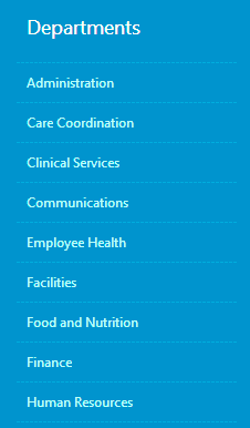


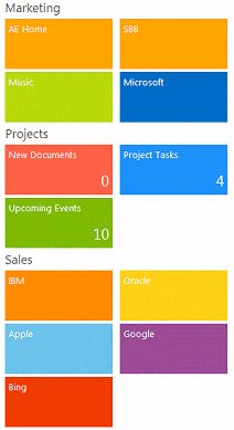
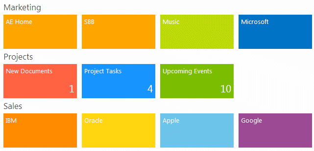

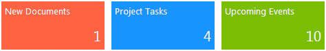


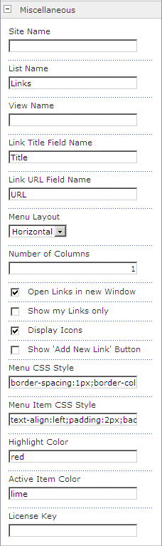
 Post a Comment