Kemal Aydık
4/11/2019 13:25 | Can this webpart be used on a SP2019 on premise modern page? |
|
Juerg
4/11/2019 13:52 | Kemal,
yes, the web part is also available for Shareponit 2019 "modern" pages. |
|
Ben
5/7/2019 18:50 | How do you add additional parameters like in the previous google chart version? For example re-label the data field labels. |
|
Juerg
5/8/2019 12:51 | Ben,
what exactly do you mean by "re-label the data field labels" ? |
|
Ben
5/14/2019 18:51 | If my data column name = calValue, but I want the data label on the chart to display as "The Value" how can I do that within the Chart Web part. I was able to do this within the google chart web part in the extra google parameters section. |
|
Juerg
5/14/2019 20:21 | Ben,
I still do not completely understand.
Can you send a screen shot to [email protected] to illustrate the issue ?
|
|
Joseph
5/22/2019 19:39 | How to we change the labels for the y axis to show as percent instead of decimals? When I change the data label with the :(%) it errors saying column not found. |
|
Juerg
5/23/2019 14:36 | Joseph,
to label the y-axis using percentages, please add the below to the web part's "Options" setting:
axisformat=percent |
|
Joseph
5/28/2019 18:22 | Hey Juerg - thanks for the follow-up. That doesnt seem to work for me. It does not update the axis labels. Does the column format need to be percent as well? |
|
Juerg
5/29/2019 11:17 | Joseph,
the column format does not need to be percent as well.
However, the "axisformat" option was added with version 1.0.13 on January 17, 2019, so you might need to update the web part if you use an older version. |
|
Chris
6/7/2019 17:26 | Hello and thanks for the great webpart!
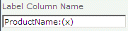
How do you supress the data callouts and add the data value on top of the bar? The ProductName:(x) doesn't appear to work for multiple data list columns. |
|
Matt
6/11/2019 17:04 | I'm curious about displaying the values on the chart as well, instead of the hover callouts. Is that possible? |
|
Andreas
6/13/2019 15:20 | Hey Juerg, as Joseph i had the problem to format the y-axis (vaxis) as percent. Try "axisformat=percent" but no success. I use AE chart Web Part Version 1.0.16. Is there an example or list of the options to use? |
|
Juerg
6/13/2019 18:14 | Chris and Matt,
we have now added the new �annotate� option to display the chart values on top of the data points. It is enabled by adding the below to the web part�s �Options� setting:
annotate=1
Please re-download the AE Chart web part and then update the solution. |
|
Juerg
6/14/2019 15:07 | Andreas,
please note that versions prior to V1.0.18 also require to enter a value into the "Vertical Axis Label" in order to honor the "axisformat" option. |
|
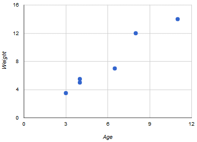
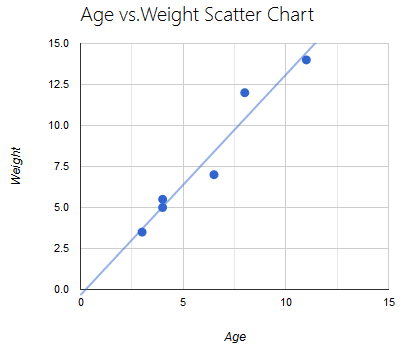
Agape
8/23/2019 21:39 | Hi, this webpart looks amazing. Is it possible to have a scatterplot?
Thanks!
Agape |
|
Juerg
8/25/2019 14:53 | Agape,
we have now added the new �Scatter� chart type:
Data List Column Name:
x-Axis,y-Axis
(eg. enter the name of the x-Axis and the y-Axis, separated by a comma)
Label List Column Name:
leave empty
Chart Type:
Scatter
If you already installed the web part, please re-download it and then update the solution. |
|
Julio
9/23/2019 19:30 | How can you make the y-axis show tenths and hundredths instead of just whole numbers?
Thankyou |
|
Juerg
9/24/2019 12:20 | Julio,
the web part automatically chooses an optimal y-axis grid.
Is this not the case in your configuration ?
If so, can you send a screen shot of the chart to [email protected] ? |
|
Jazer
10/4/2019 08:09 | How to sort data values in the graph e.g. descending |
|
Jazer
10/4/2019 08:11 | Also, if possible to hide not applicable data in the graph.. Thanks so much! |
|
Juerg
10/4/2019 15:38 | Jazer,
please create a list view with the desired sort order and then enter the view name into the web part�s �View Name� setting. |
|
Juerg
10/4/2019 15:45 | Jazer,
what exactly do you mean by �not applicable data� ? |
|
Wyatt
10/21/2019 15:10 | Can I change the size and font of the Horizontal Axis and Vertical Axis label. |
|
Juerg
10/21/2019 16:02 | Jon,
it is possible to set the font size of the axes labels by adding the below to the web part�s �Options� setting:
axisLabelFontSize=15
(the above example sets the axis label font size to 15pt).
However, currently the font family is hard-coded to �Arial�.
Would it be important for you to set an alternate font family ? |
|
Tobi
11/19/2019 15:51 | Hello,
is it possible to move annotations to a different position somehow?
Right now when values are 0/null, the "0" overlaps with real values in some chart types.
Like this: https://i.imgur.com/zNx61DE.png
-Tobi |
|
Juerg
11/19/2019 17:09 | Tobi,
this issue has now been fixed (eg. the annotations are now suppressed for values being zero).
Please re-download the web part and then update the solution. |
|
Danny
11/20/2019 19:07 | Is this the AE google chart? (with the bundle). I dont appear to have the 'Aggregation Type' field.
What i am trying to achieve is create a chart that displays the number of documents in a library by split by author field
so X would be author
and Y would be display the number of documents in that library by that particular author
Can you help? |
|
Juerg
11/20/2019 19:46 | Danny,
please make sure to install the "Chart" web part (the one described on this page as opposed to the "Google Chart" web part).
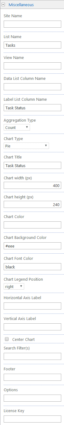
Please then configure the web part as follows:
List Name: Name of your document library
Label List Column Name: Created By
Aggregation Type: Count
Chart Type: Vertical Bar
|
|
Danny
11/21/2019 14:05 | thanks Juerg.
Following those instructions, the webpart dispays 'Label column error: Created By|1 (Value does not fall within expected range.)
any ideas where i am going wrong? |
|
Juerg
11/21/2019 18:39 | Danny,
can you temporarily enter
trace=1
into the web part�s �Options� setting and then send us the additional output generated by the web part for analysis to [email protected] ? |
|
Danny Creighton
11/24/2019 21:23 | No problem. I have emailed. |
|
Tobi
11/25/2019 13:32 | On some charts the labels get cut off. (https://i.imgur.com/ltWvt9a.png)
Is the an option to change this?
-Tobi |
|
Juerg
11/25/2019 14:38 | Tobi,
to make the vertical axis labels visible, please enter a value into the web part�s �Vertical Axis Label� setting (eg. do not leave it empty). |
|
Gary
11/27/2019 12:22 | Pointing this to a library, and selecting a 'Created By' field as the 'Label List Column Name'
I am getting the error 'data list column not specified or not found'
what am i doing wrong? |
|
Juerg
11/27/2019 14:33 | Gary,
assuming that you want to display the number of documents created by each user, please make sure to set the "Aggregation Type" web part setting to "Count". |
|
Gary
11/29/2019 22:16 | Having followed that instruction all the webpart displays is a lot of rows that displays 'Label column error: Created By|1 (Value does not fall within expected range.)
|
|
Juerg
12/2/2019 14:03 | Gary,
in case you specified a list view in the web part's "View Name" setting, please then make sure to include the "Created By" column in your list view. |
|
James Olorunosebi
12/8/2019 20:54 | Please regarding your charting tool. I have a data I need to represent with the following conditions.
The data exists in a SharePoint List, and there is a column containing when certain software licenses expires.
I want to create an Obsolescence Chart that lets me know THE COUNT of those software that will expire using these conditions.
<=31/12/2010 (Less than or Equal to December 31st 2010)
>=1/1/2011 <=31/12/2013 (Greater than January 1 2010 but less than December 31 2013)
>=1/1/2014 <=31/12/2017 (Greater than January 1 2014 but less than December 31 2017)
>=1/1/2018 <=31/12/2021 (Greater than January 1 2018 but less than December 31 2021)
>=1/1/2022 <=31/12/2025 (Greater than January 1 2022 but less than December 31 2025)
>=1/1/2025 (Greater than or Equal to January 1 2025)
I have created Views that match this requirements. How do I tell the chart to select all 6 views and display the graph in 3D horizontal bar chart? |
|
Juerg
12/9/2019 11:34 | Hi James,
the Chart web part is not able to chart multiple list views, so you will need to create a calculated column for each date range as for example:
=IF(AND([Expires]>DATE(2011,1,1),[ Expires]<DATE(2013,12,31)),1,0)
Please make sure to set the column data type to �Number�.
Please then configure the web part as shown below by entering your 6 column names, separated by commas:
Data List Column Name:
Range1,Range2, etc..
Label List Column Name:
sum
Aggregation Type:
Sum |
|
James Olorunosebi
12/9/2019 14:12 | Thanks! Worked like a Dr.Strange sorcery! :-) |
|
Gary
1/8/2020 15:41 | Having followed your instruction, ensuring the Created by field is stipulated in the libraries view.
The webpart is still displaying an error - displaying numerous row detailing 'Label column error: Created By|1 (Value does not fall within expected range.)
Any ideas please |
|
Juerg
1/8/2020 16:24 | Gary,
did you make sure to add the "Created By" column to your list view ?
|
|
Gary
1/8/2020 18:11 | Yes, the Created by field is displayed in my libraries view. |
|
Juerg
1/9/2020 10:48 | Gary,
does the problem go away if you leave the web part's "View Name" setting empty ?
Also, would it be possible to schedule a screen sharing session to troubleshoot the issue ? |
|
Gary
1/9/2020 18:46 | i get the same issue if i clear the view name i am afraid.
happy to run a screen sharing but i am due to go on leave for the next few weeks so i may have to get one of my colleagues to pick this up |
|
Juerg
1/9/2020 19:06 | Gary,
can you temporarily enter
trace=1
into the web part�s �Options� setting and then send us the additional output generated by the web part for analysis to [email protected] ? |
|
Gary
1/10/2020 10:05 | Juerg
I will get my colleague Danny to do this as i am away from the office now for a couple weeks. Danny will be in touch via email. |
|
Aleks Sh
2/10/2020 16:26 | Hi
Can we set limit to get number of items from list? I've tried use a list view with 10 items limit, but web-part still show 20 items on chart. |
|
Juerg
2/10/2020 17:12 | Aleks,
we have now updated the web part so that it honors the list view�s �Item Limit� setting (when the item limit is set to �Limit the total number of items returned to the specified amount�).
Please re-download the Chart web part and then update the web part solution. |
|
Bei Shen
3/4/2020 18:21 | Can you tell me what the difference between Chart Web Part for SP 219 (Free) and Chart Web Part (per Sharepoint WFE License)? Thanks. |
|
Juerg
3/4/2020 18:40 | Bei Shen,
Google disabled support for their Image Chart web service on March 14, 2019, although the service is still available to this date.
We thus released the �AE Chart� web part as a futureproof replacement.
The "Chart" web part also has more sophisticated features. |
|
ALEX GR
6/16/2020 10:02 | Hey. Thanks for the app.
There is a question. why you have indicated - for free. Did I get a 30-day version? But there is no information about this? Your other applications have a separate �30 day period�. But there is no such information? How should i be now ? |
|
Juerg
6/16/2020 14:36 | Alex,
the download actually is a �free� 30 day evaluation license.
Applying the license key after the 30 days turns the web part into the licensed version. |
|
Yair
6/21/2020 09:21 | Hi, Can we order the bar chart by the count value of the bars?
i.e after setting a count on a column we want to order the bars to be in descending order. Cat it be done(not from the list views) ?
Thanks
|
|
Juerg
6/22/2020 12:37 | Yair,
we have now added the new "sort" option (to be added to the web part's "Options" setting as eg.
sort=desc
or
sort=asc
to sort the chart data in ascending or descending order.
Please re-download the Chart web part and then update the web part solution. |
|
Curtis Snowden
7/28/2020 02:25 | Is it possible to have colors tied to specific values for the chart? For example, we have a chart that is Tasks On Schedule. I find that if we have a situation where we only have data that is Not On Schedule, it still displays as blue. It looks like the colors will always be used in order, regardless of what the data actually is. Can we have the chart work so that Not On Schedule will always be displayed in Red, or any other specific color we define?
I tried to use a pipe ("blue|On Schedule,red|Not On Schedule" or "On Schedule|blue,Not On Schedule|red"), but that does not work. |
|
Juerg
7/28/2020 14:51 | Curtis,
we have now added the option to map specific colors to your data columns via the web part's "Chart Color" setting as illustrated below:
On Schedule=blue,Not On Schedule=red
Please re-download the Chart web part and then update the web part solution. |
|
Curtis
7/28/2020 18:22 | Thank you very much. Unfortunately, it doesn't appear to be working. With the latest version installed it doesn't give me an error message about incorrect color configuration, but the colors still appear in the order provided regardless of the value. Copying your string to Chart Color exactly still has Not On Schedule appearing as blue. I've double checked my spelling and capitalization and it matches exactly. The field we're charting on is Calculated with a data type returned of Single Line of Text. I'm not sure if that makes a difference or not. |
|
Juerg
7/28/2020 18:43 | Curtis,
which "Chart Type" are you using ? |
|
Curtis
7/28/2020 19:06 | Standard Pie Chart, "Pie". |
|
Curtis
7/28/2020 21:33 | Also, is there any way to display the chart if there is no data? Even some kind of placeholder image or text? The title for the chart is always displayed, but if there doesn't happen to be any data based on our filters, no chart is displayed. This leaves a large empty space. |
|
Juerg
7/29/2020 12:40 | Curtis,
we have now also added color mapping to the "Pie" chart type.
We also add support to display a message or an image if no chart data is available.
You can override the default "Currently no data" message by adding the below to the web part's "Options" setting:
nodata=your message here
To display an image instead of a text message, please use:
nodata=nodata.gif
Please re-download the Chart web part and then update the web part solution. |
|
Curtis
7/30/2020 19:04 | Both changes are working in the latest version! Thank you very much for your assistance! |
|
MKirby
8/14/2020 17:57 | When I use the annotate=1 option I get the count numbers, but they have two decimal places. How can I get them to just show whole numbers? Also, do you have a listing of ALL the options we can use in the options box? |
|
Juerg
8/14/2020 18:34 | MKirby,
to display just whole numbers please use the below �Options� setting:
annotate=1|labelformat=N0
List of Options:
Please note that multiple options are separated by the �|� pipe character.
labels=none (suppress the chart labels)
labelformat=Nx (define the numeric label format)
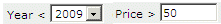
caml=CAML expression (define a custom CAML expression for filtering)
header=some text (define the chart header text)
axisformat=percent (label the y axis using percentages)
gridcolor=color (value define the gridlines color)
labelfontsize=nn (define the label font size in px)
axislabelfontsize=nn (define the axis label font size in px)
legendlabelfontsize=nn (define the legend font size in px)
tipvalue=some text (define the tooltip text)
annotate=1 (enable the chart value annotations)
piehole=nn (define the piehole size in px for donut charts)
sort=asc/desc (define the chart value sort order)
trendline=1 (display a chart trendline)
nodata=some text (display custom text if no chart data is available)
css=some CSS styles (inject additional CSS styles)
trace=1 (enable debug tracing)
|
|
Jay
8/14/2020 21:43 | Can you please show how to create a stacked vertical bar chart, thanks! |
|
Juerg
8/17/2020 12:47 | Jay,
- set the "Chart Type" to "Vertical Stacked Bar"
- enter at least 2 list columns (one per data series) into the "Data List Column Name" setting.
- if you intend to sum the values by group, set the "Aggregation Type" to "Group Sum" |
|
Matt
2/17/2021 22:28 | Hello. How do you force set the label width for horizontal bar? Mine are all squished and unreadable or just a "�". Adjusting the chart size doesn't seem to affect it. Thanks |
|
Juerg
2/18/2021 13:14 | Matt,
you can make the label area wider by ading the below to the web part's "Options" setting:
chartwidth="60%"
(please choose a suitable percentage between 0 and 100%) |
|
Matt
2/18/2021 19:43 | Thanks Juerg. That option does adjust the size of the chart within the webpart, but the labels are still condensed and not expanding at any percentage. Is there a label option I need to notate as well? |
|
Juerg
2/18/2021 19:49 | Matt,
can you send a screenshot illustrating the issue to [email protected] ? |
|
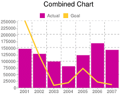
Justine
4/7/2021 21:19 | Is there a way with the CombinedBarLine graph to have 2 columns show as a bar and the third column show as the line? I can't find how to make this distinction. It is only showing the 1st data column as bar, and the last 2 as line. |
|
Juerg
4/12/2021 18:39 | Justine,
we have now released the new version which allows you to display the first 2 series as bars and the 3rd series as a line.
Please add the below to the web part�s �Options� setting:
combinedbars=2
Please also re-download the Chart web part and then update the web part solution. |
|
Jacopo
4/30/2021 10:08 | Hi
it's possible have the value label , on the bar and not at the top of the bar
thanks |
|
Juerg
4/30/2021 14:34 | Jacopo,
we have now added the �annotate=2� option (to be added to the web part�s �Options� setting) to display the annotations inside the bars as opposed to on top.
Please re-download the Chart web part and then update the web part solution. |
|
JAcopo
5/5/2021 16:52 | Thanks |
|
J Walp
7/6/2021 18:00 | Is there a way to get the values to display as %? The list settings are set to show as %, but on the graphs they just show as a number. Example: the list shows 50% but the graphs just shows 50. |
|
Juerg
7/12/2021 14:46 | Justine,
please update to the current version (V1.0.46).
Please then change the "modern" web part's �Configuration� setting by replacing
axisformat=percent
by
options=axisformat=percent |
|
Ami T
1/3/2022 14:39 | Does the "Search Filter(s)" work on the SharePoint 2019 modern page? If so, what is the configuration? |
|
Juerg
1/3/2022 14:53 | Ami,
we have now added the new �searchfilter=� web part setting to the modern version.
Example:
searchfilter=@Category
See also the�Search Filters� configuration described on this page.
Please re-download the �Chart� web part and then update the web part solution. |
|
Justine
6/1/2022 16:50 | Is there a way to display values in a cascading layout from largest values to smallest, similar to a pareto chart? |
|
Juerg
6/3/2022 14:44 | Justine,
you can sort the bars descending by using the below �Options� web part setting:
sort=desc |
|
Diana Duro Guerreiro
7/7/2022 17:37 | Hi,
How can I change de scale to the axis? I need the horizontal axis be beetwen o to 100. Thanks
|
|
Juerg
7/14/2022 12:52 | Diana,
we noticed that there is a bug in the Google Visualization library which prevents a single data point to be properly rendered when using the "sum" aggregation (eg. the y-axis scaling is not starting at zero).
We have now taken care of this issue and you can re-download the �Chart� web part and then update the farm solution. |
|
Lukas
8/1/2022 22:25 | How can I make it so that all entries that were created on one day are displayed as one day, currently I have many bars with one entry because they were made at a different time.
|
|
Juerg
8/2/2022 13:18 | Lukas,
which "Aggregation Type" are you using ? |
|
Maddy
8/18/2022 23:19 | Hi, I'm having the same problem as Lukas with the dates and I'm using GroupSum |
|
Juerg
8/19/2022 15:00 | Maddy,
if you need to sum data grouped by day, but the corresponding date column includes the time, you will need to create a "calculated" column which just displays the date part by using the below formula (referring to the "Created" column in this case):
=TEXT(Created,"yyyy-mm-dd")
and then entering the name of your calculated column into the "Label List Column Name" setting. |


 Amrein has superb customer service and well documented instructions on how to deploy the SharePoint web parts.


 Web Part Installation Instructions
 Post a Comment